Art-Directing an SVG Embedded Using the HTML object element
A Mini Case Study of Embedding, Art-Directing and Providing Accessible Fallback For The Provata Health Results Infographic
I have recently finished a front-end development project for Provata Health — a US-based health and wellness company specializing in health promotion and behavior change science. As part of their marketing website, I worked on an infographic that showcases the three major health results one can achieve by following their health program. The graphic is a perfect candidate for SVG and you’ll see why throughout this article. But even though almost all of the graphics on the site were vector (which made the entire project exciting to me), I want to focus on this particular graphic and how and why I made the development choices I made while embedding it.
I had to make a few “unusual” decisions to make sure I provide the best performance and accessibility possible, including inlining a piece of JavaScript in the middle of the page. So I wanted to share why I made those decisions, and at the same time shed the light on yet another case where SVG could be improved to adapt to our development needs.
Also, after tweeting about inlining the JavaScript in the middle of the document, I asked my go-to performance specialist—the nice Mr. Paul Lewis—about any performance implications, he too thought I should write about this and share why I made that decision. So here I am.
First, let’s have a look at that graphic and see why it is a perfect SVG candidate, before we get into embedding, art-directing and fallback.
The Results SVG Graphic
Disclaimer: I am writing this case study and sharing this image after having gotten a written approval from my client to do so. You can check the graphic out live here.
This is the SVG graphic I worked on in the website’s Results page, and how it was supposed to look on mobile and desktop, respectively.
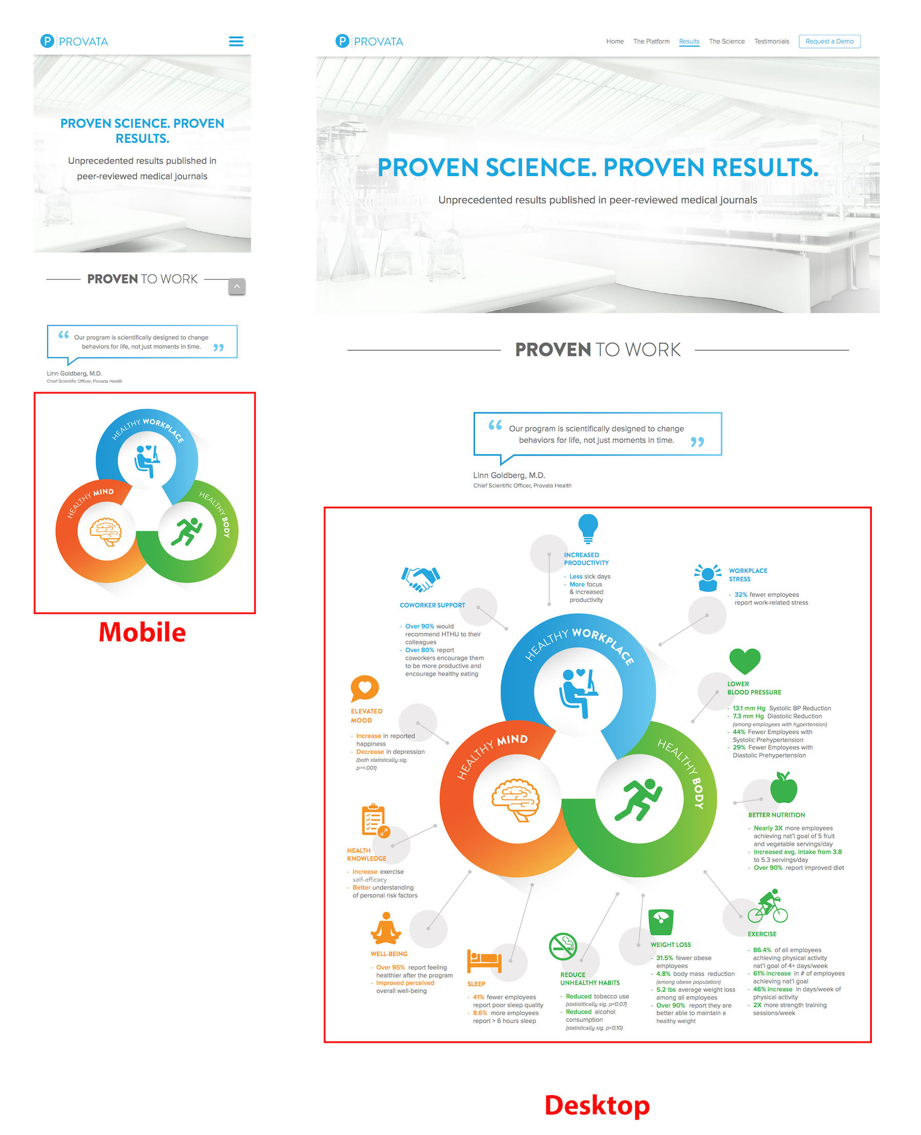
The text inside of the graphic is just as important as the rest of the HTML text on the page, with the addition of the positioning that illustrates what category each result belongs to in a nice visual manner. When you have text like this, SVG should be the first thing to think about. This kind of graphic (similar to an infographic) is a perfect candidate for SVG and one that makes SVG’s accessibility and visual features shine.
Imagine having to absolute-position each and every piece of text and image inside that graphic in an HTML document, taking into account and document flow (or lack thereof); doing this using SVG not only makes more sense but also comes with the advantage of being able to use a graphics editor to achieve all of the positioning visually, instead of hand-coding the positions using pixels or ems (or whatever unit you prefer).
Not only that, but you also get the fluidity and responsiveness of SVG images and text by default, so you won’t have to worry about adapting any text and image sizes to different viewport sizes. Not to mention text accessibility inside of the image. Win win win!
Choosing The Embedding Technique
Since the contents of the SVG are not animated (they were at first, but the UX team decided to drop the animations later for better UX), then the first logical embedding technique that comes to my mind is <img>, or its cool cousin <picture>; either way, it would be embedded as-an-image—as a foreground image, to be specific, because 1) there is no reason to embed it as a background image and 2) because foreground images have better performance metrics than background images.
However, there is one important reason why embedding it as-an-image is not an option: not only does the text inside of the image need to be as “real” (read: readable, selectable and searchable) as any other piece of text on the page, but we also need to be able to provide this same text as a raw text fallback in case the SVG fails to load for any reason.
So, to recap:
- The text inside of the image needs to be accessible to screen readers.
- The text inside of the image needs to be selectable and searchable by the reader.
- The text inside of the image should be the fallback provided for non-supporting browsers. That is, if the image fails to load for any reason, the text content of the image should be the content to replace it, not a PNG or JPEG version of the graphic. This decision was one of high importance to me because the entire section of that page depended on that text to convey a message, so should the user not be able to read the SVG text, I wanted them to be able to simply read the text content.
Given all of the above, <object> was the perfect candidate and the element I eventually used to embed the graphic.
To make sure the text inside the SVG is accessible, searchable and selectable, make sure you don’t turn it into outlines. Keep it as default SVG <text>. With this, you also get the ability to apply the page’s font face to the SVG text as well, using @font-face. So you get the text rendered and working just like you expect it to.
Between the opening and closing object tags, instead of providing a PNG version of the image for non-supporting browsers—which is what most developers would normally opt for, I provided a raw text alternative to the graphic, and the content of that text was the exact same as the content inside of the SVG graphic.
This works pretty well. While testing the graphic on mobile, and before finalizing the JavaScript (see next section), the graphic failed to load in one of the tests because the URL of the image I had specified was incorrect, so I got the text content in that section of the page instead, and it looked and worked perfect for the purpose of that section, as opposed to having loaded a PNG version that could have been unreadable.
Having chosen the embedding element, decided for an accessible fallback, and knowing that we need to provide two seperate images for desktop and mobile, it’s time to handle the image swapping…
Art Direction
I’m a huge proponent of the viewBox clipping technique. The attribute is extremely powerful and art-directing an image using this attribute is always the first thing that comes to my mind. If you’re not familiar with how this works, you should read my previous blog post explaining exactly how that’s done.
However, this is one use case where the viewBox clipping technique would not suffice because clipping would not be enough to hide the parts we do not need on smaller screens, because the viewBox can only clip to rectangular areas, so we would either have to use a custom clip path to clip out the excess content, or we could hide them by making them invisible (using opacity, visibility, display, etc.), and the latter can be easily achieved using CSS media queries. So the way it would work would be:
- Hide the branched parts (text and small illustrations) on small screens using
opacity: 0;ordisplay: none, for example - Then clip the canvas to the remaining graphic (the three overlapping colored circles) to get rid of unwanted excess white space resulting from hiding the rest of the graphic.
Changing the viewBox using CSS is currently not possible, so that would require JavaScript. Hiding the unwanted parts on small screens is possible in CSS, though. So this makes it possible to do half of the job using JS and the other half using CSS. I don’t like the sound of this, but this is the only way it’s possible now. Ideally, we would be able to change the viewBox using nothing but CSS, thus croppig and hiding the content using a few lines of CSS, but that’s currently not possible. (See previous article for details.)
art-directing SVG using the `viewBox` attribute is a powerful technique but one you should not pursue if the graphic you are embedding is too big to serve in full composition on mobile.
So, we can use one SVG image and art-direct it using CSS and a few lines of JavaScript. Great.
However, something else must be kept in mind here: performance. In my previous article on this subject, I mentioned that art-directing SVG using the viewBox attribute is a powerful technique but one you should not pursue if the graphic you are embedding is too big to serve in full composition on mobile. And in the case of the Provata graphic, the hidden parts were indeed non-trivial in contributing to the overall file size, making it significantly bigger, so using the same full image and hiding parts of it on mobile was definitely not a suitable approach in this case.
Which brings us to the next section…
Art-Directing The SVG object
Instead of serving the same graphic for desktop and mobile, we opted for two different graphics. Both of them were embedded using an <object> tag.
Had we embedded the SVG as an image, we would have been able to easily switch the source of the image using the <picture> element and its <source> descendant. I wrote all about this in a previous article as well, so you might want to check it out. The code for that would look something like this:
<picture>
    <source
        media="(max-width: 640px)"
        srcset="results-graphic--small.svg"
        type="image/svg+xml">
    <source
        srcset="results-graphic--full.svg"
        type="image/svg+xml">

    <img src="results-graphic--default-fallback.jpg" alt="Header description..">
</picture>
But since we need the text fallback and are using <object>, we need to swap out the source of the object using JavaScript because it’s not possible to do so using markup…
Using JavaScript to Switch object Source
To detect viewport size, I like using Modernizr. So the function swapping the object source looks something like this:
// after getting a reference to the graphic...
function changeSource(){
    var url = graphic.getAttribute('data');

    if (Modernizr.mq('(max-width: 767px)')) {
        if(url == "path/to/results-graphic--mobile.svg") return;
        else {
            graphic.setAttribute('data', 'path/to/results-graphic--mobile.svg');
            // maybe show/hide something else related to it here
        }
    }
    else {
        if(url == "path/to/results-graphic--desktop.svg") return;
        else {
            graphic.setAttribute('data', 'path/to/results-graphic--desktop.svg');
            // maybe show/hide something else related to it here
        }
    }
}
Of course, make you sure sure you trigger this function and re-trigger on window resize, and since the function already checks for whether or not the source is the one required at a specific screen size, it won’t keep swapping the source every time (that would otherwise cause a horrible flash making the image unusable). The rest is self-explanatory.
Inline or External JS? Sync or Async?
I inlined the script right after the </object> tag in the markup, and did not make it async.
“Why? 😳”
I needed the browser to parse the JS and specify the object source as soon as possible, I did not want it to parse the entire document before it displayed the graphic, because it’s the most important graphic on the page and I wanted it to show up as soon as possible. So, I did not async the inline script.
(We devs can turn any word into a verb and it’s totally legit.)
(Yes it is.)
At first, I was relying on the JS to set the object source on both mobile and desktop. That caused some issues on mobile—loading- and performance-wise, so I ended up setting the data to point to the mobile version of the graphic by default, and have the script do the swapping to the desktop version when on desktop. That got rid the mobile loading issue, and, expectedly, works pretty well on desktop.
Now, this works, perf is pretty good on both desktop on mobile and I even got a “looks good to me” from Paul, so I took that as my “good to go” sign.
The takeaway here is: always test your pages, no matter what technique you use to achieve something. It turned out that inining small pieces of JavaScript is sometimes even recommended to improve load times, says Google, and that’s exactly what I achieved by inlining the JS in this case.
An object Extension?
As I worked on this project, I tweeted about how nice it would be if we have a <picture> cousin that did the same thing as <picture> does for <img>, but something more object-oriented. (Pun not intended.)
Art-directing an SVG embedded as an <object> is something I’ve done more than once, and all in real-life, practical use cases as part of client projects. So this is something that is useful and would make a lot more sense if we could do it using markup without having to resort to (inline) JavaScript.
After second thoughts, I think that maybe, instead of coming up with a new element to do this, extending the object element with a <source> or <data> element that is similar to source might be quite handy.
So we could do something like:
<object type="image/svg+xml">
    <data src=" " media=" " >
    <data src=" " media=" " >
</object>
This is just an idea, and probably not even close to something implementable—it is just meant as an idea that might be shaped into something usable/implementable or maybe a similar idea that achieves the same functonality could spawn from it.
This is yet another thing added to my SVG wishlist. Until we get anything like that, JavaScript is the way to go to swap object sources.
UPDATE: After reading the article, Taylor Hunt pointed me to this specification, which defines a element to extend the options for some SVG elements. Maybe this element or something very similar in concept could achieve the URL-swapping without resorting to script. Just something to keep in mind.
Happy User, Happy Client, Happy Dev
In that order. The image used was important in conveying a message and was a vital part of the site’s content, so we made sure it was as accessible and good-looking as it could possibly be, using the awesome that SVG is.
At Provata, we focus on creating dynamic, interactive, and engaging digital health experiences. So we wanted our marketing website to reflect that. Sara expertly incorporated SVG techniques to deliver a final product beyond our expectations. She is an incredibly knowledgeable and diligent developer. She captured the spirit of our company brilliantly.
—Alex Goldberg, CEO Provata Health
Final Words
Working on this site has been great, and my client was one of the best I’ve worked with. Not only do I love the branding and design, but I also love the spirit behind the health program. (You can learn more about it here.) And my absolute favourite part was getting to work with lots of SVG animations using my favourite animation library. (Thank you, Jack.)
The SVG decision-making process is also one I enjoy a lot, even though the amount of options we have can sometimes be overwhelming, and in spite of the fact that we sometimes may need to make certain compromises when choosing one option over the other, and in spite of the lack of full-fledged tools and techniques we got at hand today. I love SVG and enjoy going through the entire process every time.
Hopefully things will get better in the future. The more we use SVG, the more practical, real-life use cases come up with, the more features we need, the more features we should request, and hopefully the more features make it to specs and implementation.
I also learned quite a few designer-y things while working on this project, and plan on sharing more of those in future articles and talks, so stay tuned!
Thank you for reading.