Creating Non-Rectangular Layouts With CSS Shapes
Today we can create all kinds of shapes with CSS using CSS transforms, but all these shapes do not affect the flow of the content inside or around them. That is, if you create a triangle or a trapezoid with CSS, for example, the shape created does not define or affect the way the text inside it flows, or the way inline text around it does.
With the introduction of CSS Shapes into the web, wrapping content in custom non-rectangular shapes, and recreating print designs and layouts on the web becomes a piece of cake!
In this article we're going to go over the basics of declaring shapes, and creating some simple layouts using these new CSS technologies. When more CSS Shapes features are implemented, more complex and awesome layouts will be possible, but even with what we have at hand now, some interesting and very creative layouts can be created with a little extra experimentation.
The CSS technologies we’ll be covering in this article may not work in your browser. If you want to see the working live demos you need to make sure you’re viewing them in a browser that supports these technologies. Check the current state of browser support for CSS Shapes out. You don't need a supporting browser to understand the features and demos, though. I've included screenshots of the demos so you can see how the final result looks like.
Most of this article's demos use the shape-inside property, which has been temporarily removed from Webkit and Blink. So, for the time being, this article will only show screenshots of how the demos work when shape-inside is implemented again.
Declaring Shapes
All HTML elements have a rectangular box model which governs the flow of content inside and around it. In order to give an element a custom non-rectangular shape, the shape-inside and shape-outside properties are used. At the time of writing of this article, the shape-outside property can be applied to floating elements only, and the shape-inside property isn't completely implemented, so you may still find bugs when u use it. The shape-* properties can also only be applied to block-level elements. Non-block-level elements should be forced to block if you want to use a shape property on them.
Shape-* properties take one of three values: auto, a basic shape, or an image URI. If the value is set to auto, the element’s float area uses the margin box as normal. (If you’re not familiar with the CSS box model, make sure you read up on it because you should know how it works).
If the value is set to a shape function, then the shape is computed based on the values of one of ‘inset’, ‘circle’, ‘ellipse’ or ‘polygon’. You can learn more about each of these functions in this article by the Adobe Platform team.
And finally, if the value is set to an image URI, the browser will use the image to extract and compute the shape based on the image’s alpha channel. The shape is computed to be the path that encloses the area where the opacity of the specified image is greater than the shape-image-threshold value. If the shape-image-threshold is not specified, the initial value to be considered is 0.5. The image should be CORS-same-origin, otherwise, it won't work, and the default value auto will be the value of the computed shape.
Shapes defined using the shape-outside property define the exclusion area on an element, while those defined using the shape-inside property define the float area of an element. We'll learn what each of these means in the examples below.
The shapes defined by the shape-* properties can be modified by using the shape-margin and shape-padding properties. The margin and padding shape properties are self-explanatory.
Establishing a coordinate system on an element
For the CSS shape declared to actually be applied on an element, we need to first start with establishing a coordinate system which we’ll be using to draw the shape.
A coordinate system is necessary because the shapes you declare will be defined by a set of points (and radii if you’re drawing circles or ellipses for example), and these points have x and y coordinates which will be placed on this coordinate system.
The shape-* properties use the content box of the element they’re applied to for their coordinate system, so in order to make them work, you need to specify a fixed width and height for the element which defines its bounding box, which in turn will be used to establish the coordinate system for the shapes you draw. If no explicit width and height are specified, the shape-* properties don’t work.
The origin of the coordinate system defined on the element's bounding box is positioned at the top left corner.
So, to declare a shape an element you have to start with:
- Specifying the dimensions of the element getting the shape (remember: the element should be floated when using
shape-outsideon it). - Declaring the shape on that element using the shape-* properties.
Applying a background to a custom shape
While the boundaries used for wrapping inline flow content outside a float can be defined using shapes, the actual box model does not change. If the element has specified margins, borders or padding they will be computed and rendered according to the CSS3BOX module. —W3C CSS Shapes Module Level 1
In other words, the shape you define on an element using shape-* properties only affects the element’s float area, i.e. the flow of the content inside/outside this element, but all the element’s other properties won’t be affected.
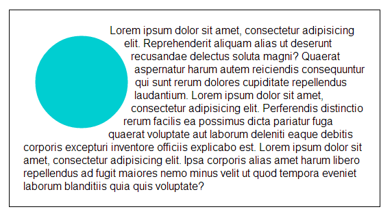
For example, suppose you only want to draw a circular shape and have content float on its side like the shape in the image below, you’d first have to declare the circular shape on the element (again, remember to float the element and give it a height and width). Then, say you want to apply a background color to the circular shape to look like the one in the image..
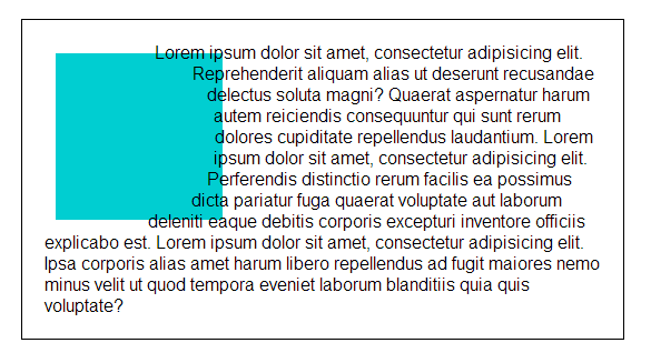
You’d be tempted to just add a background color to the containing element and then end up with the above result (that’s what I did the first time), but doing that won’t do the job. The reason for that is that all properties of the element, other than the flow of content outside it, won’t be affected by the shape you defined inside it, and they will be rendered normally according to the element’s box model (its rectangular shape), as we’ve seen in the spec. So if you apply a background color to it, you’ll end up with this.
So, how can we apply the color to the shape only and not the whole element? This is where the clip-path property from the CSS Masking specification can help.
The clip-path property will be used to clip parts of the element that we don’t need and keep only the parts inside the shape we defined. That obviously means that we’re not actually applying the color to the shape, we’re just trimming the element and leaving only the shape intact. With this, you’ll end up with a floating circle wrapping text outside it.
How, exactly? what value does the clip-path property get to do this?
The user coordinate system for the shapes defined by the clip-path property is established using the bounding box of the element to which the clipping path is applied, so the coordinate system is the same one as that of the shape-* properties.
Because of this, we can use the same shape defined in the shape-* property for the clip path, which will cut out, or clip, everything inside the containing element that’s outside the boundaries of the shape, and we’ll end up with a custom shape with a background.
You can test this concept live in this pen, just make sure you test it in a supporting browser.
Quick Reminder
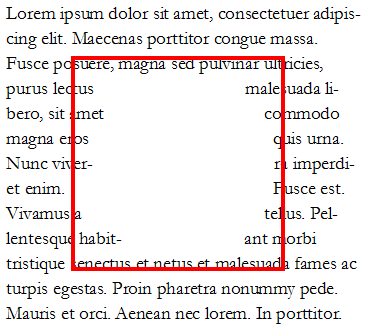
At the time of writing of this article, the shape-outside property only works on floats, and both shape-outside and shape-inside properties are applied only to block-level elements, or inline elements forced to block. A shape defined on a float will cause inline content to wrap around the defined shape instead of the float's bounding box. Future levels of CSS Shapes will allow use of shapes on elements other than floats, and when that happens we’ll be able to wrap content on both sides of a shape (as in the image below). So for now, we can only float an element and have content flow on either side of it.
You could also fake wrapping content on both sides using the Exclusion Punch plugin by Bear Travis.
Now let’s get our hands dirty drawing some shapes and creating some fun layouts!
Each of the following examples will introduce a new tip/idea/technique that are used to define and use CSS shapes and exclusions.
You can view the live demo for each example by clicking on the demo's screenshot.
Example #1: Floating text around a custom shape with shape-outside
We’ll start with a simple example. In this example we’re going to define a custom shape and have content flow on its side. The end result will look like the image below:
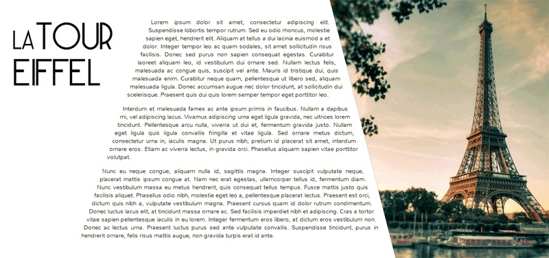
In the demo we have a container which contains two elements: a .content container with text on the left, and another element with a class.shaped floated to the right, which will get the custom shape and have the text flow on its left side.
The heading in the .content area is also getting a similar treatment to the one we're giving the floated div on the right, so I'll skip its explanation and only talk about what we're doing on the .shaped area on the right.
<div class="container">
    <div class="shaped"></div>
    <div class="content">
         <h1><span>La</span> Tour <br/>Eiffel</h1>
         <p>Lorem Ipsum......</p>
    </div>
</div>
We will first start by giving the floated div on the right a specific height and width to establish a coordinate system. We’ll set its height to be the same as its container, which for this demo I’ve set to be the same height as the viewport, using CSS’s vh unit.
.container{
    overflow:hidden;
    height: 100vh;
    width: 100vw;
}
.shaped{
    float:left;
    height:100vh;
    width:40vw;
    float:right;
    background: black url(../images/eiffel.jpg) center top no-repeat;
    background-size:cover;
}
Now that the coordinate system is ready, we’re going to draw the shape, to define the float and exclusion areas of the element. There are two ways to go about declaring a shape for this demo:
Using polygon()
For the first method, we’ll be using the polygon() function. This function takes in a set of points that form the polygon, each point defined by x and y coordinates. We're going to define a very simple polygonal shape, with 4 vertices, as shown in the image below (blue and orange discs):
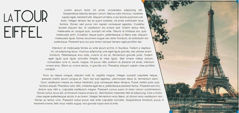
The coordinates of the points can have either specific values (px or em), or percentage values. In this example we're going to provide percentage values for the vertices visible in the above screenshot. Now all we have to do is just declare this shape on the floated element so that the text flows on its side.
.shaped{
    /*...*/
    shape-outside: polygon(0 0, 100% 0, 100% 100%, 30% 100%);
    shape-margin: 20px;
}
And that’s it! the text can now flow in the float area of the element, defined by the custom shape we declared on it.
You can also see that I've added a margin to the shape, to push the content away from the shape a little and create a gap.
But we have one more thing to add here. Like I mentioned in a previous section, the background of the floated element is applied to its original rectangular shape, not just to the shape we declared on it, because the background property is not affected by the shape declared on the element. So far, the demo looks like this:
So in order to clip out the excess areas that we don't need, we're going to use the clip-path property, and give it the same value/shape that we gave to the shape-outside property above. So we add this rule to the rule set:
.shaped{
    /*...*/
    clip-path: polygon(0 0, 100% 0, 100% 100%, 30% 100%);
}
And we're done! Simple, right?
The page title on the left gets the same treatment as the .floated div on the right. The heading is floated inside its container .content, it is given a specific height and width to establish a coordinate system, and then a shape is declared on it using the shape-outside property just like we did on the .floated element.
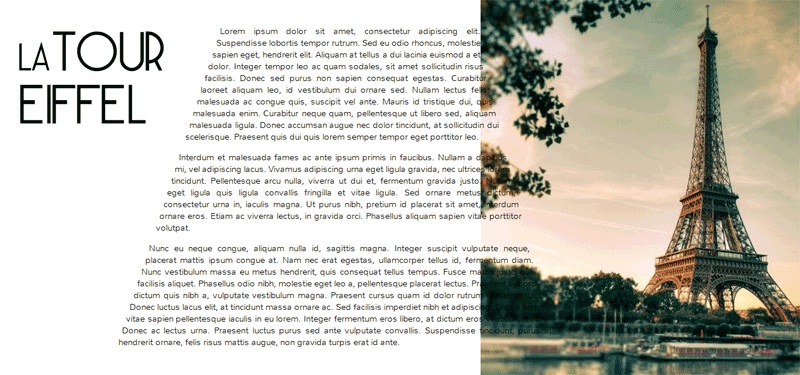
Using an image URI
Another way we could define the shape on our element is by using an image with an alpha channel, that is, any image with transparent areas.
For our example here, instead of using the polygon() function to define the shape, we’ll give the shape-outside property an image URI, and the browser will extract the shape from the image, and use it.
The image that would define the exclusion area for this example is the one shown below. You can see that the image shows the same shape defined by the polygon() points in the previous method.
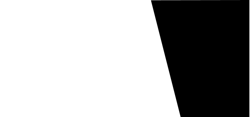
When you’re using an image with alpha channels to define a shape for the shape-outside property, the transparent area of the image will define the area where the inline text flows, this is the area called the float area of the element. The black portion defines the exclusion area of the element.
To use this image we write the following:
.shaped{
    /*...*/
    shape-outside: url(../images/mm.png);
    shape-image-threshold: 0.5;/* this property is used to set the threshold used for extracting a shape from an image. 0.0 = fully transparent and 1.0 = fully opaque */
}
Each of the two methods mentioned has its advantages. You might want to use an image URI for complex shapes that may be cumbersome to define the points for manually, in this case creating an alpha channel image in Photoshop would be much easier and faster than manually adding the points.
Another situation where you might want to use an image URI instead of a shape function is when you have multiple float or exclusion areas inside an element, in that case using this method is necessary because you can’t, for now, declare multiple shapes on an element, but if the image contains multiple areas, the browser will extract these areas from the image and use them. Pretty neat, right? :) we’ll see an example of this in the last demo.
Exmaple #2: wrapping/flowing text inside a custom shape with shape-inside
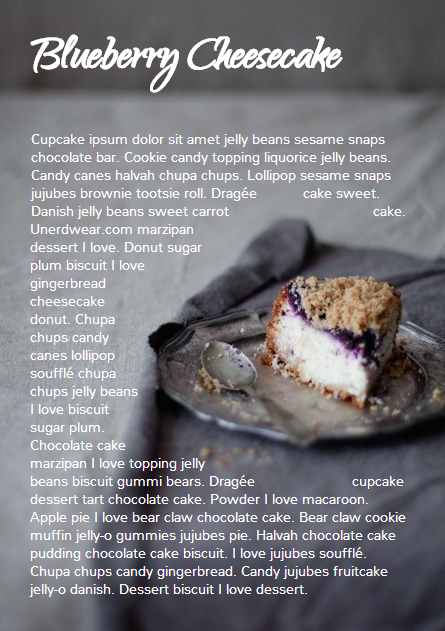
For the second example we’ll create a simple demo where the end result will look like this:
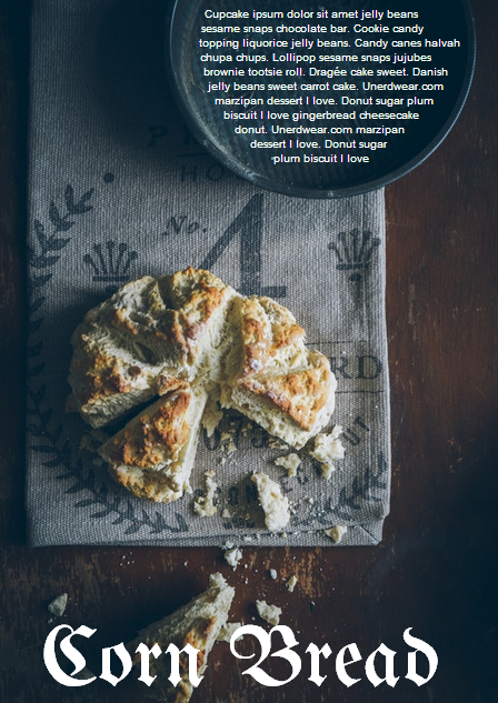
The goal of this example is to demonstrate the shape-inside property used to float text inside a non-rectangular shape. We have a container element with some placeholder text inside it, and we applied the photo as a background image to this container.
<div class="container">
    <div class="content">
        <p>...</p>
    </div>
    <h2>Corn Bread</h2>
</div>
As you can see from the demo screenshot above, the text is wrapped inside a circular shape at the top. So, we know that we’re going to have to declare a circle on our container. Now, like in the previous example, there are two ways we can do that..
Using circle()
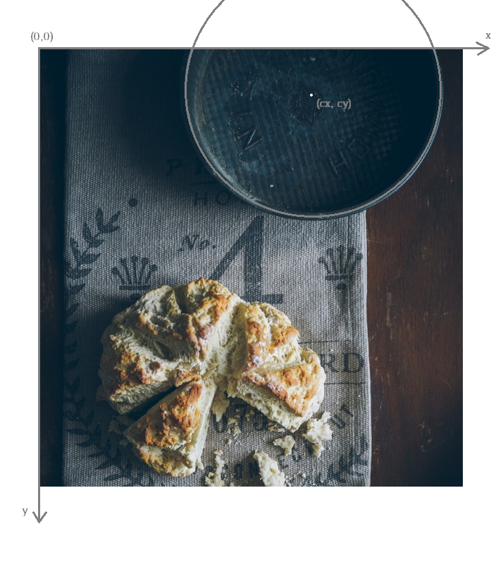
Using the circle() function we're going to define a circle and position it on our element.
The image below shows the coordinate system established on the element, and the position of the circle inside the element. We’re making sure the circle is positioned on top of the pan image inside the photo we’re using as a background, so that it appears as if the text is contained inside that pan. On the image the position of the center of the circle with respect to the coordinate system established on the element is also visible.
Because we want to wrap text inside a custom shape, and not flow it around it, we’re going to use the shape-inside property on the element containing this text. When you're applying the shape-inside property to an element, you have to remember that this element would have the text content inside it, unlike the previous example, where the content was outside the element we declared the shape on.
We’ll specify the coordinates of the center of the circle and we'll set the value of its radius, and apply those to the container:
.container{
    float:left;
    width:600px;
    height:900px;
    overflow:hidden;
    margin:0 50px;
    color:white;
    font-size:13px;
    padding:10px;
    background: url(../images/pan.jpg) top left no-repeat;
    background-size:100% 100%;
    /*declare shape using the shape function circle()*/
    shape-inside: circle(160px at 400px 60px);
}
Of course, unless you're attempting to create a perfect circular shape, you can also define the shape using polygon().
Using an image URI
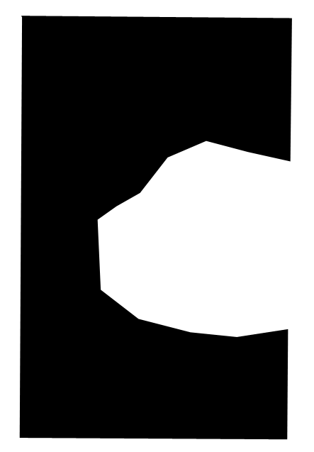
We can also use the URI of an image with an alpha channel to extract the shape of the circle from it. The image would look like the following:
It’s important to note here that when you’re using an image with an alpha channel to define a shape for the shape-inside property, the black (or opaque) area of the image will define the area where the text flows. In the previous example, the opaque area defined the exclusion area of the element we applied the shape to, i.e the area where no text flows.
So declare the shape using an image URI instead of the shape function circle(), you'll have to set the value of the shape-inside property to point to the URI of the image:
.container{
    /*...*/
     shape-inside: url(mask.png) top left;
}
Example #3 : wrapping/flowing text inside a custom shape with shape-inside
In this example we're also going to declare a polygonal shape on a container and have its content flow inside this shape. The end result will look like the image below:
Here, too, we can use either a shape function or an image URI to declare the shape on the element.
The shape declared on this container is clearly a "random" polygonal shape, not a geometric shape that we could declare using a shape function like circle(), ellipse(), or inset(), so we're going to use the polygon() function to declare it.
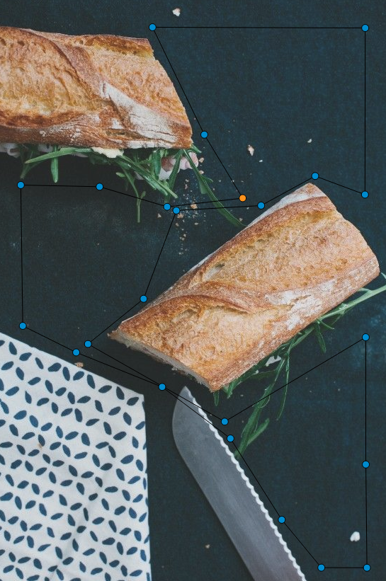
The shape defined by a set of points is visible in the image below.
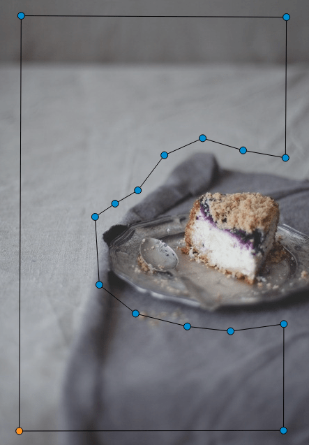
Because there's a fairly large number of points making this shape up, it would be cumbersome to calculate the coordinates of these points, so it would be helpful if there was a visual tool available to help us plot these points on the image, right? Well, there is a tool created by Adobe's Bear Travis, which is actually a collection of tools that can help you when working with CSS shapes. Make sure you check the Shape Tools out because they are very valuable.
One of the Shape tools mentioned is called Poly Draw, and it allows you to manually "draw" a shape, a polygon in particular, and then it generates the coordinates of the shape for you to copy and paste into your CSS to declare the shape on your element.
I have used the Poly Draw tool to draw the above shape on the image. Now, the tool does not take an image and sets it as a background for the element you define the shape on, so I had to git clone the repo of the tool and fiddle with the tool’s code a bit in the dev tools, and I applied the image to it and plotted the points on it.
Razvan Caliman suggested this idea when I asked him about the availability of a tool that allows us to define shapes on top of images right in the browser, just like the one he showed and used in his talk at this year's CSS Conf EU. If you haven't watched his talk yet, make sure you do. The tool he used will some day, soon I hope, be open-sourced by Adobe, and then it'll be an indispensible tool when working with CSS shapes. But until then, you could do with the Poly Draw tool.
After drawing the shape with the Poly Draw tool, all you have to do is declare the resulting shape on your element and you're good to go.
.container{
    width:445px;
    height:670px;
    overflow:hidden;
    margin:30px auto;
    /*shape generated by the Poly Draw tool*/
    shape-outside: polygon(170.67px 291.00px,126.23px 347.56px,139.79px 417.11px,208.92px 466.22px,302.50px 482.97px,343.67px 474.47px,446.33px 452.00px,443.63px 246.82px,389.92px 245.63px,336.50px 235.26px,299.67px 196.53px,259.33px 209.53px,217.00px 254.76px);
}
We could also define the shape above using an image with an alpha channel. The image below shows what that image would look like. Again, the black areas define the float area when using shape-inside, and they're where the text is going to flow.
If you want to go with the image URI instead of the shape function, youd replace the above shape outside value with the following:
.container{
    /*...*/
    shape-inside: url(mask.png) top left;
}
Example #4 : Multiple float areas with shape-inside
In this example we're going to create multiple float areas inside an element to wrap content inside. The result of this demo is shown in the following image:
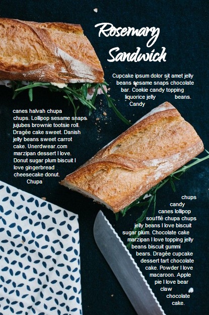
We have a div with a background image, and we want the text inside this div to flow inside specific areas inside it, all of which have custom shapes.
<div class="container">
    <div class="content">
        <h2>Rosemary Sandwich</h2>
        <p>...</p>
    </div>
</div>
Now, since we can't declare multiple shapes on an element, we're going to use an image with an alpha channel. An image can contain as many shapes and areas as you want, so it's perfect to define multiple shapes on an element, and the browser will extract all the shapes from this image and use them on the element.
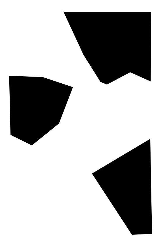
We'll use the following image to define the shapes. The black areas in the image will define the float area of for the content inside the .container where the text will flow.
We'll use the URI of this image as a value for the shape-inside property that we're going to declare on the .container, all the while remembering to set height and width values for the div:
.container{
    width:556px;
    height:835px;
    overflow:hidden;
    margin:0 50px;
    color:white;
    position:relative;
    background: url(../images/bread.jpg) top left no-repeat;
    background-size: 100% 100%;
    shape-inside: url(mask.png) top left;
    font-size:13px;
}
And we're done. The browser does the rest of the work for us by extracting the shapes from the image we gave it, and our text flows nicely inside those areas!
Using an image to define the shapes is the logical way to go when you have separate areas that are not connected to eachother, i.e that don't form a singe polygonal shape. For this demo, we could have used the polygon() function to define the shape, by defining a polygon that looks like the one in the image below:
But, as you can notice, this isn't the best way to do this, I just added this to show the difference between using an image and defining the shape with polygon(), and to show that sometimes the best practice or the one that seems more proper and makes more sense is to use an image, even if you can use a shape function to define your shapes.
Combining CSS Shapes with Regions and Flexbox to create magazine layouts
Typical print magazines usually combine multi-column text layouts with non-rectangular shapes to create creative and appealing designs. The columns are usually equal in height unless needed otherwise.
Once future CSS Shapes features are implemented, and wrapping content on both sides of a shape is possible, creating print-like digital magazine designs becomes very much possible when combining Shapes and Exclusions with Regions and Flexbox.
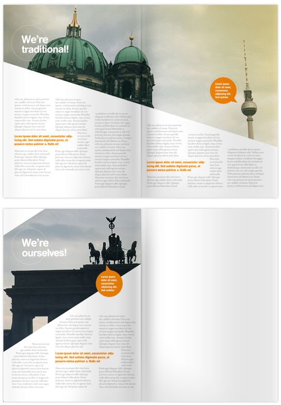
Flexbox provides us with the equal-height columns, Regions allows us to flow text into different areas on the page and separate the page content from its layout, and Shapes and Exclusions will allow us to add that final creative touch that takes our magazine layouts to the next level.
Final Words
I don’t think I’ve been excited about a new CSS feature as I am about CSS shapes and exclusions. The power, flexibility, and creativity that these features combined regions and flexbox can provide is just fantastic!
Widespread support for CSS Shapes should be coming soon, as the web platform team at Adobe is constantly working on improving and implementing these features, and providing tools to make working with them easier.
The future of web layout is looking brighter and more captivating every day. It's a wonderful time to be a web developer!
I hope this article helped introduce you more to the technical part of getting started with CSS Shapes. This will not be my last article on this topic. Combining CSS Shapes with other cutting edge CSS technologies like Regions opens the door to a new world of creativity, and lots of new tutorials! ;)
You should subscribe to my blog's RSS feed and follow me on Twitter to stay in the loop for upcoming new articles.
Thank you for reading!
Resources & Further Learning
- Bear Travis’s CSS Shape tools
- W3C's CSS Shapes Working Draft
- CSSWG Wiki on CSS Shapes and Exclusions use cases examples
- Adobe’s CSS shapes support matrix
- Adobe Web Platform's resources for CSS Layout
- This project by Bear Travis contains a series of exercises demonstrating new web platform layout features including an combining CSS Flexbox, Grid, Regions, Shapes, and Exclusions.
- CSS Exculsions article by Robert Sedovše
This article wouldn’t have been possible without the great help from Razvan Caliman, so a big thanks goes to him.