Navicon Transformicons: Animated Navigation Icons with CSS Transforms
The following is a collaboration post between Bennett Feely and I. After seeing Bennett's impressive animated navigation icon transformations (or "Navicon Transformicons") penson Codepen, I asked him if he would like to write a tutorial on how he did them as a guest post on my blog. He kindly approved. And as he doesn't have a lot of free time to work the article, we decided to collaborate on it. We'll be covering a few of the icons he created in his pen, and a couple more.
If you were to ask me what my most favorite CSS property is I might just answer the transition property. It has proven to be a perfect use case for progressive enhancement and it’s adoption has made countless websites feel smoother. By the way, a heck of a lot of properties are also transitionable.
While the prefixed transition property has been supported by the major browsers for a long time now (web speaking), there was quite a dilemma with browsers and their ability to transition and animate pseudo-elements (:before and :after). While Firefox has been doing things right since version 4.0, it wasn’t until March of this year when Chrome finally fixed things. Now, even IE10 supports transitions and animations on pseudo-elements.
So what shall we call these transforming CSS icons? How about transformicons?
These code snippets are intended to work only in browsers that support the properties used.
We will only cover the styles/transforms in SCSS, and add some explanation in the form of comments for those of you who aren't very familiar with SCSS. You'll find the complete compiled CSS code in the source code on Github. As the Javascript is very simple (just toggling a class name) we won't be going over it, and you'll also find it in the downloadable source code on Github.
Three-line to arrow (arrow left and arrow up)
The Markup
The three-line menu icon, aka navicon, aka hamburger icon can be accomplished quite a few different ways, but in this case we will use a wrapper element and a child with two psuedo elements to form the three lines. The markup really isn’t heavy.
First we’ll set up the wrapper around the actual navicon to trigger the transition. $button-size is the width of the lines of the navicon, not the entire target area.
$button-size: 3.5rem; $transition: .3s;// increase this to see the transformations in slow-motion
We are using the mixin in the .lines element and its absolutely positioned pseudo elements to create the navicon.
.lines { //create middle line @include line; position: relative;
/*create the upper and lower lines as pseudo-elements of the middle line*/ &:before, &:after { @include line; position: absolute; left:0; content:''; transform-origin:$button-size/14 center; } &:before {top:$button-size/4;} &:after {top: -$button-size/4;} }
We need to line up the transform origin of the pseudo elements (upper and lower lines) carefully if we want everything to line up perfectly.
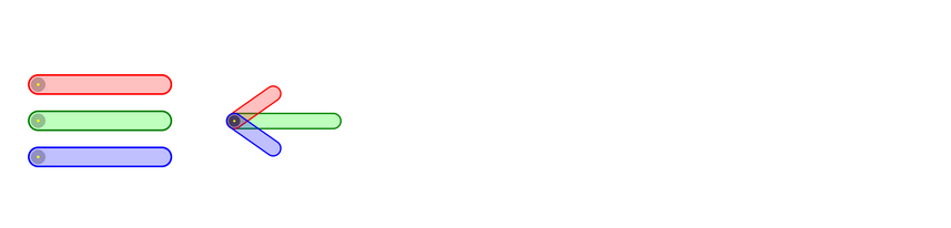
I created a simple pen to show where the transform origin goes and how the pseudo-elements are transformed.:before is red, :after is blue, and .lines is green.
Finally, let’s transform this three-line menu into a left arrow icon. For this demo, when the .lines-button wrapper clicked, we will add a .close class to it. The arrow looks better when it is scaled down a bit so we will do so using scale3d() rather than just scale(), which will trigger hardware acceleration and should make things run a bit smoother.
For the :before and :after lines, we will shorten them a bit and overlay them all on top of each other. Finally, we rotate them 40° in opposite directions to each other. We have made an arrow!
For the second navicon transformation into an arrow pointing upwards, the markup remains the same, we’ll just add a class of .arrow-up to the button.
```
This icon will get the exact same styles and transformations as the previous one, but we'll rotate the icon in it's .close state by 90 degrees so the arrow points upwards.
```scss
.lines-button.arrow-up.close {
transform: scale3d(.8,.8,.8) rotate3d(0,0,1,90deg); // Rotate around the z-axis
}
```
Three-line to —
The markup for this one is, of course, the same as the markup in the previous section. The button in this example gets a .minus class, which defines the styles that will be applied to it.
The SCSS
To style this icon we’ll apply the same styles as above too down until the hover state. But where this icon will differ from the previous one is in the styles applied to it when it’s clicked, i.e in the .close state. This icon will transform into a “—” (like a minus sign), which can resemble a “collapse menu” icon, or “show less”, if you’re using it for a mobile navigation. The pseudo-elements (top and bottom lines) won’t be rotated so we’ll reset the transforms to none, and we’ll keep the width of the icon instead of shrinking it, and then we'll just overlay them on top of the .lines element to form one single line instead of three.
This icon will start out the exact same way the previous ones have. The markup structure is the same as the previous three-lines icons, with the same hover state expanding effect. For this transformation, the icon will get a .x class (resembles a transformation to an x shape).
When the button is clicked, an .close class is added to it just like in the previous examples. But this is where the new transformation will be defined.
The SCSS
In order to transform the three lines into an ✕ shape, we're going to change the icon's background into a transparent one (the middle line will disappear), and the upper and lower lines (the pseudo-elements) will be rotated by 45 degrees in opposite directions and overlayed to create the shape.
```scss
.lines-button.x.close .lines{
/*hide the middle line*/
background: transparent;
/*overlay the lines by setting both their top values to 0*/
&:before, &:after{
transform-origin: 50% 50%;
top:0;
width: $button-size;
}
// rotate the lines to form the x shape
&:before{
transform: rotate3d(0,0,1,45deg);
}
&:after{
transform: rotate3d(0,0,1,-45deg);
}
}
```
This transformation is very similar to the arrow transformation, but the key notes which make it different is keeping the width of the lines here instead of shrinking them like we did for the arrows, and keeping the transform origin at the center.
Three-line to ✕ (#2)
This transformation is inspired by the fifth transformation style from Pedro Campos’s pen on Codepen. We’ll make the markup for this one, of course, the same as the markup for all our buttons, with a specific class, in this case .x2.
The SCSS
This icon will start out with the same transformation as the three-line-to-minus icon, and when the first transformation is finished, the pseudo-elements will rotate and form the ✕ shape. We’ll apply the second transformation when the first one is finished, so for that we’ll need to set a delay for the transitions so that they don’t happen simultaneously.
Where this transformation differs from the previous ✕ effect is the order of transformations and the added delays. For the previous effect we rotated and overlayed simultaneously, while in this case we're going to overlay, and delay the rotation till the overlaying is done, and then we'll rotate.
```scss
.lines-button.x2 .lines{
transition: background .3s .6s ease;
&:before, &:after{
//set transform origin back to center
transform-origin: 50% 50%;
transition: top .3s .6s ease, transform .3s ease;
}
}
```
We have added a delay on the transition for the lines so that the transformations happen in a row.
Next, we’ll define the transition delays and transformations for the pseudo-elements. When the button is clicked, the upper and lower lines will first be translated to overlay on top of each other, the middle line’s background will be set to transparent to hide it, because we don’t want it to be there when the x is formed, and then each of two remaining lines will be rotated by 45deg (and -45deg for the opposite line) to form an ✕ shape.
The trick here that’s different from the previous transformations is just to set the transform origin of the pseudo-elements to be their center, and add the proper transition delays.
Grid to ✖ (#1)
The Markup
Similar to the previous markup, we have a .grid-button wrapping a .grid icon.
```
The SCSS
For this icon, instead of using psuedo elements we will instead leverage the power of the mighty box-shadow property. To make the code cleaner and easier to modify, we will create a $base and a $space variables. First we will style the .grid-button, wrapper.
```scss
//variables are used to make the buttons more flexible and easier to customize
//these variables are replaced with their values in the compiled CSS
$base : 1rem;
$space : $base/4;
$color : #c0392b;
.grid-button {
padding: $base*2; //2rem
cursor: pointer;
user-select: none;
}
```
Now let’s get to the .grid icon itself and the crazy box-shadow property. Think of each comma-separated shadow as a it’s own sort of pseudo- element. It is very important to keep track of the order of each shadow in the box-shadow property or the animation will not look right.
The box-shadow property is nice that when a color is not specified, the property simply inherits whatever the color property may be. In a situation like ours, it’s very helpful with an element with a ton of shadows that are the same color to simply leave out the colors and set it once with the color property.
```scss
.grid-button .grid{
width: $base;
height: $base;
background: $color;
color: $color; /* Not in use when the colors are specified below */
transition: $transition;
}
```
When we click on the button, we add the .close class to .grid-button.
Because we'll be using two techniques to create an ✖ out of the grid icon, we'll be using two different class names for two two transformations. For the first one we'll use a .rearrange class name, as we'll be rearranging the box shadows.
First we’ll spread the box shadows for the icon to form a grid.
We have removed all the spaces between the individual shadows (removed all the $space variables), and moved the four corner shadows inward and four side shadows outward by rearranging them. Last but not least, we rotate the whole icon by -45° and scale it, all using hardware acceleration to make the animation run smoothly. And with that we've achieved the first effect.
Grid to ✖ (#2)
For the second grid to ✖ transformation, we’ll be doing something very similar to what we did previously, but instead of rearranging the shadows we’re going to “collapse” four of them into the main element and bring the other four closer by removing the spaces and thus forming an ✖. We'll give the button with this effect a class .collapse.
```scss
.grid-button.collapse .grid{
//the order of box shadows here differs a little from the above one order-wise
box-shadow:
-($base+$space) 0,
-($base+$space) ($base+$space),
$base+$space 0,
($base+$space) (-($base+$space)),
0 0 -($base+$space),
-($base+$space) 0 -($base+$space),
0 ($base+$space),
($base+$space) ($base+$space);
}
/*The CSS equivalent to the box-shadow specified here is:
box-shadow:
-1.25rem 0,
-1.25rem 1.25rem,
1.25rem 0,
1.25rem -1.25rem,
0 -1.25rem,
-1.25rem -1.25rem,
0 1.25rem,
1.25rem 1.25rem;
*/
```
And when the button is clicked the .close class is added, and the shadows “collapse”.
Join 8k+ designers, engineers, and frontend enthusiasts on my mailing list who get VIP access to updates and new content from me before it is publicly released.