Art-Directing SVG Images With The viewBox Attribute: How-To, Notes, Tips and Why We Need A viewBox Property in CSS
The SVG viewBox attribute is easily one of SVG's most powerful features. Mastering this attribute can take your SVG skills to the next level, especially considering that a couple of the main SVG spriting techniques rely on this attribute to work. Because the viewBox attribute can be used to crop and extend the SVG canvas, it can be used for art-directing SVGs—by using it to crop the SVG to the area that you want to display at a time. In this article, I want to go over how to do this, mention some tips that can save you some time doing it, and show the importance of having a viewBox property in CSS, in hopes that this article would serve as a practical use case that helps push this old SVGWG proposal forward.
Since I’ve already covered everything you need to know about the viewBox attribute in a previous post, I will assume that you have a basic understanding of how the attribute works and what each of its values stands for. I will be mentioning some of the basics along the way, but I highly recommend you head to my other article and scan it before you move on with this article if you’re not familiar with the attribute.
Quick Overview Of the viewBox Parameters
The viewBox attribute is used to specify the origin and dimensions of the user coordinate system of an SVG image. All the drawing inside of the SVG is done relative to this system. And since the SVG canvas is conceptually infinite in all directions, you can even draw shapes outside the boundaries of this coordinate system; but the position of those shapes relative to the SVG viewport can also be controlled by the position of the user coordinate system.
The viewBox attribute takes four parameters that specify the position of the origin of the system and its dimensions: x y width height. Initially, this system is identical to the initial viewport coordinate system established by the width and height of the SVG image, and its origin is at (0, 0)—the top left corner of the SVG.
By changing the value of the x and y parameters you change the position of the origin. By changing the width and height, you change the dimensions of the system. This eventually allows you to extend and crop the SVG canvas using nothing but the viewBox attribute. Read along for examples.
IMPORTANT NOTE: Throughout this article I won't be changing the default behavior (scale and position) of the viewBox inside the SVG viewport. Therefore, as per the default behavior of the attribute, the viewBox will scale as much as possible while still be entirely contained inside the viewport, and positioned at its center. Using the preserveAspectratio attribute, you can change the scale and position of the viewBox to your liking, but that is not required for the technique in this article to work, and therefore we won't be getting into that in this article.
Cropping the SVG Using viewBox a.k.a SVG Art Direction Using the viewBox Attribute
A while back, a client of mine requested that the SVG header photo of his website change on different screen sizes, so that only one portion of the full composition is visible on small screens, a bigger portion is visible on medium screens, and the full composition be visible on large screens. The first idea that crossed my mind when he requested that was to use the viewBox attribute to crop the SVG and only show the portions of the image he wanted on different screen sizes.
By changing the dimensions of the SVG coordinate system and the position of its origin, we can crop an SVG to only show the parts that we want inside the viewport.
Let’s see how that’s done.
Suppose we have the following SVG image in full composition, that we want to crop on smaller screen sizes. The image is a freebie House vector designed by Freepik and is licensed under Creative Commons Attribution 3.0 Unported License. For the sake of simplicity, we will assume that the image is going to be cropped only once to show one portion on small–medium screens, and the full composition on larger screens, as shown in the image below.
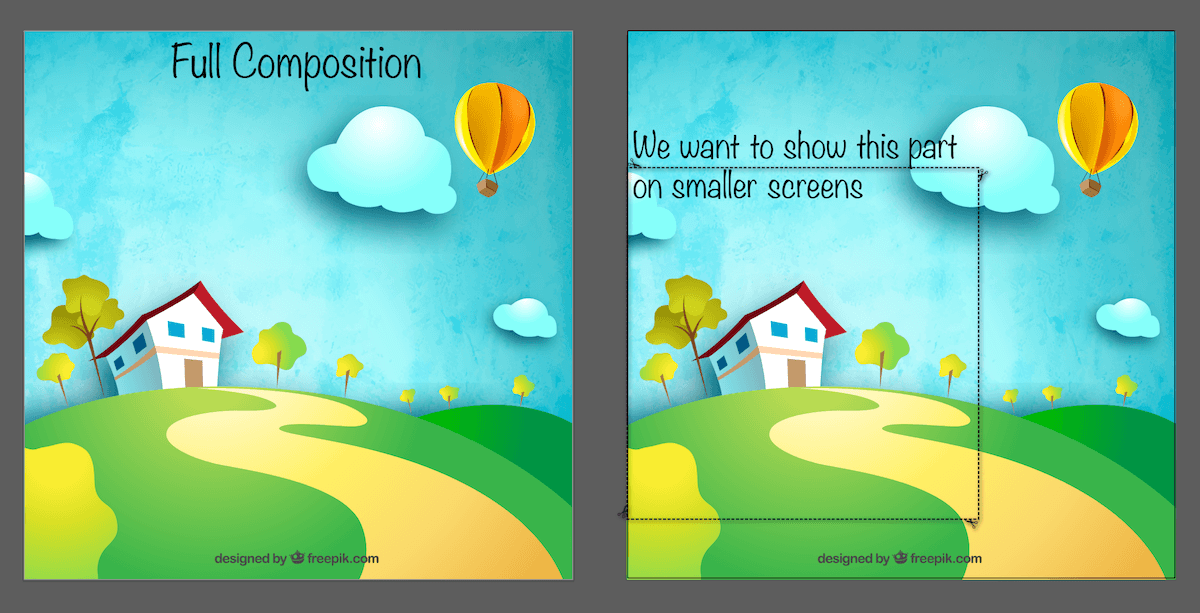
viewBox attribute. The image on the right shows the area of the image that we want to show on smaller screens.Now, there are a few considerations when cropping an SVG by changing the value of the viewBox attribute. We’ll get to these shortly. But first, in order to change the coordinate system so that it matches the dashed rectangular area in the above image, we need to change the value from its initial 0 0 800 800 parameters by translating the system’s origin and changing the width and height.
But how do you know the new position and dimensions without having to go through a lot of trial and error?
There are a couple of ways. Since we’re already in the graphics editor (Ai, in my example), we can use the editor’s panels to retrieve the positions and dimensions of elements.
There is a reason why I drew that dashed rectangle to wrap the area I want to show on smaller screens: we can retrieve the position and dimensions of this rectangle and use them as values for the viewBox. Using Ai’s Transform panel (see image below), we retrieve these values. By selecting the rectangle and then clicking the Transform link at the top right corner, we get the panel shown in the image below, with the x, y, width and height values that we are going to use.
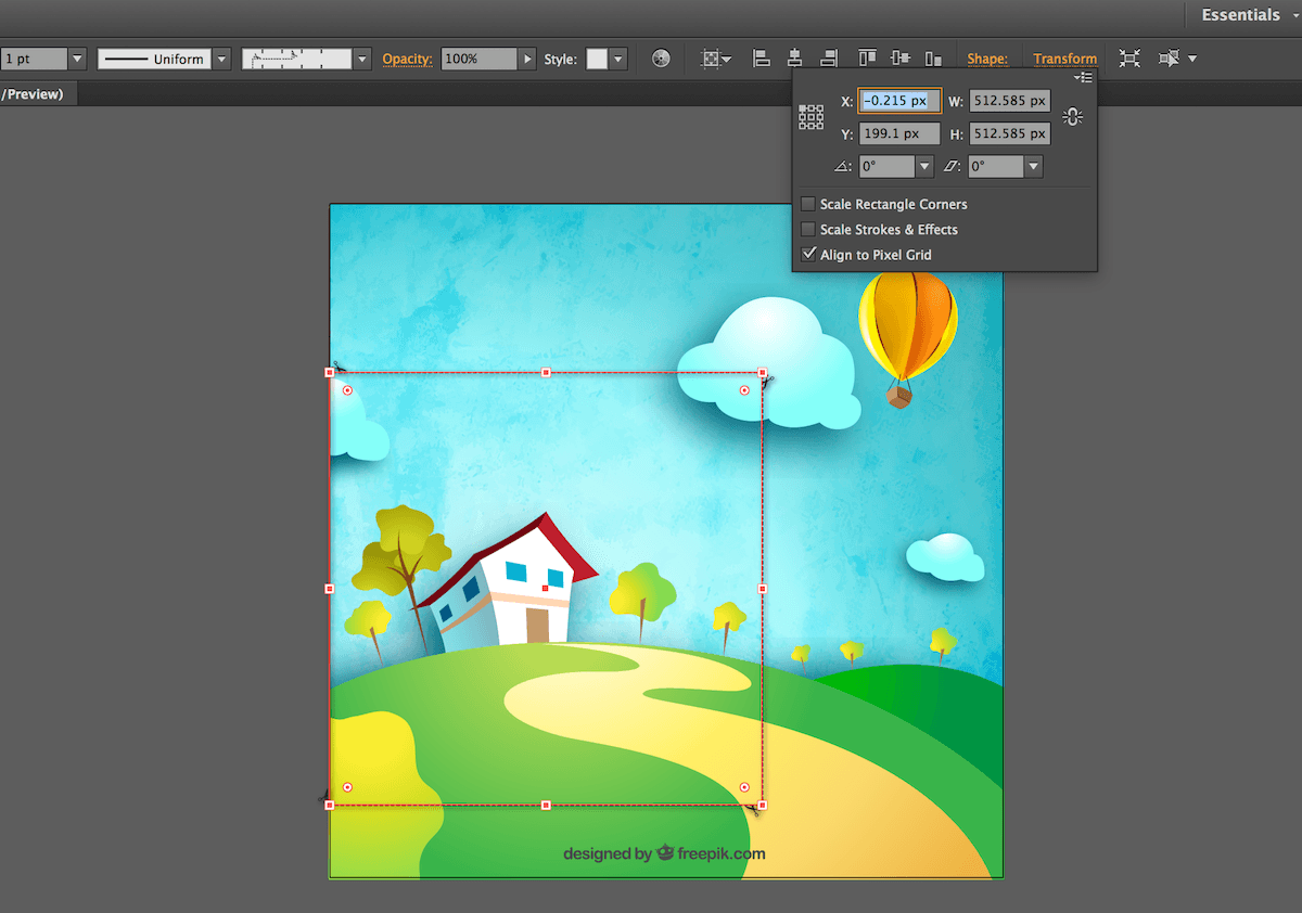
As you have probably noticed, the values are not rounded, so we can do that ourselves. Using the above information, we change the viewBox value to: 0 200 512 512.
Since the aspect ratio of the new viewBox is the same as the aspect ratio of the SVG viewport (both are square), the viewBox is going to scale up and only the selected area will be visible inside of the viewport. The result of changing the viewBox value is:

viewBox attribute is visible inside of the viewport. The blue border represents the SVG viewport.We need to ask a question here at this point:
What if the aspect ratio of the cropped area (thus, the viewBox) is not the same as the aspect ratio of the SVG viewport?
Well, in this case, there will be visible overflow. By visible overflow I don’t mean overflow extending beyond the boundaries of the SVG viewport, but overflow relative to the new user coordinate system defined by the viewBox. The following image illustrates the problem.
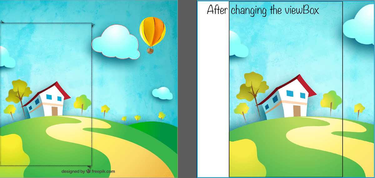
viewBox is different from that of the viewport, and there is content inside the SVG that overflows the user coordinate system, you could end up with something like this.
The black border represents the new user coordinate system, and the blue border is the SVG viewport.
The black border in the above image on the right is the area defined by the viewBox. As per the default behavior of the viewBox inside the viewport, it has been centered and scaled up as much as possible while remaining fully contained inside the viewport (blue border).
Since the SVG canvas is conceptually infinite in all directions, you can draw outside the boundaries of the user coordinate system, and the content would simply overflow the system as shown in the above image.
If you change the aspect ratio of the SVG viewport (the SVG width and height) so they match those of the viewBox's, you won’t see that overflow anymore, since the viewBox will scale to fit the viewport as in the previous example.
But, in some scenarios, you may not be able or simply not want to change the aspect ratio of the Svg. An example is if you are using an SVG sprite to display images of a set of avatars on the page. In most cases, the avatars all have a fixed aspect ratio—you won’t be changing the size of each avatar to match the content of the image inside it. Or maybe you’re embedding an icon system and want/need all icons to have the same dimensions all the time.
To clip off any excess (for example, part of another icon in the sprite that is showing inside the viewport), you can use a <clipPath> to clip that excess out. The clip path would be a <rect> element that covers the entire viewBox area, and is then applied to the root SVG.
There is, however, one thing to keep in mind here: make sure the x and y attributes of the <rect> are identical to those of the viewBox, otherwise the rect will be positioned relative to the old/initial system’s origin and you will end up cropping and clipping an unexpected part of the SVG.
<svg xmlns="http://w3.org/2000/svg" viewBox="vx vy width height" clip-path="url(#clipper)" width=".." height="..">
	<!-- SVG content here -->
	<clipPath id="clipper">
		<rect x="vx" y="vy" width="100%" height="100%"></rect>
	</clipPath>
</svg>
Of course, clipping the excess out will mean that you’re still using different aspect ratios and are thus going to end with that extra white space on either side of the content. If the SVG is a continuous scene as in our previous example, this will be unwanted and you will need to adjust the aspect ratio of the viewport. If the SVG is a bunch of icons that you’re showing one at a time inside different viewports, this might not be an issue.
The important thing here to keep in mind that the aspect ratio of the viewBox is best kept the same as that of the viewport; else, you will have to apply a fix to avoid any excess unwanted space inside the SVG.
So, the viewBox can be used to crop the SVG and only show parts of it when needed. But how would that be done in a practical example?
Art-Directing An SVG For Responsive Web Design
Nothing new to add in this section, except the actual process with code. So, suppose you have the above SVG and you want to use it as a header image, for example, and you only want to show the cropped part on small–medium screen sizes and the full composition on bigger screens.
In order to change the value of the SVG viewport’s width and height, we can use CSS. Simple. But to change the value of the viewBox, we currently need to use JavaScript.
Not all SVG presentation attributes are available as CSS properties; only the set of attributes that have CSS property equivalents can be set in CSS. You can see an overview of the set of attributes available as CSS properties in this table. In SVG2, more attributes (like x, y, cx, cy, r, etc.) will be added to the list; but those are the properties we can work with today.
In order to show different parts of the SVG by changing the viewBox value based on different media queries, you can, for example, use Modernizr, check for media query conditions, and then change the viewBox accordingly, in JavaScript. An example of that might look like so:
// get a reference to the root <svg>
var svgRoot = ...; // depends on how you embed and retrieve your SVG
// define your viewBox value(s) to be used
var vbValue = '0 200 512 512';
// use Modernizr's media query detection to change the viewBox value
if (Modernizr.mq('(max-width: 700px)')) {
   svgRoot.setAttribute('viewBox', vbValue);
}
// else if ... etc.
This works. But wouldn’t it be much more optimal if we could use CSS to do this?
Using a CSS viewBox Property To Art-Direct SVGs
DISCLAIMER: At the time of writing of this article, there is no CSS viewBox property. This is just an example to demonstrate why such a property would be useful and an example of how I imagine it would be used.
Ideally, we would be able to do something like this:
<style>

@media screen and (max-width: 700px) {
    svg {
        viewBox: 0 200 512 512;
    }
}

/* etc. */

</style>
These styles would go inside (or outside) an SVG, and the SVG will then adapt its viewBox according to the viewport size—be it the viewport of the page (in case of inline <svg>), or the viewport established by the dimensions of whichever element is used to reference the SVG (which would lend us something practically identical to element queries).
This is currently not possible because we don’t have a viewBox property in CSS.
A while back, I asked an SVG spec editor about this, and he said that I could propose it to the SVGWG with a practical use case and example. After some discussion on Twitter, I learned that there already is a fairly old SVGWG proposal thread that goes a few years back. The initial proposal is still there today, and my hope is that, with a practical use case like this, this proposal could be pushed forward and the property implementation specced at some point in the near future.
If you would like to see the viewBox property in CSS, please help make this happen by pushing this thread forward and commenting on it.
Things To Keep In Mind When Approaching SVG Art-Direction with viewBox
While working on my client project, it took me literally less than a minute to art-direct the header image the way he wanted. However, we ended up going for three separate SVGs instead of using the same SVG with different viewBoxes on different screen sizes.
The reason we chose to go with three SVGs is that the size of the full composition was too big to serve on mobile—reaching a whopping 100kb+ in size. The initial SVG was around 200kb, and I was able to slash the file size down to half by optimizing the SVG, but the resulting size was still too big to serve on mobile, so we ended up using three different images. This is something to keep in mind when art-directing SVGs: performance matters. A lot. So, if your SVG is too big, don’t art-direct it using viewBox.
Now, if you choose to serve three different SVG images, you can do so in one of many possible ways—depending on the way you embed your SVG, and this also depends on what you want or don’t want to do with it.
The ideal way to serve different SVG images would be to use the <picture> element. Not only does it allow us to provide different SVGs for the browser to choose from without needing JavaScript, but it also enables us to provide multiple optimized fallback images for non-supporting browsers (think IE8 and below) as well. <picture> is great when used with SVG, and you can read all about providing SVG fallback using <picture> in this article.
All this being said, <picture> will not be your best choice if you want to animate or interact with your SVG. Just like an SVG embedded using <img>, the SVG cannot be styled and animated unless the styles and animations are defined inside the <svg> file, the SVG cannot be scripted (for security reasons), and any interactions (CSS or JS) — like hover, for example — will not work.
So, as I always say: SVG provides us with a lot of options to do almost everything; you need to weigh things, prioritize, sometimes maybe even make compromizes, and pick your best route based on that. But never compromise performance in favor of development convenience.
Before we finish up, and since we’re on the subject of changing the SVG canvas’ size using the viewBox attribute, let’s take a look at another example where we can leverage the power of this attribute to save us some time and effort when working with SVG.
Extending the SVG Canvas using viewBox
Just like the viewBox attribute can be used to crop an SVG, it can be used to extend the SVG canvas as well.
A few weeks ago I created a tool that allows you to generate circular menus in SVG. I created a few examples to show how a generated menu could be animated using JavaScript. The demos are embedded on the app page using the <object> element. The boundaries of the <object> define the boundaries of the SVG viewport, and anything that lies outside these boundaries is considered overflow and will be hidden by default.
Note that the phrase "outside these boundaries" refers to content inside the SVG that is still drawn on the infinite SVG canvas, but that extends beyond the finite rectangle defined by the viewport.
The menus are created such that the size of the SVG is just big enough to contain the menu, not more, to avoid any excess and unwanted white space around the menu.
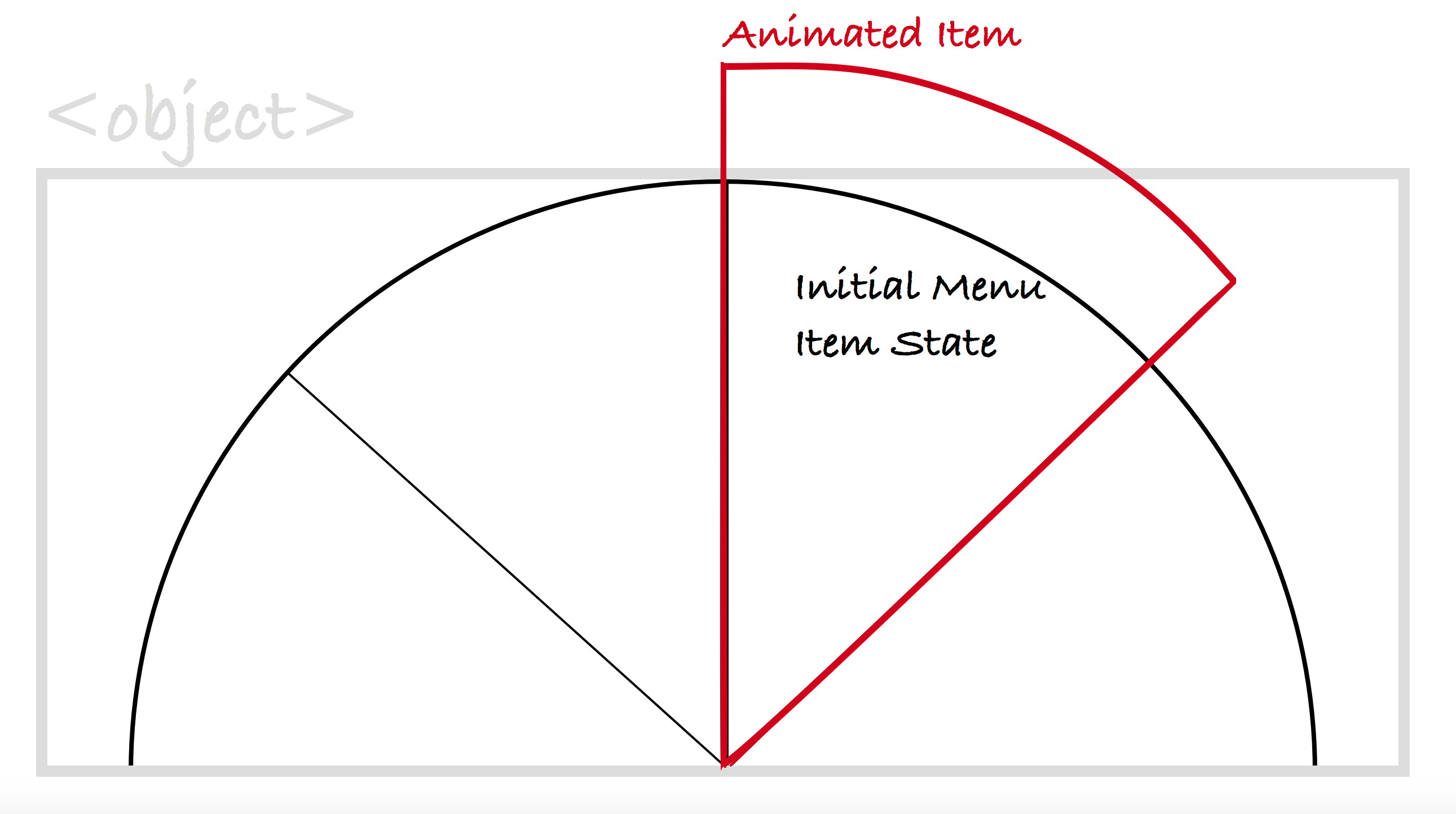
I applied a staggering, bouncing animation to one of the menus as an example of how the menu can be animated. The bouncing effect “stretched” the menu items, and this led to the items being cut off while they animated.

The staggering bouncing animation is applied to the items such that it will scale an item from zero (items are initially not visible, scaled down) to 100% using a bouncing timing function, the effect of which will be scaling the item beyond 100% right before it is scaled back to 100%. This effect causes the item to scale up beyond the boundaries of the SVG and hence get cut off.
The following image shows the result of scaling the menu item up beyond the boundaries of the <object> used to embed it (grey border).
Setting overflow: visible on the <object> does not fix this, because <object> is practically similar to an <iframe> in behavior. What we need to do is extend the SVG canvas inside the viewport created by the <object> so that the scaled items have enough space to “bounce” without exceeding its boundaries. We can do this using the viewBox attribute.
To extend the SVG canvas, you simply increase its dimensions. So, instead of 500px by 250px—the original dimensions of the SVG menu, we use 700px by 350px; this will increase the height of the canvas visible inside of the viewport by 100px, and its width inside of the viewport by 200px. I chose these values based on how much the menu item is being scaled up in the bounce effect. Depending on your SVG and what you’re working on, these values might be different.
Now, to make sure the menu remains centered inside of the viewport, we’re going to shift the position of the coordinate system by 100 pixels in the negative direction (upwards and to the left). Applying this shift to the origin of the coordinate system is practically the same as applying a translation transformation to the menu inside of the system. The result will be that the menu remains centered inside of the viewport.
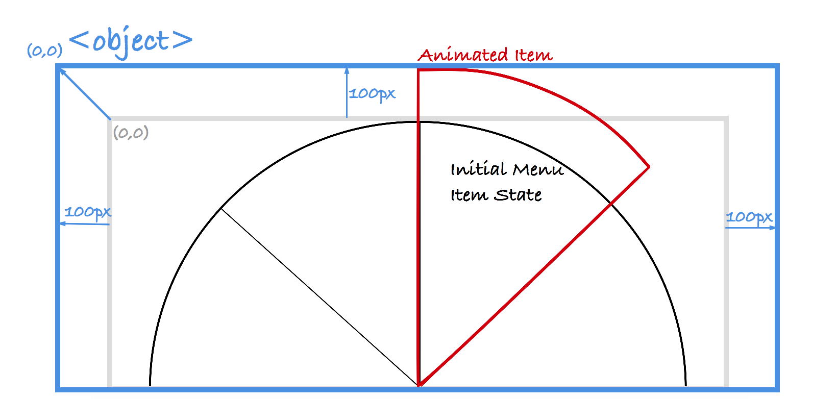
By extending the dimensions of the user coordinate system, you are increasing the area of the canvas visible inside of the viewport. The result of doing this will also be that the contents of the canvas will look slightly smaller—depending on how much you increase the canvas. In the case of the menu, the result was perfectly acceptable.
The following screen recording shows the result of extending the SVG canvas and how the animation now looks inside the buondaries of the SVG.

Changing four values inside the viewBox attribute to extend the SVG canvas was all that was needed to troubleshoot and solve the issue of the items being cut off. Now that’s pretty powerful, isn’t it?
Wrapping Up
The viewBox attribute is awesome. It is literally SVG on steroids. By using this attribute, you can save a lot of time when working with SVG, troubleshoot SVG quickly without having to resort to a graphics editor, and, all in all, feel more comfortable editing SVG by hand.
I highly recommend you learn all about this attribute if you haven’t already, play with its values, and then leverage its power in your work. And if you do decide to use it to art-direct SVGs, don’t forget to keep performance in mind.
One of the main objectives of this article was to also shed some light on the importance of having a viewBox property in CSS, so if you’re convinced that this property is needed, please take the time to vote on / respond to the SVGWG thread and support the request.
Thank you very much for reading! :)