Understanding SVG Coordinate Systems and Transformations (Part 2) — The transform Attribute
SVG elements can be transformed by scaling, translating, skewing, and rotating—much like HTML elements can be transformed using CSS Transforms. However, there are certain inevitable differences when it comes to the coordinate systems used and affected by these transformations. In this article we'll go over the SVG transform attribute and CSS property, covering how to use it, and things you should know about SVG coordinate system transformations.
This is the second article in a series I’m writing about SVG coordinate systems and transformations. In the first article, I covered everything you need to know to understand the basics of SVG coordinate systems; more specifically, the SVG viewport, and the viewBox and preserveAspectRatio attributes.
- Understanding SVG Coordinate Systems & Transformations (Part 1) – The viewport,
viewBox, andpreserveAspectRatio - Understanding SVG Coordinate Systems & Transformations (Part 2) – The
transformAttribute - Understanding SVG Coordinate Systems & Transformations (Part 3) – Establishing New Viewports
In this part I’m going to assume you read the first one, so, if you haven’t, make sure you do before you continue reading this article.
The transform Attribute Values
The transform attribute is used to specify one or more transformations on an element. It takes a <transform-list> as a value which is defined as a list of transform definitions, which are applied in the order provided. The individual transform definitions are separated by whitespace and/or a comma. An example of applying a transformation to an element may look like the following:
The possible SVG transformations are: rotation, scaling, translation, and skewing. The transformation functions used in the transform attribute work similar to the way CSS transform functions work in the transform property, except that they take different arguments.
Note that the function syntax defined below only works in the transform attribute. See the section about transforming SVGs with CSS properties for information on the syntax used in the CSS transform properties.
Matrix
You can apply one or more transformations to an SVG element using the matrix() function. The syntax for the matrix transformation is:
matrix(<a> <b> <c> <d> <e> <f>)The above declaration specifies a transformation in the form of a transformation matrix of six values. matrix(a,b,c,d,e,f) is equivalent to applying the transformation matrix [a b c d e f].
For those of you who are not math-savvy, you’re probably not going to be using this function. Those of you who are, you can read more about the math behind it here. Since this function is rarely used—if ever—I’m just going to skip to the other transformation functions.
Translation
To translate an SVG element, you can use the translate() function. The syntax for the translation function is:
translate(<tx> [<ty>])The translate() function takes one or two values which specify the horizontal and vertical translation values, respectively. tx represents the translation value along the x-axis; ty represents the translation value along the y-axis.
The ty value is optional; and, if omitted, it defaults to zero. The tx and ty values can be either space-separated or comma-separated, and they don’t take any units inside the function—they default to the current user coordinate system units.
The following example translates an element by 100 user units to the right, and 300 user units to the bottom:
<circle cx="0" cy="0" r="100" transform="translate(100 300)" />The above example is still valid if the transformation was applied using translate(100, 300) where the values are comma-separated.
Scaling
You can resize an SVG element by scaling it up or down using the scale() function transformation. The syntax for the scale transformation is:
scale(<sx> [<sy>])The scale() function takes one or two values which specify the horizontal and vertical scaling values, respectively. sx represents the scaling value along the x-axis, used to stretch or shrink the element horizontally; sy represents the scaling value along the y-axis, used to stretch or shrink the element vertically.
The sy value is optional; and, if omitted, it is assumed to be equal to sx. The sx and sy values can be either space-separated or comma-separated, and they are unitless numbers.
The following example doubles the size of an element by scaling it to twice its original size:
<rect width="150" height="100" transform="scale(2)" x="0" y="0" />The following stretches an element horizontally to 2 its original width, and shrinks it vertically to half its original height:
<rect width="150" height="100" transform="scale(2 0.5)" x="0" y="0" />The above example is still valid if the transformation was applied using scale(2, .5) where the values are comma-separated.
It is important to note here that when an SVG element is scaled, its entire current coordinate system is scaled, resulting in the element also being repositioned inside the viewport. Don’t worry about this now, we’ll get into it in more detail in the next section.
Skew
An SVG element can also be skewed. To skew it, you can use one or both of the two skew transformation functions: skewX and skewY.
skewX(<skew-angle>)
skewY(<skew-angle>)
The skewX function specifies a skew transformation along the x-axis; and the skewY function specifies a skew transformation along the y-axis.
The skew angle specified is a unitless angle that defaults to degrees.
Note that skewing an element may result in the element being repositioned inside the viewport. More about this in the next section.
Rotation
You can rotate an SVG element using the rotate() function. The syntax for the function is:
rotate(<rotate-angle> [<cx> <cy>])The rotate() function specifies a rotation by rotate-angle degrees about a given point. Unlike rotation transformations in CSS, you cannot specify an angle unit other than degrees. The angle value is specified unitless, and is considered a degrees value by default.
The optional cx and cy values represent the unitless coordinates of the point used as a center of rotation. If cx and cy are not provided, the rotation is about the origin of the current user coordinate system. (See Part 1 if you’re not sure what a user coordinate system is.)
Specifying a center of rotation inside the rotate() function is like a shorthand way for setting transform: rotate() and transform-origin in CSS. Since the default center of rotation in SVG is the upper left corner of the current user coordinate system in use, and since that may not allow you to create the rotation effect you want, you will probably end up specifying a new center inside rotate(). If you know your element’s dimensions and position in the SVG canvas, you can easily specify its center as the center of rotation.
The following example rotates a group of elements around a specified center of rotation positioned at (50, 50) in the current user coordinate system:
<g id="parrot" transform="rotate(45 50 50)" x="0" y="0">
	<!-- elements making up a parrot shape -->
</g>
However, if you want an element to rotate around its center, you’d probably rather specify the center as 50% 50% like you would do in CSS; but unfortunately doing that inside the rotate() function is not possible—you need to use absolute coordinates. However, you can do this using the CSS transform-origin property in conjunction with the CSS transform property. More about this later in the article.
Coordinate System Transformations
Now that we’ve covered all possible SVG transformation functions, we’ll dig into the visual part and the effect of applying each transformation to an SVG element. This is the most important aspect of SVG transformations. And they are called “coordinate system transformations” not just “element transformations” for a reason.
In the specification, the transform attribute is defined as being one of the two attributes that establish a new user space (current coordinate system) on the element it is applied to — the viewBox attribute is the second of the two attributes that create a new user space. So what exactly does this mean?
The transform attribute establishes a new user space (current coordinate system) on the element it is applied to.
This behavior is similar to the behavior of CSS transformations applied to an HTML element—the HTML element’s coordinate system is transformed, and this is usually most obvious when you’re chaining tranformations (we’ll get to this later). Despite being similar in many aspects, HTML and SVG transformations have some differences.
The main difference is the coordinate system. The coordinate system of an HTML element is established on the element itself. Meanwhile, in SVG, the coordinate system of an element is, initially, the current coordinate system or user space in use.
When you apply the transform attribute to an SVG element, that element gets a “copy” of the current user coordinate system in use. You can think of it as just creating a new “layer” for the transformed element, where the new layer has its own copy of the current user coordinate system (the viewBox).
Then, the element’s new current coordinate system is transformed by the transformation functions specified inside the transform attribute, thus resulting in the transformation of the element itself. It is as if the elements are drawn onto the canvas in the transformed coordinate system.
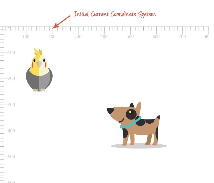
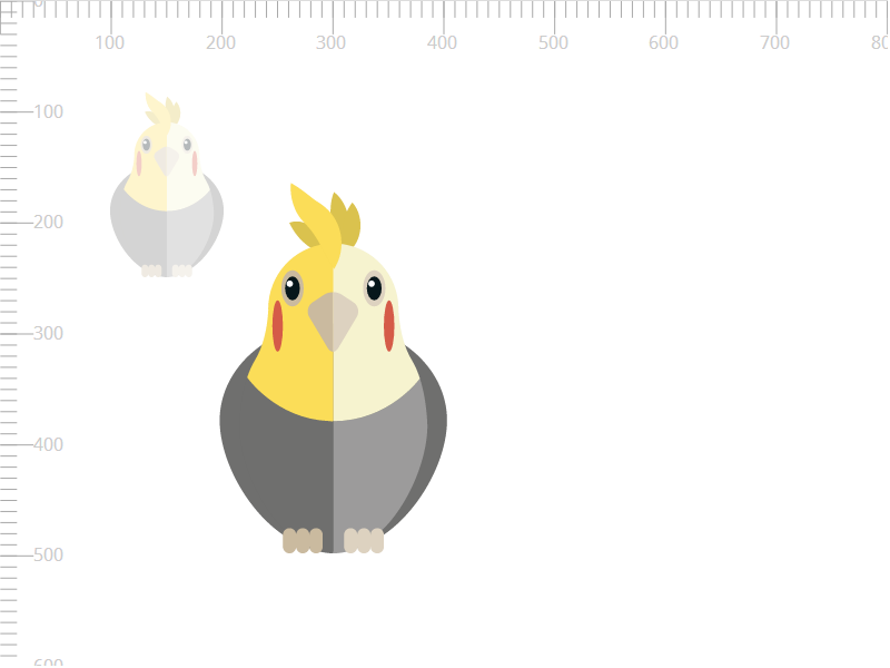
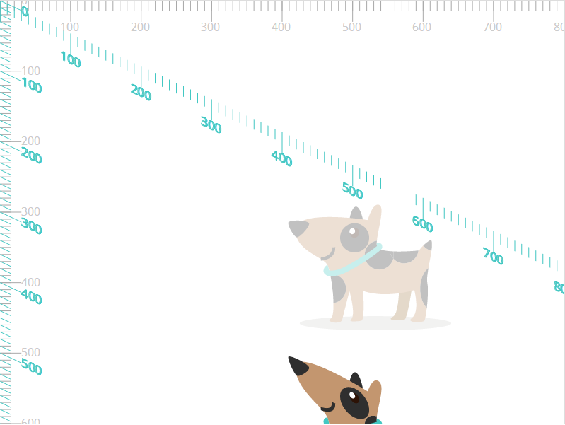
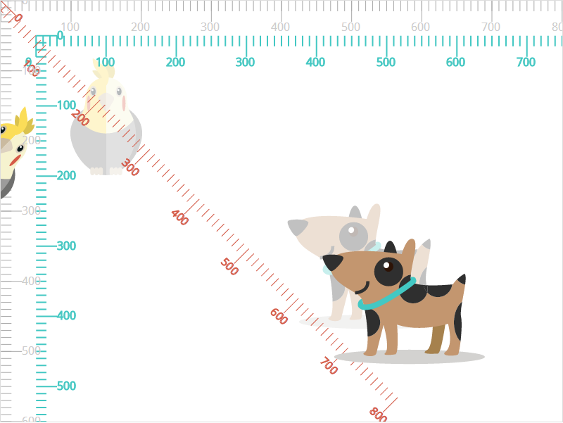
To understand how SVG transformations are applied, let’s start with the visual part. The following image shows the SVG canvas we’re going to be working with.
The parrot and the dog are the elements (groups <g>) that we’re going to be transforming.
<svg width="800" height="800" viewBox="0 0 800 600">
	<g id="parrot">
		<!-- shapes and paths forming the parrot -->
	</g>
	<g id="dog">
		<!-- shapes and paths forming the dog -->
	</g>
</svg>
The grey coordinate system is the initial coordinate system of the canvas established by the viewBox. For simplicity’s sake, I’m going to not change the initial coordinate system—I’m using a viewBox that is the same size as the viewport, as you see in the above code.
When you apply the transform attribute to an SVG element, that element gets a "copy" of the current user coordinate system in use.
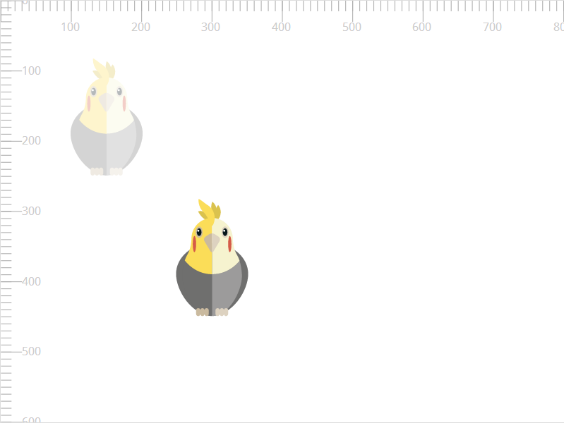
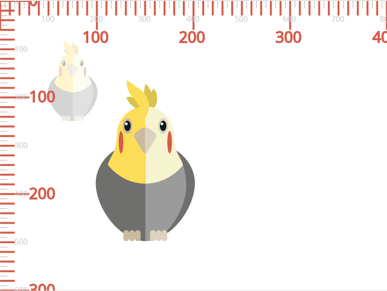
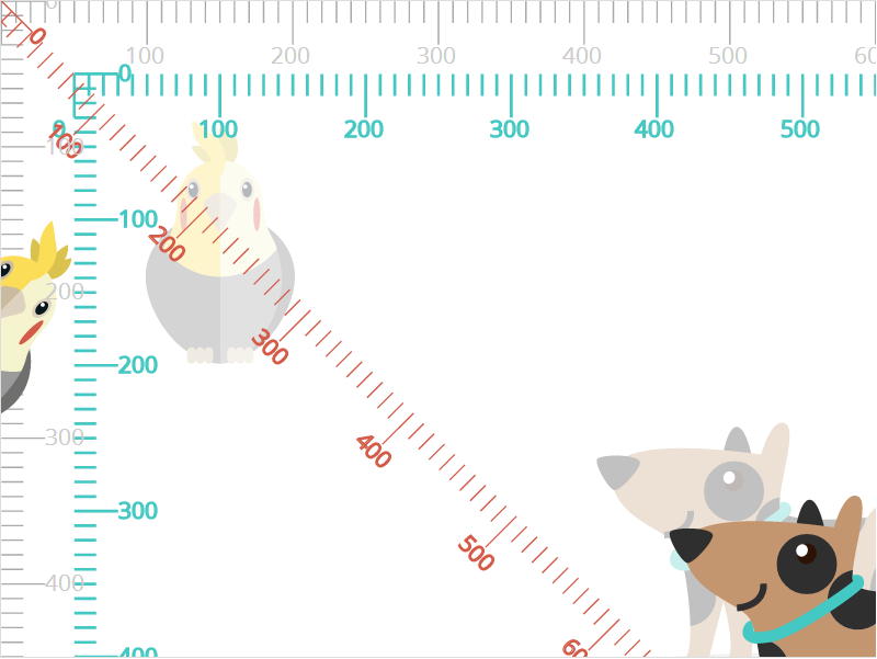
Now that we’ve established our canvas and an initial user space, we’re going to start transforming elements. Let’s start by translating the parrot by 150 units to the right and 200 units downwards.
The parrot is, of course, made of several paths and shapes. It’s enough to apply the transform attribute to the group wrapping these shapes <g>; this will in turn apply the transformation to the entire set of shapes and paths, and the parrot will be translated as one whole item. See the article on structuring and grouping SVGs for more information.
<svg width="800" height="800" viewBox="0 0 800 600">
	<g id="parrot" transform="translate(150 200)">
		<!-- shapes and paths forming the parrot -->
	</g>
	<!-- ... -->
</svg>
The following image shows the result of translating the parrot by the above translation. The translucent version of the parrot shows the initial position before the transformation was applied.
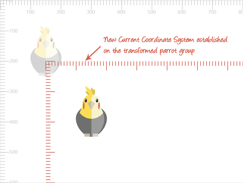
The translation transformation in SVG is as simple and straightforward as it is in CSS when applied on an HTML element. We mentioned earlier that applying the transform attribute to an element establishes a new current user coordinate system on it. The following image shows the “copy” of the initial coordinate system, that is established on the parrot element when it was transformed. Notice how the parrot’s current coordinate system is translated.
It’s important to notice here that the new current coordinate system established on the element is a replicate of the initial user space, with the position of the element preserved inside it. This means that it is not established on the element’s bounding box, nor is the size of the new current coordinate system restricted to the size of the element. This is where the difference between HTML and SVG coordinate system shines.
The new current coordinate system established on a transformed element is not established on the element's bounding box, nor is its size restricted to the size of the element.
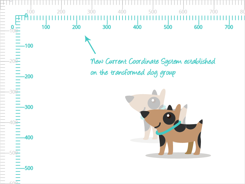
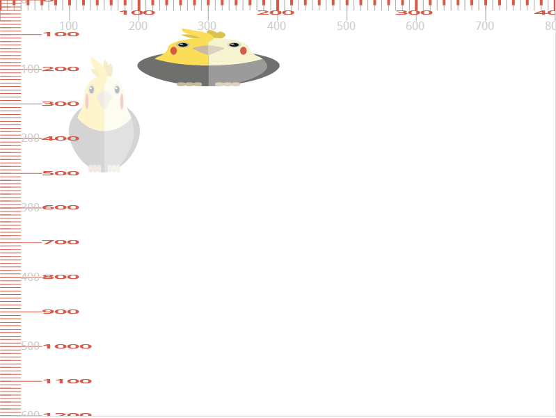
This is more evident if we are to transform the dog at the bottom right of the canvas. Suppose we want to translate the dog by 50 units to the right and then 50 units downwards. This is how the dog, its initial position, and the new current coordinate system (that is also translated with the dog) will look. Notice how the origin of the dog’s new current coordinate system is not positioned at the top left cornder of the dog’s bounding box. Also notice how the dog and its new coordinate system seem as if they were moved to a new “layer” on top of the canvas.
Now let’s try something else. Instead of translating the parrot, let’s try scaling it. We’re going to scale the parrot to double its size:
<svg width="800" height="800" viewBox="0 0 800 600">
	<g id="parrot" transform="scale(2)">
		<!-- shapes and paths forming the parrot -->
	</g>
	<!-- ... -->
</svg>
The result of scaling an SVG element differs from that of scaling an HTML element. The scaled SVG’s element’s position changes inside the viewport when it is scaled. The following image shows the result of doubling the size of the parrot. Notice the initial position and size, and the final size and position.
What we can notice from the above image is that not only the size (width and height) of the parrot were doubled, but the coordinates (x and y) were also multiplied by the scaling factor (which is two, here).
The reason we ended up with this result is something we’ve mentioned earlier: the element’s current coordinate system is transformed, and then the parrot is drawn into the new system. So, in this example, the current coordinate system was scaled. This effect is similar to the effect of using viewBox = "0 0 400 300", which “zooms in” to the coordinate system, thus doubling the size of the content inside it (see part 1 of the series if you haven’t already).
So, if we were to visualize the coordinate system transformation showing the current transformed system of the parrot, we’d get the following result:
The new current coordinate system of the parrot is scaled up, “zooming in” to the parrot at the same time. Notice that, inside its current coordinate system, the parrot is not repositioned—it is only the effect of scaling the coordinate system that repositions it inside the viewport. The parrot is simply drawn at its original x and y coordinates inside the new scaled up system.
Let’s trying scaling the parrot in both directions using different scaling factors. If we scale the parrot by applying transform="scale(2 0.5), we’re doubling its width while making it half its original height. The effect will be similar to applying viewBox="0 0 400 1200".
Notice the position of the parrot inside the scaled coordinate system, and compare it to the position in the initial system (translucent parrot): the x and y position coordinates are preserved.
Skewing an element in SVG also results in the element being “moved” as a result of its current coordinate system being skewed.
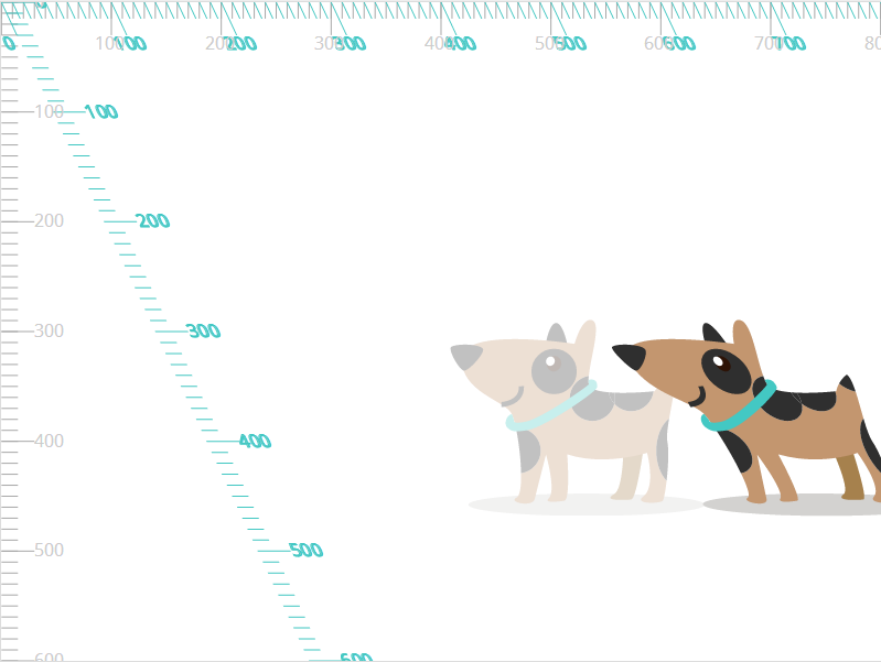
Suppose we apply a skew transformation to the dog along the x-axis using the skewX function. We’re going to skew the dog by 25 degrees horizontally.
<svg width="800" height="800" viewBox="0 0 800 600">
	<!-- ... -->
	<g id="dog" transform="skewX(25)">
		<!-- shapes and paths forming the dog -->
	</g>
</svg>
The following image shows the result of applying the skewing transformation to the dog. Its coordinate system is skewed, and so is the dog itself.
Note that the position of the dog with respect to its original position also changes, as a result of skewing its coordinate system.
The following image shows the result of skewing the dog by the same angle using skewY() instead of skewX:
And last but not least, let’s try rotating the parrot. The default center of rotation is the upper left corner of the current user coordinate system. The new current system established on the rotated element will also be rotated. In the following example, we’re going to rotate the parrot by 45 degrees. The positive direction of rotation is clockwise.
<svg width="800" height="800" viewBox="0 0 800 600">
	<g id="parrot" transform="rotate(45)">
		<!-- shapes and paths forming the parrot -->
	</g>
	<!-- ... -->
</svg>
The result of applying the above transformation looks like this:
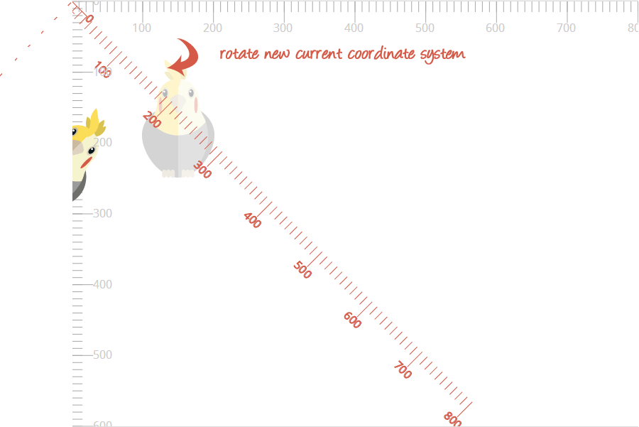
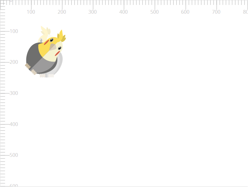
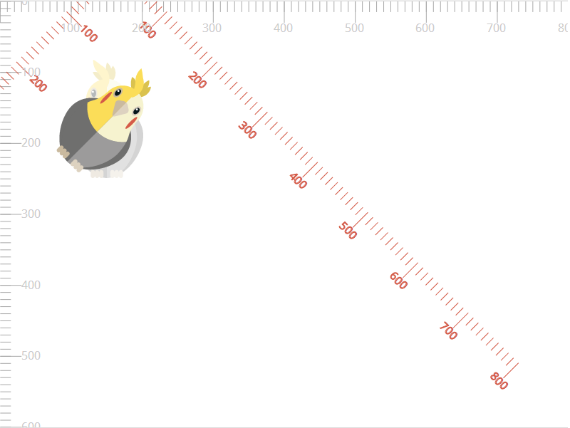
You are probably going to want to rotate an element around a point other than the default origin of the coordinate system. Using the rotate() function in the transform attribute, you can specify that point explicitly. Suppose we want to rotate the parrot in this example around its own center. According to the width, height, and position of the parrot, I can determine its center to be at approximately (150, 170). The parrot can then be rotated around this point:
<svg width="800" height="800" viewBox="0 0 800 600">
	<g id="parrot" transform="rotate(45 150 170)">
		<!-- shapes and paths forming the parrot -->
	</g>
	<!-- ... -->
</svg>
At this point, the parrot is rotated and will look like so:
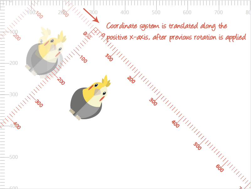
We said that the transformations are applied to the coordinate system, and because of that, the element is eventually affected and transformed. So how exactly does changing the center of rotation work on the coordinate system whose origin is at the point (0, 0)?
When you change the center or rotation, the coordinate system is translated, rotated by the specified angle, and then translated again by specific values depending on the center of rotation you specify. In this example, this:
<g id="parrot" transform="rotate(45 150 170)"> is performed by the browser as a series of translation and rotation operations equivalent to:
<g id="parrot" transform="translate(150 170) rotate(45) translate(-150 -170)"> The current coordinate system is translated to the point you want to be the center. It is then rotated by the angle you specify. And then finally the system is translated by the negation of the values. The above transformation applied on the system looks like this:
Before we move on to the next section where we’re going to nest and chain transformations, I want to note that the current user coordinate system established on a transformed element is independent from other coordinate systems established on other transformed elements. The following image shows the two coordinate systems established on the dog and the parrot, and how they are independent from each other.
Also note that each current coordinate system still lies inside the main coordinate system of the canvas established using the viewBox attribute on the containing <svg>. Any transformations applied to the viewBox will affect the entire canvas and all elements inside it as well, whether they have their own established coordinate systems or not.
For example, the following is the result of changing the user space of the entire canvas from viewBox="0 0 800 600" to viewBox="0 0 600 450". The entire canvas is scaled up, preserving any transformations applied to the individual elements.
Nested and Chained Transformations
A lot of times you may want to apply several transformations to an element. Applying multiple transformations in a row is what is referred to as “chaining” transformations.
When transformations are chained, the most important thing to be aware of is that, just like with HTML element transformations, each transformation is applied to the coordinate system after that system is transformed by the previous transformations.
For example, if you’re going to apply a rotation to an element, followed by a translation, the translation happens according to the new coordinate system, not the inital non-rotated one.
The following example does just that. We’re applying the previous rotation, and then translating the parrot using by 200 units along the positive x-axistransform="rotate(45 150 170) translate(200)".
Depending on the final position and transformation you’re after, you need to chain your transformations accordingly. Always keep the coordinate system in mind.
Note that when you skew an element—and its coordinate system with it—the coordinate system will no longer be an orthogonal one, and the coordinates will no longer be calculated as orthogonal ones—they will be skew coordinates. Simply put, this just means that the coordinate system’s origin is no longer a 90 degrees angle, and hence the new coordinates will be computed based on this new angle.
Nested transformations occur when a child of a transformed element is also transformed. The transformation applied to the child element will be an accumulation of the transformations applied on its ancestors and the transformation applied on it.
[For nested transformations,] the transformation applied to the child element will be an accumulation of the transformations applied on its ancestors and the transformation applied on it.
So, in effect, nesting transforms is similar to chaining them; only difference is that instead of applying a series of transformations on one element, it automatically gets the transformations applied on its acestors, and then finally its own transformations are applied to it, just like we applied transformations in the chain above—one after the other.
This is particularly useful for when you want to transform one element relative to another. For example, suppose you want to animate the tail of the dog. The tail is a descendant of the #dog group.
<svg width="800" height="800" viewBox="0 0 800 600">
	<!-- ... -->
	<g id="dog" transform="translate(..)">
		<!-- shapes and paths forming the dog -->
		<g id="head">
			<!-- .. -->
		</g>
		<g id="body" transform="rotate(.. .. ..)">
			<path id="tail" d="..." transform="rotate(..)">
				<!-- animateTransform here -->
			</path>
			<g id="legs">
				<!-- ... -->
			</g>
		</g>
	</g>
</svg>
Suppose we translate the dog group; then rotate its body by some angle around some point, and then we want to animate the tail by rotating it and animating that rotation.
When the tail is to be rotated, it “inherits” the transformed coordinate system of its ancestor (#body), which in turn inherits the transformed coordinate system of its transformed ancestor (#dog) as well. So, in effect, when the taill is rotated, it is as though it has been translated (by the same translation of the #dog group), then rotated (by the same rotation of the #body group), and then rotated by its own rotation. And the effect of applying a series of transformations here is the same as we explained in the chaining example above.
So, you see, nesting transformations has practically the same effect as chaining them on the #tail.
Transforming SVGs using CSS Properties
In SVG 2, the transform attribute is referred to as the transform property; this is because SVG transformations have been “exported” into the CSS3 Transforms specification. The latter combines the SVG Transforms, CSS 2D Transforms, and CSS 3D Transforms specifications, and introduces features like transform-origin and 3D transformations into SVG.
The CSS transform properties specified in the CSS Transforms specifications can be applied to SVG elements. However, the values for the transform property functions need to follow the syntax specified in the CSS spec: function arguments must be separated with commas — space-separation alone isn’t valid, but you can include one or more white space before and/or after the comma; and the rotate() function does not take <cx> <cy> values anymore — the center of rotation is specified using the transform-origin property. Also, the CSS transformatio functions do accept units for angles and coordinates, such as rad (radians) for angles (among others) and px, em, etc. for coordinate values.
An example of rotating an SVG element using CSS may look like the following:
#parrot {
	transform-origin: 50% 50%; /* center of rotation is set to the center of the element */
	transform: rotate(45deg);
}
And SVG element can also be transformed in three-dimensional space using CSS 3D Transforms. Note that the coordinate systems are still, however, different from the coordinate systems established on HTML elements. This means that 3D rotations will also look different unless you change the center of rotation.
#SVGel {
	transform: perspective(800px) rotate3d(1, 1, 0, 45deg);
}
Because transforming SVG elements with CSS is pretty much the same as transforming HTML elements with CSS—syntax-wise—I’m going to skip elaborating on this topic in this article.
That said, at the time of writing of this article, implementations are still incomplete in some browsers and for some features. Because of how fast browser support changes, I recommend you experiment with the properties to determine what currently works and what doesn’t, and decide on what you can start using today and what not.
Note that once CSS Transforms are fully implemented for SVG elements, it is recommended that you use the CSS transforms function syntax even when you apply the transformation in the form of a transform attribute. That said, the above mentioned syntax of the transform attribute functions will still be valid.
Animating transform
SVG transformations can be animated, just like CSS transforms can be. If you’re using the CSS transform property to transform the SVG, you can animate the transformation using CSS animations and transitions just like you would animate CSS transforms on HTML elements.
The SVG transform attribute can be animated using the SVG <animateTransform> element. The <animateTransform> element is one of three elements in SVG that are used to animate different SVG attributes.
Details of the <animateTransform> element are outside the scope of this article. Stay tuned for an article I’ll be writing about the different SVG animation elements, including <animateTransform>.
Final Words
Working with SVGs can be really frustrating at first, if the concepts behind the coordinate system transformations aren’t very clear, especially if you’re coming from a CSS HTML transformations background, and naturally expect SVG elements to respond the same way to transformations as HTML elements do.
However, once you get a grip of how they work, you gain a better control over your SVG canvas, and can manipulate elements more easily.
In the last part of this series, I’m going to go over nesting SVGs and establishing new viewports and viewboxes. Stay tuned!
The SVG parrot & dog illustrations used are freebies from Freepik.com.
I hope you liked this article and found it useful. Thank you for reading!