Building a Circular Navigation with SVG
Published on | Takes approximately 9 min to read
Last week, I released CIRCULUS.SVG—the SVG circular menu generator. In this article I want to go over why SVG is better suited for creating this kind of UI element, and give you and overview of the SVG code for creating the menu items using SVG elements and transformations.
Note that, unlike my usual tutorials, we will not be going over a detailed how-to, but only an overview of the concepts behind this. Creating the menu in detail would require lots of maths and digging into the SVG path data syntax which deserves an article of its own; so, for the sake of brevity, I will not be digging into either of these, but will go quickly over the concepts.
Now, to draw the sectors, you can, of course, literally draw them in a graphics editor like Illustrator, Inkscape or Sketch, and then export your graphic as SVG, make it interactive, and embed it. However, since the title says “building”, we’re going to go over how to draw these items with code.
If you’re only interested in the end result—a usable circular menu, you can head to the generator and create your own menu there. Otherwise, let’s start with why SVG is better than CSS for creating circular menus.
SVG vs. CSS
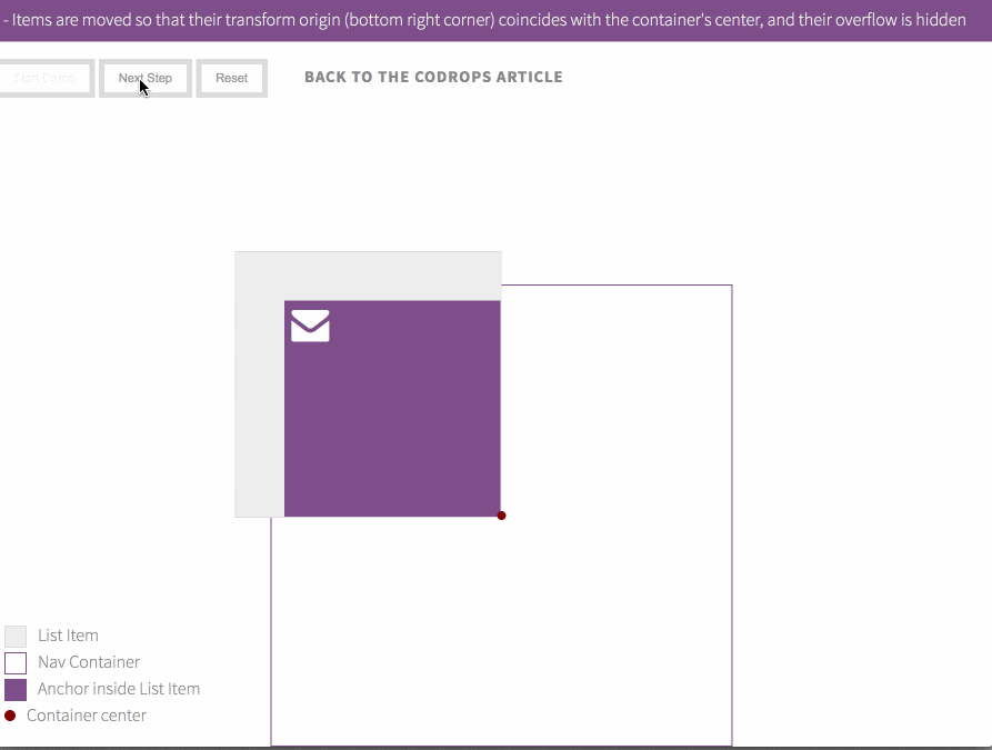
Over a year ago, I wrote an article over at Codrops about using CSS Transforms to create a circular navigation. Even though the technique works, it comes with a couple of browser bugs & inconsistencies, not to mention that it’s practially hacky—we’re bending the rectangular box model to create the menu items by skewing and rotating the list items and cutting them off by hiding the overflow on their container. The innards of the list items need to be “un-skewed”, and everything is positioned absolutely.
Placing content other than icons inside the menu can get difficult depending on the type of content. And finally, to make the menu repsonsive, you’re gonna need to use media queries and adjust the different sizes used for different viewport widths (and/or heights!).
With SVG, on the other hand, it’s very different.
Shapes in SVG are marked up as semantic, fully-accessible XML elements like <rect>, <circle>, <ellipse> and <path>. And with the different drawing elements available, SVG makes for the perfect candidate for drawing non-rectangular shapes and elements. And to top it off, SVG items can be styled and scripted and hence are completely interactive. That’s exactly what we need for our circular menu.
Since we are creating circular slices — a.k.a sectors (symbol: ⌔) — as menu items, we will use the <path> element to mark each slice up, since SVG’s path commands will allow us to draw the slices in a more straightforward manner using the line and arc commands available.
Drawing the menu items in SVG is much, much more straightforward. Here is an interactive demonstration showing how the items are drawn and positioned inside the menu. Play the animation to see the demonstration.
See the Pen Building A Circular Menu With SVG #2 by Sara Soueidan (@SaraSoueidan) on CodePen.
Now that is definitely better than the steps taken in CSS, isn’t it? The SVG <path> comes with a bunch of commands for drawing lines and arcs. Let’s take a closer look at the commands and parameters used to draw our menu items.
Drawing A Menu Item Using SVG <path>
We’re going to need some data to draw our sectors. We will then pass this data to the <path> commands as parameters that define the shapes we’re drawing.
A sector is defined by three points, a radius, and an angle. In order to draw a sector using the SVG <path> element, you need to know the coordinates for the three points. Then, using the path commands, we are going to move to the center of the circle (the first point), draw a line to the circle’s circumference (second point), then draw an elliptical arc from the second point to the position of the third point, and then close the path by drawing a line back to the center.
The following is an interactive illustration showing how the path will be drawn. Click the button to start the demonstration.
See the Pen 24de844274fb139d7eb1702783c9076d by Sara Soueidan (@SaraSoueidan) on CodePen.
The three colored points are the points required to draw the sector. So let’s do some simple calculations to determine the coordinates of these points.
Determining Point Coordinates
In order to build the circular menu, we are going to start with a square SVG canvas that has 500px by 500px dimensions. So, the menu will be centered inside it. The center of the circle will be at the center of the square. The radius will be 250px. So the blue dot in the above demo (point A) will have the coordinates (250px, 250px), and the orange one (point B) will be positioned at (500px, 250px).
To determine the coordinates of the third point ©, we need the value of the angle (that is determined based on the number of menu items); then, using the given data and the values of the angle’s sine and cosine, we can get the polar coordinates of the third point. The y value of the pink dot in the polar coordinate system is equal to sin(angle) multiplied by the radius r. The x value is equal to the cos(angle) mutiplied by the radius r.

For the path data, we need the cartesian coordinates of the point, which means that we now need to convert the polar x and y coordinates we have to cartesian coordinates. Using a simple math conversion we can transform those coordinates into cartesian coordinates which will represent the coordinates of the pink dot in the SVG canvas. The conversion formula looks something like this (speaking in JS):
//polar to cartesian coordinates conversion
//knowing the value of your angle in degrees..
//get value of the angle in radians
angleInRadians = -angleInDegrees * Math.PI / 180.0;
//get the cartesian x coordinate (centerX = x coordinate of the center of the circle == 250px in our case)
x = centerX + radius * Math.cos(angleInRadians);
//get the cartesian y coordinate (centerY = y coordinate of the center of the circle == 250px in our case)
y = centerY + radius * Math.sin(angleInRadians);
Once you have all coordinates, you are ready to draw the sector.
Drawing The Sector's Lines And Arc
Using the SVG <path> element, each sector can be drawn using one line of SVG:
<path fill="transparent" stroke="#111" stroke-width="2" d="M250,250 l250,0 A250,250 0 0,0 466.5063509461097,125 z" />The part we’re interested in is the content of the d (= data) attribute; it is where our coodinates will come in use. Here is a colored breakdown of the path data:
M250,250 l250,0 A250,250 0 0,0 466.5063509461097,125 z
We’re using four path commands here: M, l (small L), A and z.
First, move to (M) the point of coordinates 250,250—the center of the circle.
Next, draw a line to (l) the point that is at 250,0 relative to the current position. In other words, when we move to the orange dot, we are not using that point’s coordinates. We are calculating the horizontal and vertical distance of this point relative to the current position—which in this case is the center of the circle. You can, however, use the point’s coordinates if you use the L command (capital letter), which draws a line using absolute coordinates instead of relative ones.
Okay so, move from the center 250 units to the right, drawing a line in that direction.
Next, draw an elliptical arc (A) defined by: 250,250 0 0,0 (we’ll get back to these shortly), from the current position to the point at 466.5063509461097,125—which are the cartesian coordinates of the pink dot. The capital letter A command will draw an arc using absolute values; that is, it will draw an arc from the current position to the position you specify in the coordinates, and these coordiates will be absolute, not relative to the current position.
Then, close the path (z): a line is drawn from the pink dot back to the center, and the sector is complete.
But what is that 250,250 0 0,0 part all about?
The elliptical arc command takes in a few parameters: (rx ry x-axis-rotation large-arc-flag sweep-flag x y).
For our circular menu, the 250,250 part determines the horizontal and vertical radii (rx ry). Both values are equal since we are drawing a circular sector, not an elliptical one. You set these to be equal to the radius of the circle you are working on.
For the sake of brevity, I’ll skip the next three parameters for now. What you need to know is that, for our circular menu, you need to set these three parameters to zero since we are drawing small circular arcs.
Finally, the coordinates of the point to which the arc will be drawn are provided (x y).
With one sector drawn, the others follow the same way. Draw as many sectors as you need. Then, the remaining sectors are rotated by the necessary angle to position them along the circle as we saw in demonstration from the previous section.
Since CSS transforms on SVG elements are not supported in IE, I’ve used SVG’s native transformations to rotate the items. The transform attribute takes three parameters: the angle of rotation, and the x and y position of the center of rotation. The center of rotation is the center of the circle at (250px, 250px), and the angle of rotation is calculated based on the number of menu items you choose in the GUI and whether the menu is a full circle or a semi circle.
Adding Icons To The Menu Items
Since each icon could be more than just an icon—for example, an icon and a label, or just a label, it is best if we had a “wrapper” for whatever the contents of each item’s icon will be. The first thing that comes to mind in this case is using a group element: <g>. However, <g> has its limitations as it does not come with a viewBox attribute, nor does it create a coordinate system for its content to be positioned inside. The next logical option is using an <svg> element as a wrapper.
The icons could be wrapped in <svg> elements which will create a coordinate system for the icon’s content. That being said, I chose not to go with this option because it would have required you to get your hands dirtier with the code whenever you wanted to modify or change the icons. I wanted to make it as simple as possible. For that reason, I chose the next best option: <symbol> and <use>.
<symbol> accepts a viewBox attribute, and <use> accepts width and height attributes that serve as the viewport for the viewBox specified on the <symbol>. Thus, combined, <symbol> and <use> provide us with what <svg> would have provided us, plus a way to separate icon definitions from their actual use throughout the menu. Perfect.
Positioning The Icons
We don’t have relative positioning in SVG that allows us to position an element relative to another element, but we can use nested SVGs to work around that. That being said, nesting SVGs to position the icons “relative” to the sectors (or: relative to a common container, to be more accurate) would have been overkill given that we I could do it another way.
My objective was to position the icons at the center of the sections and rotate them by an angle so that they look as if they are rotated with the sector. Visually speaking, the icons would be positioned along a virtual line that bisects the sector’s angle, and does not extend beyond the chord joining the orange and pink dots from the previous section’s illustration.
Using the SVG DOM API, we can translate the above logic into code by first determining the virtual alignment line for the icon in the middle of the sector, the maximum length of that line which we can specify after getting the point on the chord where the virtual line and the chord would intersect, and then using the SVG getPointAtLength() method to specify where on that line the icon should be positioned. Then, what is left after that is simply rotating the icon by half the angle of the sector and nudging it a little bit so that its center is positioned at the point on the line that we want.
The two black dots in the above illustration show the position of the icon along the line (that we can get using getPointAtLength()) and the point of intersection of the line with the sector’s chord. The range control in the app’s GUI that allows you to change the position of the icon inside each item actually changes the result of getPointAtLength(), making sure it does not exceed the point of intersection with the chord.
Linking In The Menu
Each menu item is made up of the path representing the sector shape and a <use> element referencing a <symbol>. These two elements are wrapped in an anchor element: <a> to make an item clickable.
Just like HTML <a> elements, an SVG anchor also has href and title attributes, with one important difference: namespacing. Before the href and title parts, you need to add the xlink namespace such that the link would be marked up like this:
<a xlink:href=".." xlink:title=".."> <!-- item contents --> </a>Additionally, the menu generator adds the role and tabindex attributes for accessibility. And that’s pretty much all you need for the items.
About Styling And Interactivity
In the CSS version of this menu, pointer events were buggy in some browsers and z-index was needed to handle stacking the elements on top of each other. With SVG, and because of the nature of elements in SVG, the pointer events are restricted to each shape without having to do anything extra. Since each shape is independent from the other and they do not overlap, no stack handling is required. Everything just works as you’d expect it to.
Moreover, the SVG elements can be selected and styled in CSS. In order to make styling the elements and icons easier, I avoided adding any unnecessary presentation attributes.
You can interact with the menu items and animate them independently using CSS or JavaScript. The app comes with a guide that includes a few animated examples using JavaScript. I chose the latter over CSS for browser compatibility because, again, IE does not support CSS transformations on SVG elements yet.
Final Words
SVG is very powerful, and SVG paths are one of the most powerful of its features. The very nature of SVG elements gives us more flexibility for creating and animating non-rectangular UI elements. And the fact that these elements can be drawn while remaining semantic and fully accessible gives SVG an edge for creating visually and functionally superior interfaces.
I hope you found this article useful. Thank you for reading.