
Imagine you visit a website and you want to browse it for some content. You want to buy something; or maybe book a flight somewhere. And as you move your cursor onto the page, it suddenly disappears. Your hand may be still on the mouse, and you’re moving the mouse across the screen and across the page; but you can’t see where it is. You may or may not be hovering over a link or a button or any other form control at any moment. But if you are hovering over one, you don’t know which one it is. You could try clicking and then finding out, but you can probably already imagine what a nightmare of an experience you’re about to get into.
Unfortunately, keyboard users experience the Web in a similarly frustrating manner too often. Their equivalent of a mouse cursor is usually hidden on too many websites, making it almost impossible for them to navigate those sites. A keyboard user’s cursor equivalent is the focus indicator. By designing and implementing accessible focus indicators, we can make our products accessible to keyboard users, as well as users of assistive technology that works through a keyboard or emulates keyboard functionality, such as voice control, switch controls, mouth sticks, and head wands, to mention a few.
Keyboard users typically navigate their way through websites by pressing the tab key. This allows them to jump from one interactive element on the page to another.
Just like mouse users, they need to be able to see where they are on a page as they Tab their way through it, otherwise they won’t be able to identify the elements they are interacting with. That’s what focus indicators are for.
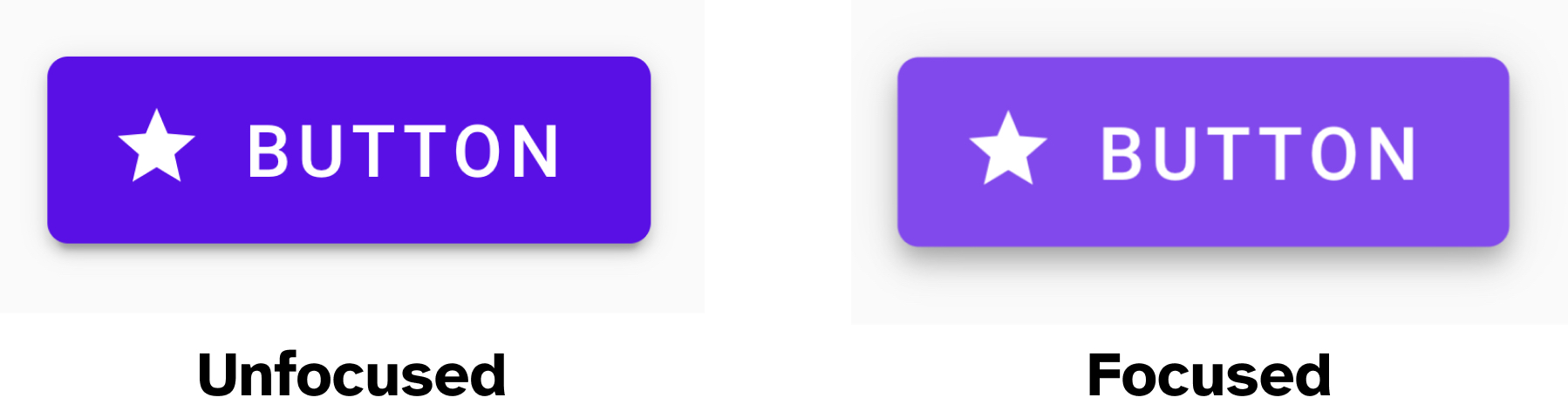
A focus indicator is a visual indicator that “highlights” the currently focused element. This visual indicator is commonly presented as an outline around the element. An outline takes the shape of its element, and since every element in CSS is a rectangle, an outline is, therefore, usually a rectangle drawn around an element.
So a focus indicator allows a keyboard user to see exactly where they are at any given moment. Without it, they wouldn’t know where they are on a page and they wouldn’t be able to navigate the page and operate its controls.
The focus indicator is to keyboard users what the mouse cursor is to mouse users. And just like you would never want to hide the mouse cursor, you never want to hide the focus indicator.
In fact, a visible focus indicator is a requirement for a site to be considered accessible under the Web Content Accessibility Guidelines (WCAG). Removing or hiding focus indicators is a violation and will therefore fail Success Criterion (SC) 2.4.7: Focus Visible (Level A), which states that:
any keyboard operable user interface has a mode of operation where the keyboard focus indicator is visible.
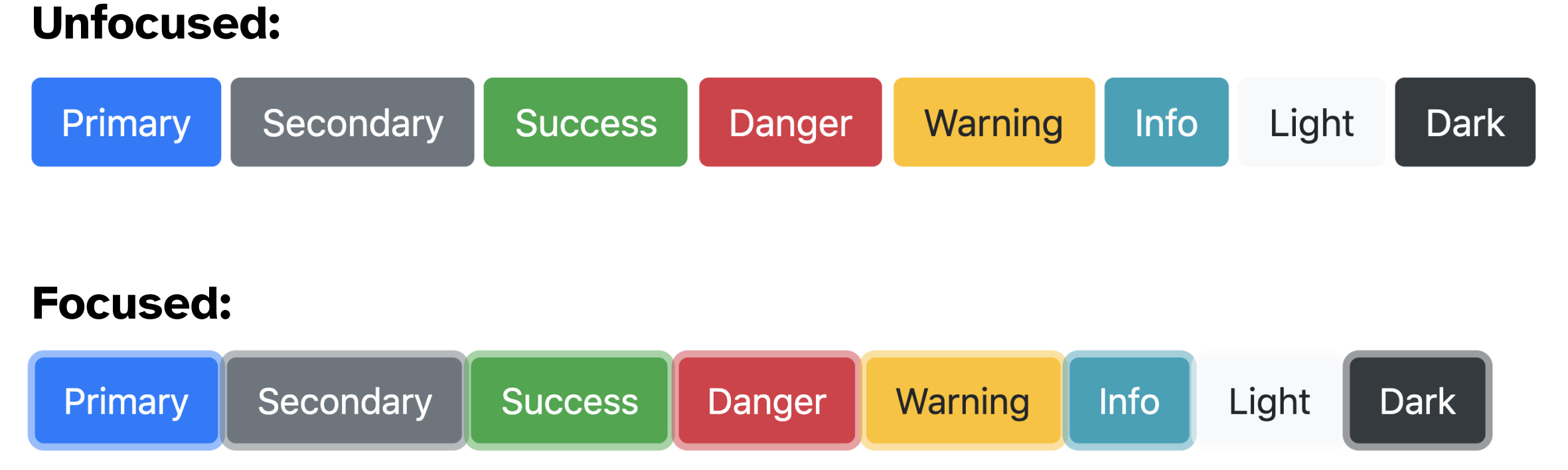
Browsers provide focus indicators to native interactive elements out of the box, for free. And most of us—if not all—have at some point in time included this CSS snippet in their stylesheets:
:focus {
	outline: none;
}
to remove those focus indicators applied by the browser.
To meet the accessibility requirement, you should avoid removing the focus indicator provided by the browser unless you are replacing it with your own focus indicator. And I do recommend you do that.
By preserving browser focus styles, you may meet the requirement of showing a visible focus indicator, but that may not be enough, because a focus indicator needs to be clearly visible to be considered accessible. And browser focus indicators may not always be.
(What’s the benefit of showing an indicator that many users may not be able to see?)
In order for a focus indicator to be clearly visible it needs to have a color contrast against adjacent colors that is high enough for users with moderately low vision to be able to discern it.
The Web Content Accessibility Guidelines define the minimum color contrast ratio required for interactive components and their states to be accessible in SC 1.4.11 Non-Text Contrast.
Focus indicators on UI controls fall under the “non-text” components category, as they are used to identify a component’s state. To pass this criterion, our focus indicators must have a color contrast ratio of at least 3:1 against adjacent colors.
Default focus indicators provided by browsers may fail this criterion, depending on the colors you’re using on your page. You can end up with a usability problem if the colors of your page clash with the colors of the default focus indicators, making them difficult to see. When that happens, you’ll want to override those focus styles with better, more accessible ones.
Here is a screenshot of how Chrome, Firefox, Microsoft Edge, and Safari style their respective focus indicators (at the time of writing) when applied to a <button>:
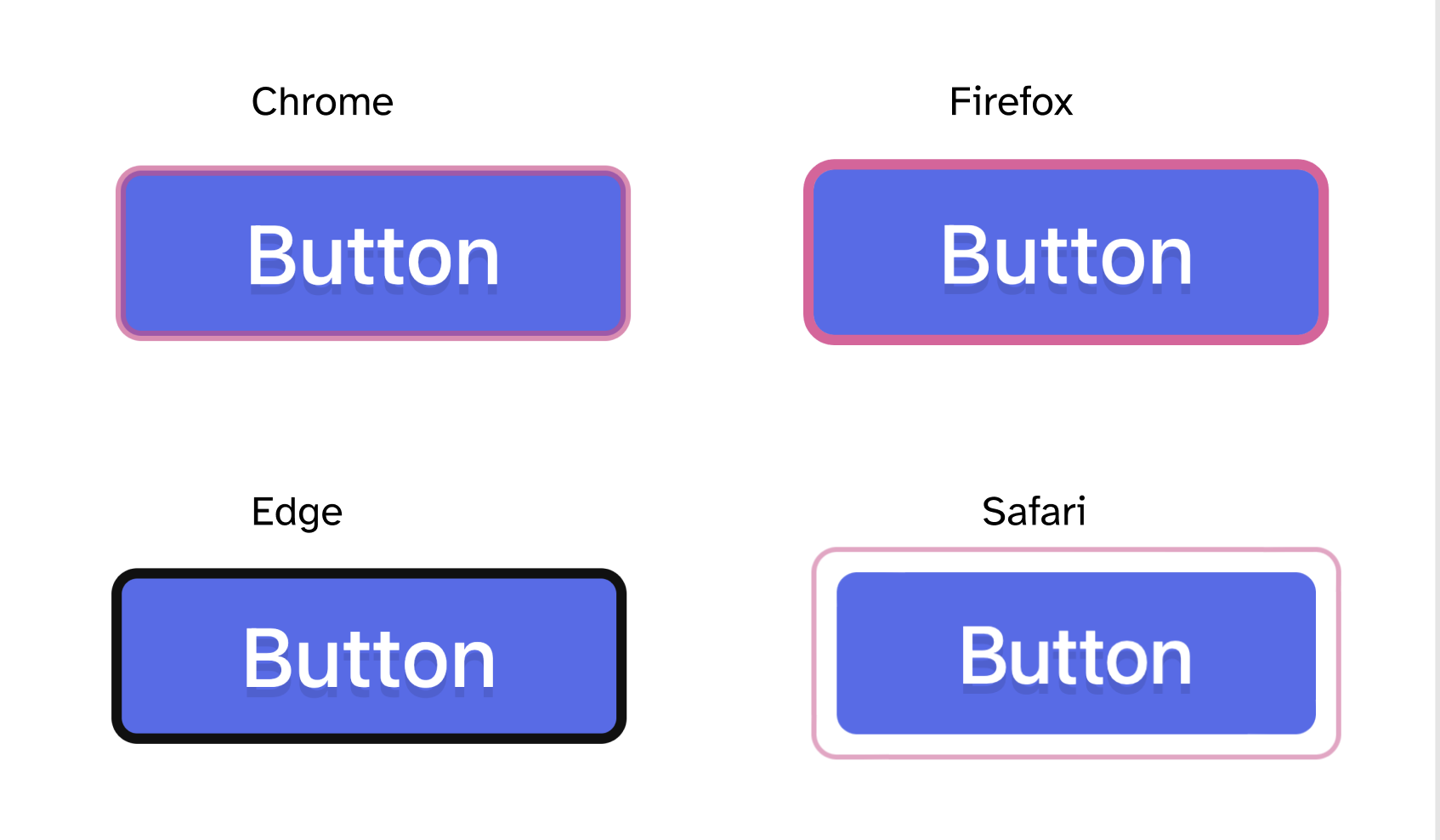
Chrome, Edge and Safari apply a 1-pixel solid outline. Firefox applies a 1-pixel dotted outline. As far as color contrast with the white background goes, they all pass the accessibility check. But the dotted outline in Firefox is still very difficult to discern compared to the other outlines, even though its color has enough contrast with the white background. This is because the contrasting area of the outline is not large enough. And that’s because the outline is very thin and dotted. We’ll come back to this shortly.
On a black background, Firefox’s black focus indicator disappears, and Safari’s indicator has a contrast so low it will be extremely difficult to discern by most users.
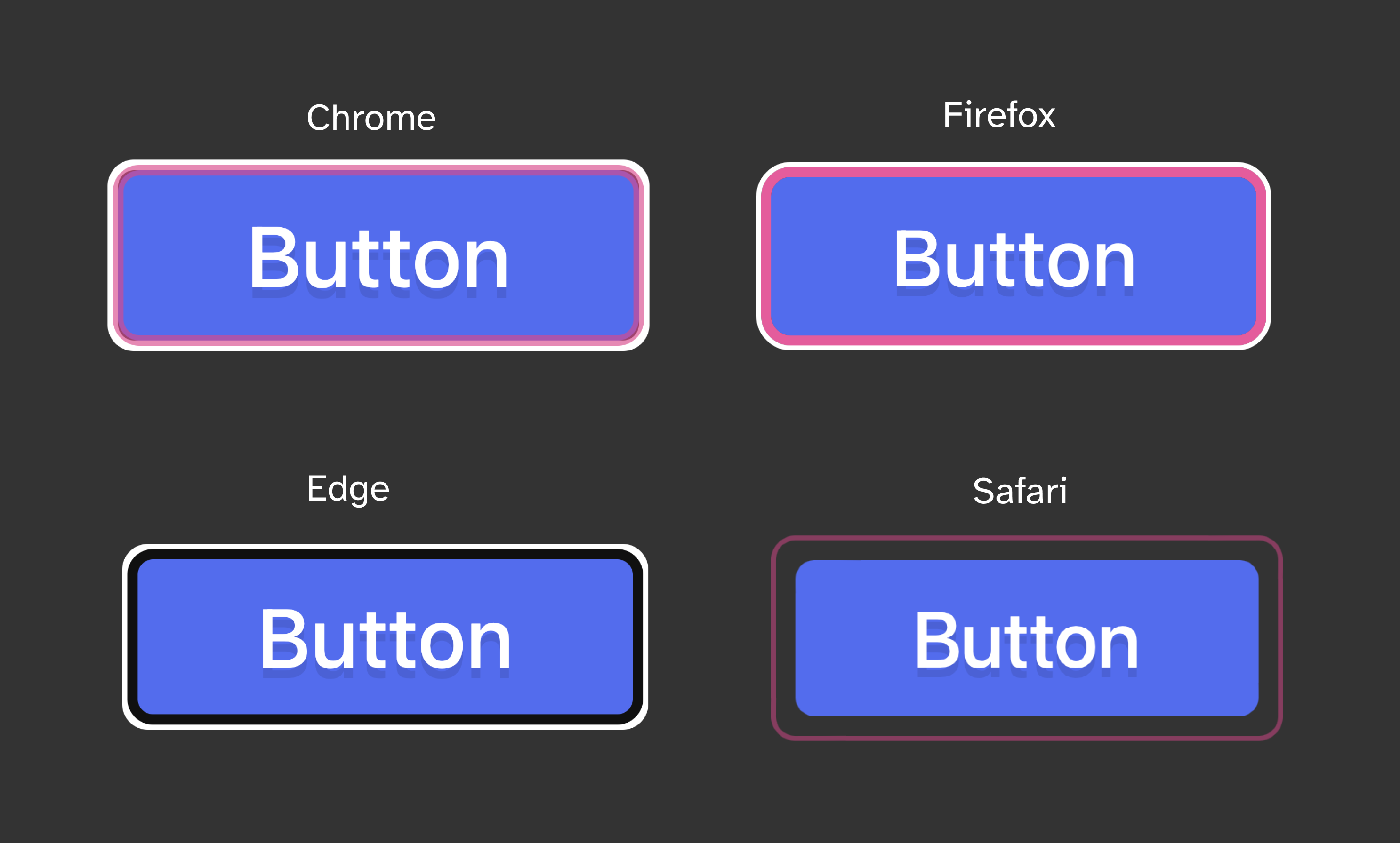
Chrome and MS Edge, however, have something interesting happening in that they apply what looks like a second outline—a white outline around the first outline, that creates enough contrast on most darker backgrounds.
So while you may get away with using the default browser focus styles to meet WCAG 2.1 requirements and call it a day, it is generally a good idea that you override the default styles with more accessible ones. In fact, in WCAG 2.2, it becomes necessary to do that, because the requirements get more specific, and as you’ll see in the following sections, browser focus indicators will often fail the new requirements.
In what follows, we’re going to get a little nerdy!
In WCAG 2.2, three new success criteria were added to define how accessible a focus indicator is depending on its color, area, and visibility:
These new criteria aim to ensure that a keyboard focus indicator is clearly visible and discernible, and they provide the conditions to ensure that. These criteria specify a minimum area required for the focus indicator to be considered accessible, taking into account its color contrast ratio relative to its initial color, as well as against adjacent colors within the focused component.
We’re going to dive into these requirements and how to meet them in the following sections.
We’ll start with SC 2.4.11 Focus Appearance which states that:
When the keyboard focus indicator is visible, one or both of the following are true:
- The entire focus indicator meets all the following:
- encloses the user interface component or sub-component that is focused, and
- has a contrast ratio of at least 3:1 between the same pixels in the focused and unfocused states, and
- has a contrast ratio of at least 3:1 against adjacent non-focus-indicator colors.
- An area of the focus indicator meets all the following:
- is at least as large as the area of a 1 CSS pixel thick perimeter of the unfocused component or sub-component, or is at least as large as a 4 CSS pixel thick line along the shortest side of the minimum bounding box of the unfocused component or sub-component, and
- has a contrast ratio of at least 3:1 between the same pixels in the focused and unfocused states, and
- has a contrast ratio of at least 3:1 against adjacent non-focus-indicator colors, or is no thinner than 2 CSS pixels.
Exceptions:
- The focus indicator is determined by the user agent and cannot be adjusted by the author, or
- The focus indicator and the indicator’s background color are not modified by the author.
For most of the examples, we’ll be demonstrating and examining the focus indicator requirements when applied to a blue button set on a white background.
To start, we’re going to define two terms that will help us understand these requirements: the focus indication area, and the contrasting area. (These terms were introduced in previous versions of the Success Criteria and have been edited out in the final wording. But I think they are helpful in understanding the requirements.)
When a component changes on focus to include a focus indicator, that change can always be measured as a change of color contrast.
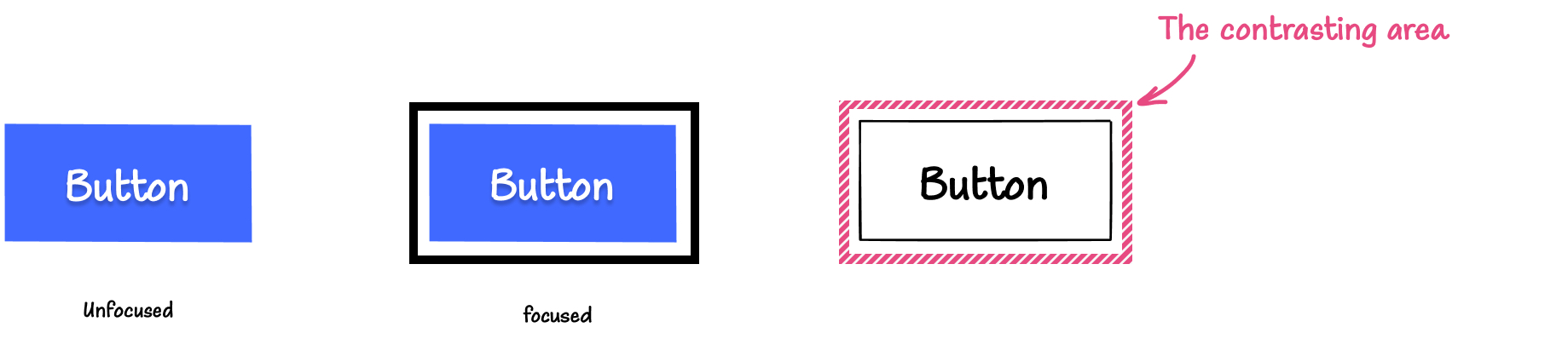
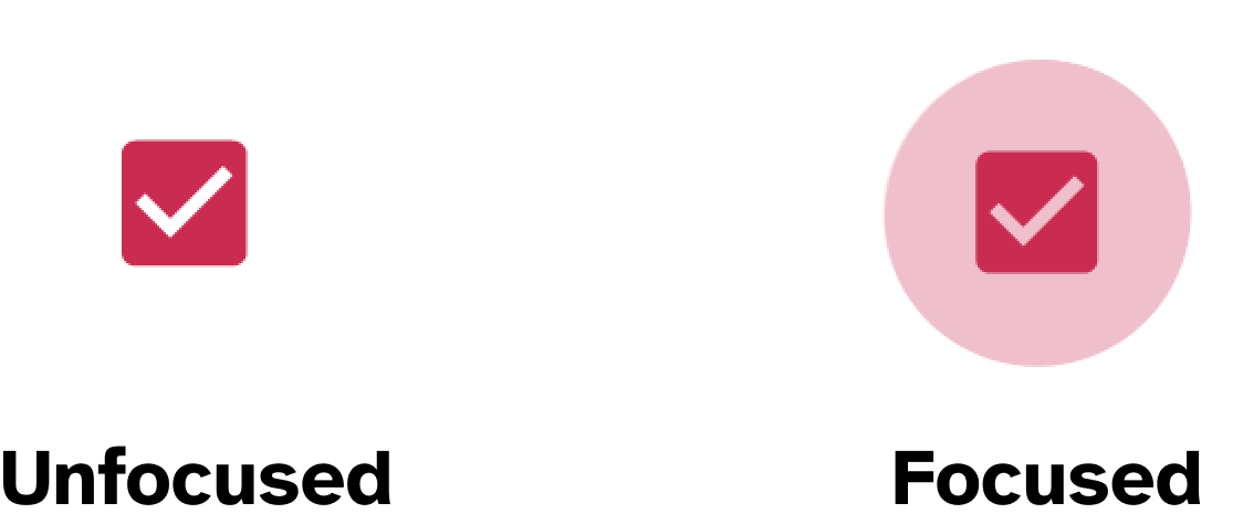
If you add a black outline around the blue button, the change of color between the unfocused and focused states is from white to black. That’s because the area— the pixels on the screen —that has changed color in the focused state is the area around the button. That area was initially white, and it changed to black when the button received focus. This area is called the focus indication area.
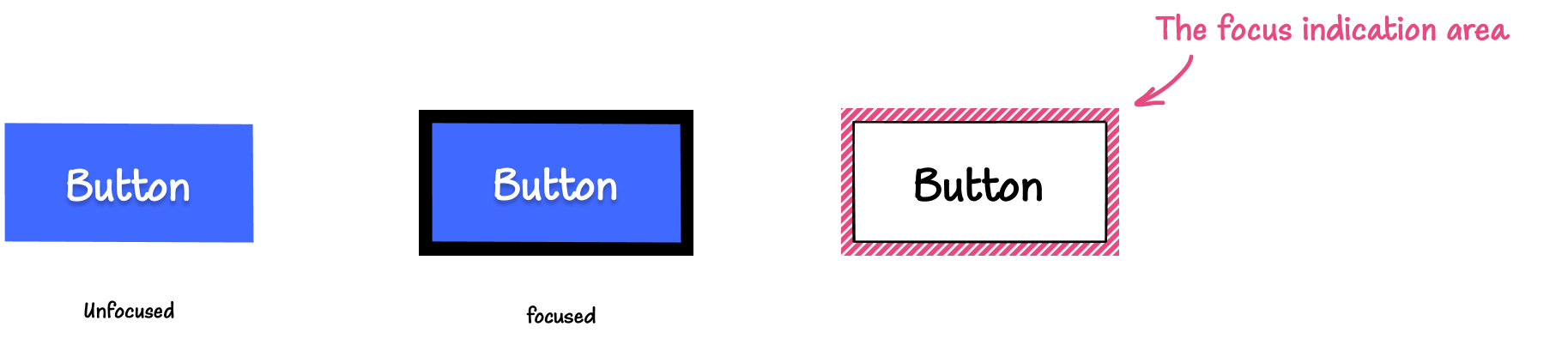
The focus indication area is the area in square CSS pixels where the change in color between the focused and unfocused states of the component happens.
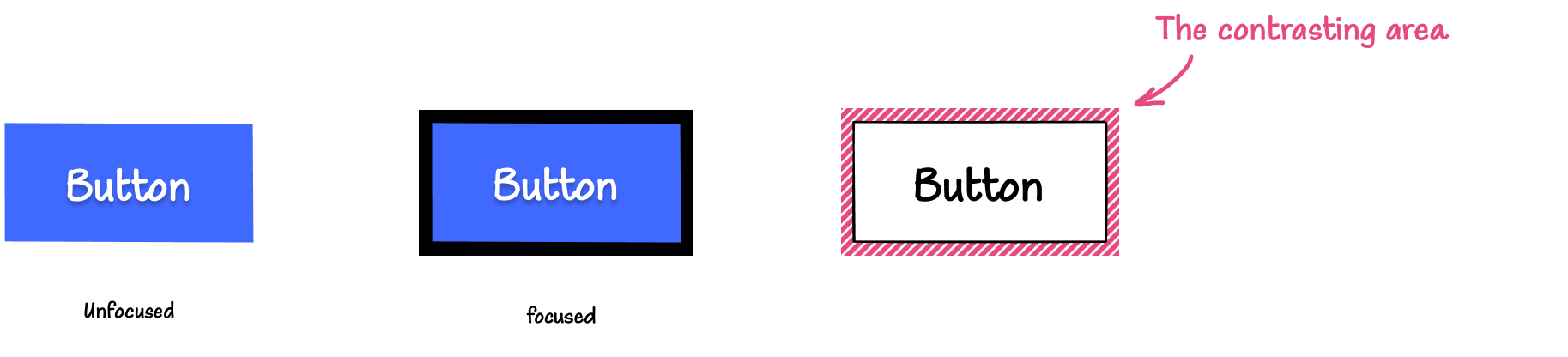
For a focus indicator to be accessible, it is required to have an area of the focus indication area (a subset of the focus indication area) that has a minimum contrast ratio of 3:1 between the colors in the focused and unfocused states. That area is called the contrasting area.
In other words, the contrasting area is the area of the focus indication area that has at least a 3:1 contrast ratio with the colors of the unfocused state. And the contrasting area may or may not be equal to the entire focus indication area.
In the previous example, the color change happens from a solid white to a solid black, and the color contrast ratio between the unfocused and focused state (white and black) is 21:1. So the entire focus indication area meets the minimum contrast requirement. This means that the contrasting area is equal to the entire focus indication area.
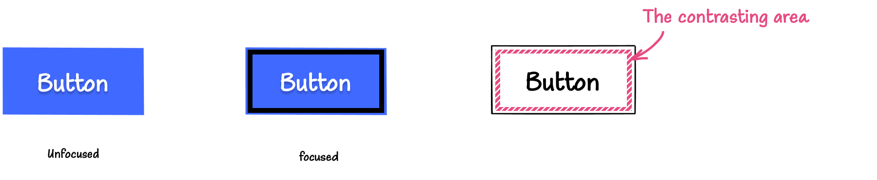
Similarly, if you add a black outline that is separated from the button, once again, the area that exhibits the change in color is the contrasting area.
(I like this pattern because it adds some breathing room and helps the focus indicator stand out, making it easier to see.)
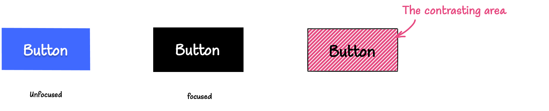
If you add an outline inside the button itself, the contrasting area then lies inside the button. The change of color is from blue (the button’s background color) to black. The color contrast ratio between the focused and unfocused state is 4.86:1.
If the button changes its background color from blue to black on focus, then the entire button’s background area is the contrasting area, and the color contrast ratio between the focused and unfocused state is once again 4.86:1.
When the focus indicator is a solid color, measuring the color contrast ratio in the contrasting area is straightforward. But color changes may not always be solid. You may want to indicate focus on the button by applying a gradient drop shadow to it. In this case, only the portion of the gradient with sufficient contrast (larger than 3:1) will be our contrasting area; the remaining portion that fails will not be a part of it. This is an example of when the contrasting area is smaller than the focus indication area.
You may need to take some spot-checks on the gradient area and establish what area meets the contrast requirement.
The greater the change of contrast between the unfocused and focused states, the easier it is for users to see it.
In addition to requiring a minimum contrast in the contrasting area, a focus indicator is required to have a minimum surface area for the contrasting area as well. In other words, the contrasting area needs to be large enough to be considered accessible. But how much is large enough?
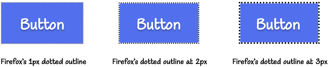
Remember how we said that Firefox’s dotted outline was difficult to discern even though its contrasting area had a high contrast ratio with the background? I mentioned that that’s because its area was small, due to the outline being thin and dotted. The main issue here lies in the fact that it is dotted. The gaps in the line decrease the overall area of the focus indicator, making it difficult to see.
The bigger the visible change when the component receives focus, the easier it is to see. And to ensure that focus indicators have good visibility, 2.4.11 requires a minimum surface area for the contrasting area. That is, the contrasting area needs to be larger than a specified minimum.
The SC states that:
The entire focus indicator encloses the user interface component or sub-component that is focused [ or ] An area of the focus indicator is at least as large as the area of a 1 CSS pixel thick perimeter of the unfocused component or sub-component, or is at least as large as a 4 CSS pixel thick line along the shortest side of the minimum bounding box of the unfocused component or sub-component
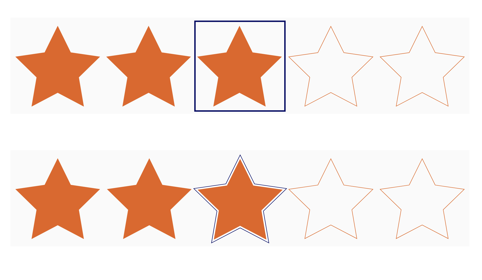
To “enclose” a component means to “solidly bound or surround”. Bounding is derived from the “bounding box” of an element. The bounding box of a component is the smallest possible rectangle that entirely encloses it and its descendants. Surrounding is kind of like “wrapping” a shape. The difference between bounding and surrounding is illustrated in the two images of a set of ratings stars.
The first point in the criterion is technically a special case of the second condition.
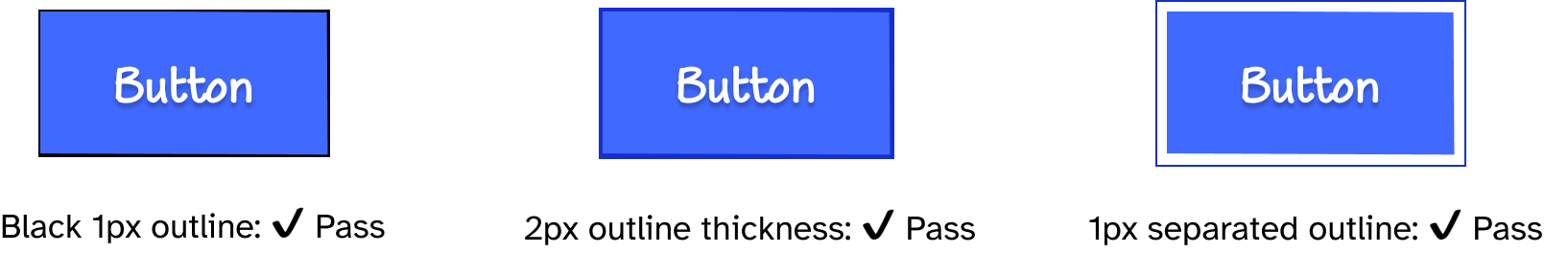
A focus indicator that encloses a component is a focus indicator that solidly bounds or surrounds the component. A solid outline is an example of a focus indicator that solidly bounds an element. And solid 1px outline has an area of at least 1px thick perimeter of the component. (Of course, any outline thicker than 1px will also meet the area requirement.)
If the focus indicator is dotted or dashed (not solid), it no longer ‘solidly bounds or surrounds’ the component and will therefore need to meet the condition defined in the second point.
The second point determines the minimum contrasting area using the perimeter of the component.
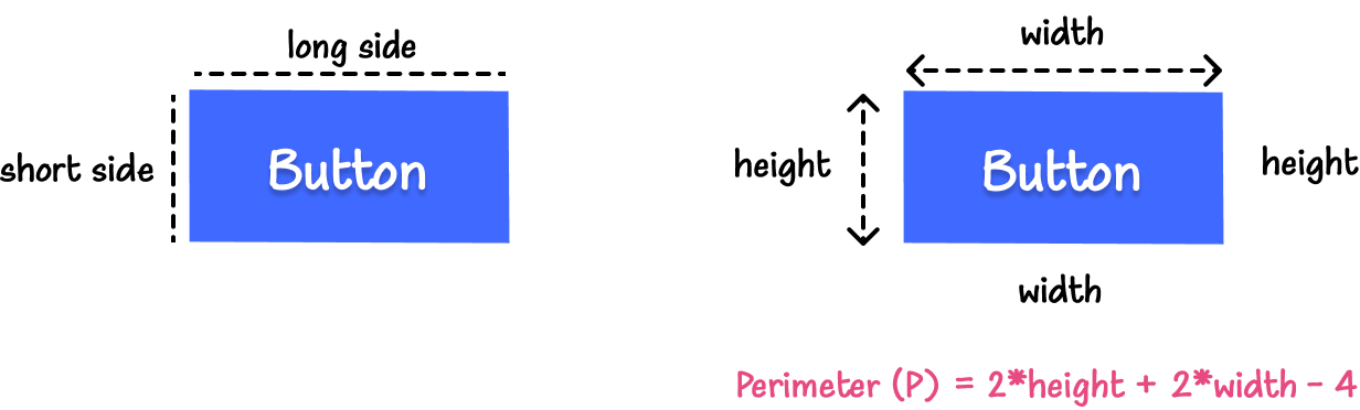
The perimeter of a rectangle is equal to a line that’s 2 times the width plus 2 times the height minus the shared corner pixels which are equal to 4 pixels: Perimeter § = 2h + 2w - 4.
The perimeter of a circle is 2𝜋r, where r is the radius of that circle.
Firefox’s focus indicator is equal to the length of the perimeter of the button minus all the gap spaces introduced by using the dotted style. The resulting length is approximately half of the perimeter. To fix it, the outline thickness can be doubled to make up for the area that is lost in the gaps. Here’s what the dotted outline looks like with 2px and 3px thicknesses. The thicker the outline, the larger its surface area, and the easier it is to see.
Now let’s assume, for demonstration purposes, that we’re designing focus styles for a 150px by 75px button. The perimeter of this button is: 150px + 150px + 75px + 75px - 4px = 446px.
When we apply an inner outline to the button, this outline is going to be smaller than the perimeter of the button (because the outline’s width and height are shorter than the button’s width and height). Once again, increasing the thickness of the outline will make up for the area lost by placing the outline inside the button.
Similarly, for a contrasting area in a gradient focus indicator, you’ll want to calculate the component’s perimeter and compare the contrasting area to that of the perimeter.
In the following image is a circle with a 22px radius and 138px perimeter.
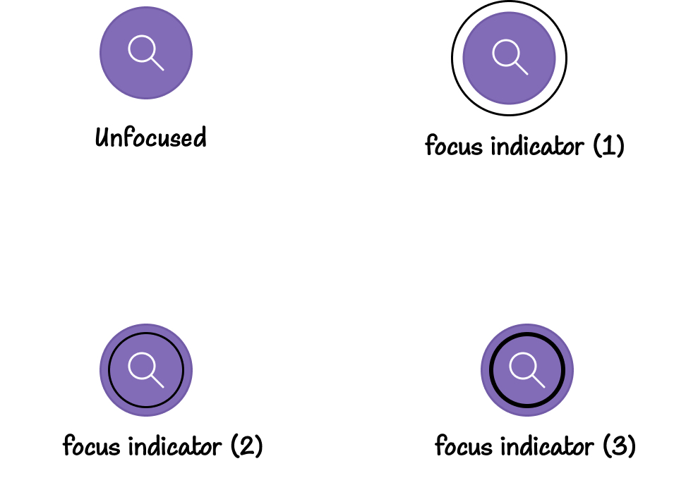
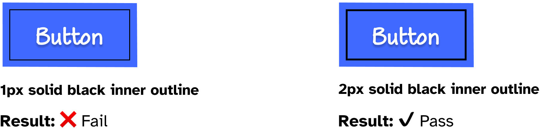
On the top right, the focus indicator (1) is a 1px solid circular outline. The perimeter of the focus indicator is 172px, which is larger than 138px. With a color contrast change that is higher than the minimum requirement, this indicator passes the accessibility requirement.
On the bottom left, focus indicator (2) is an inner 1px solid outline with enough color contrast change, but an area (113px) smaller than the circle’s perimeter. This indicator does not pass the requirements.
And finally on the bottom right, the focus indicator (3) is an inner 2px thick outline. This outline has a double the area of focus indicator (2) (226px), making it larger than the perimeter of the circle, so it passes the minimum area requirement.
In addition to the minimum area requirement that is based on the component’s perimeter, the success criterion also provides a secondary minimum based on the shortest side of the component:
or is at least as large as the area of a 4px thick line along the shortest side of the component’s minimum bounding box
Instead of aiming for a minimum area of 1px thick perimeter, you could aim for a 4px thick line along the shortest side of the component’s bounding box.
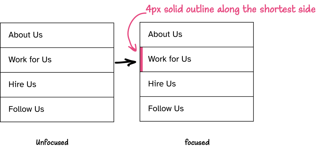
The secondary minimum area can be useful for when you have a list of focusable items stacked on top of each other, such as links in a vertical navigation or a drop-down menu. The focus indicator on a link in the drop-down could be a 4px thick border along the shortest side (typically the height) of the link as shown in the image below.
The thicker the line, the larger the contrasting area, the more visible the focus indicator is. Obviously, the 4px thick line along the shortest side of the element is a minimum. A border along the longest side would also meet the requirement (assuming the thickness ensures a large enough area). My point is that, while I am giving simple and specific examples, my goal is to demonstrate the requirements. But you have the creative freedom to choose any focus indicator style you prefer that meets the accessibility requirements.
The main goal of the minimum area requirement is to ensure that the focus indicator is easier to see. Whetever the style you choose to indicate focus, the important thing is to ensure that the contrasting area meets the minimum area requirement(s), so that it can be easily seen.
In addition to requiring a minimum contrast ratio 3:1 and a minimum surface area, the contrasting area also needs to be easily distinguishable from adjacent colors within the focused component.
This is accomplished either by
We’ll start with the blue button again as an example, and apply a simple 1px (external) outline to indicate focus. But this time, I’m changing the color of the outline from black to a darker shade of the blue background.
The contrasting area’s contrast ratio (dark blue versus the white background) is: 11.02:1. And its area is larger than the button’s perimeter. So the outline color and area pass the minimum contrasting area requirements that we discussed earlier.
But the dark blue color of the outline has a low contrast ratio against the adjacent blue used in the background of the button: 1.89:1. So while this outline meets the first two accessibility requirements, it fails the third one.
To fix it, we can either
#000, for example), orWe can also fix the low adjacent contrast by separating the outline from the button, so the outline’s adjacent color becomes white (the page background), and would therefore meet the color contrast requirement.
The goal of a focus indicator is to allow the user to see and know where they are on a page, by making the currently active element more visible to their eye.
But what good is a focus indicator if the focused element itself is not visible because it’s hidden off-screen or obscured by other elements on the page?
SC 2.4.12 Focus Not Obscured (Minimum) states that:
When a user interface component receives keyboard focus, the component is not entirely hidden due to author-created content.
Simply put: you want to make sure the user can actually see the component that they’re focusing on, by making sure it’s not hidden behind other content on the page.
That being said, this criterion requires that the component be not entirely hidden
. This does imply that it could be partially hidden, as long as it’s still partially visible.
SC 2.4.13 Focus Not Obscured (Enhanced) (which is the level AAA version of this requirement) states that:
When a user interface component receives keyboard focus, no part of the focus indicator is hidden by author-created content.
When aiming for Level AA conformance, you may get away with partially hiding the focused component, though I can’t imagine where or how that would not be problematic. I recommend that you always make sure focused component is entirely visible and not obscured by other content. It’s just better for usability. SC 2.4.13 is one of the AAA-level criteria that are also fairly easy to meet, even if you’re not aiming to be AAA-compliant.
You may wonder if this requirement makes Skip links inaccessible. It doesn’t. Because Skip links are designed so that they are visible when they receive focus; so the user is able to see what they are focusing on when they focus on the skip link.
A very common pattern that is more likely to fail this criterion on many websites is off-canvas navigation and other drop-down and fly-out components. Links in drop-down or off-canvas navigations are only meant to be interactive when they are visible. If you want to click on a link, you open the navigation, the links become visible, and you can click on the link you need and go where you need to go.
Keyboard users sometimes experience these navigation patterns differently when they are implemented inaccessibly. They’ll navigate through a page and suddenly notice their focus indicator disappear. They may continue tabbing, until at some point the indicator finally re-appears and continues to the next visible link.
This happens because the links that are hidden off-screen or inside dropdowns are only visually hidden, but are still accessible via keyboard. This results in a mismatch between the visual and keyboard experiences of a keyboard user: they’re tabbing through links and components that they are not seeing on screen.
To avoid this happening, make sure that components that are not meant to be visibly interactive are properly hidden, by making them inert, for example.
So theses are the accessibility requirements for focus indicators to pass WCAG.
With these requirements in mind, we now know that Firefox’s button focus indicator that we saw earlier fails the minimum contrasting area requirement. Chrome and Edge’s current focus indicators would fail the adjacent contrast requirement if your button has a background color that clashes with the outline’s color. And Safari’s focus indicator will also fail the minimum contrast ratio requirements also depending on the colors you use inside and outside the button.
These browsers may also apply different focus indicators to different interactive elements, which may also fail at least one of the accessibility requirements, depending on your color palette.
So I highly recommend overriding the default focus indicators with custom, more accessible ones. This also gives you the creative freedom to design focus indicators that look nicer on your components than the ones provided by the browser.
Knowing what makes a focus indicator accessible, we can examine our own as well as the focus indicators of popular design systems and UI pattern libraries, and determine which ones pass WCAG criteria and which ones don’t…
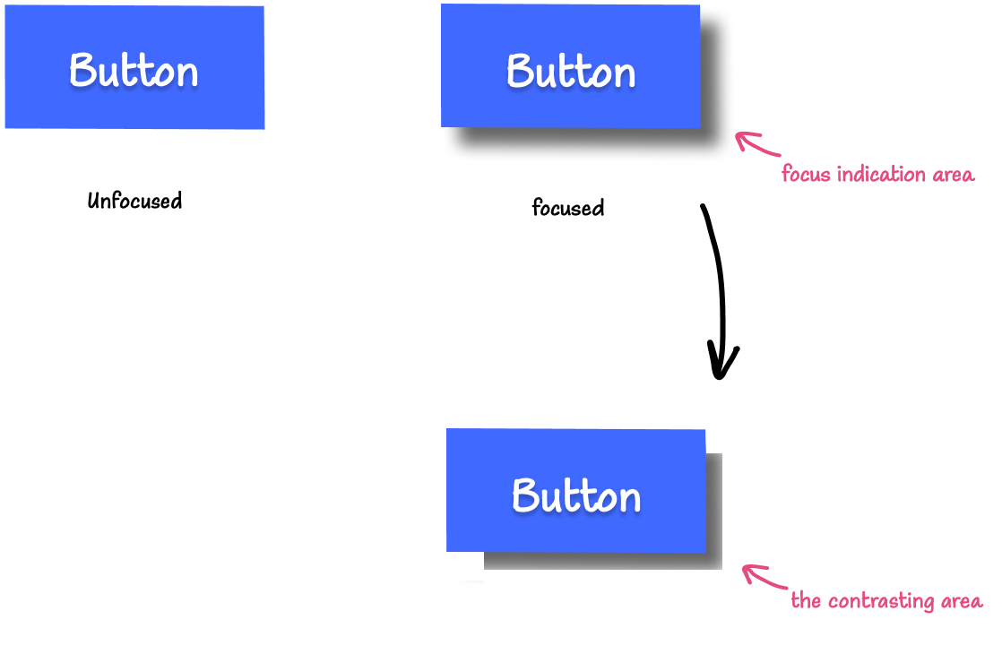
Material design button focus indicator is a change in background color, in addition to an elevation effect created by extending the box shadow underneath the button. This focus indicator fails the accessibility requirements because of a very low change in contrast (1.53:1) between the focused and unfocused states.
Bootstrap 4 buttons also fail WCAG requirements because of low change in contrast between the focused and unfocused states. For example, the change in contrast on the blue button is 1.92:1.
Material UI Checkboxes get a large focus indicator area, but the color contrast change is also low (1.58:1).
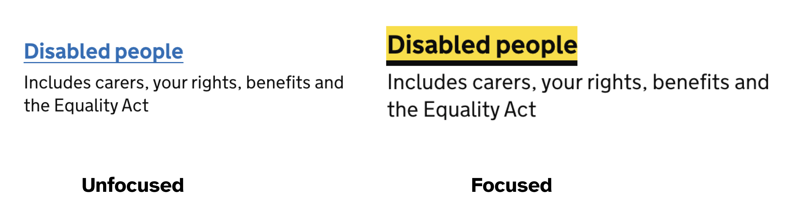
GOV.UK is one of the most accessibility-compliant websites I know. So I was curious to see how their focus indicators measure against WCAG 2.2 requirements.
When focused, the links get a thick underline as well as a change in background color from white to yellow. While the yellow does not pass the minimum color contrast requirement, the indicator still passes accessibility requirements with the thick border compensating for that. (Note: A focus indicator that is larger than the minimum area may have parts that do not meet the 3:1 contrast ratio, as long as an area equal to the minimum does meet the contrast ratio.)
The text field on the GOV.UK homepage gets a 3px solid yellow outline as a focus indicator. This yellow outline has a contrast change (3.86:1) that’s higher than the requirement minimum (for a pixel color change from blue to yellow). The yellow color does not contrast with the input’s white background enough (adjacent contrast), but it is 3px thick, which compensates for that. So this focus indicator passes WCAG requirements.

The main argument I usually hear against focus styles is that they appear even when you don’t want them to, such as when you click on the component with a mouse ot tap on it. Designers and stakeholders are usually not very fond of that. I remember a client once reporting “a bug” and telling me that mouse clicks are “kinda broken” because a thick outline appears when they clicked on links and buttons on the page. When that happens, I usually start a discussion about what focus styles are, why they are important, and why we should keep them. And then I’d always try to make a case for preserving them and “compromising aesthetics” for the sake of usability and accessibility. I didn’t always win those discussions.
Today, I have those arguments far less. While I still find myself asking for focus styles in design specs, I don’t need to argue my way into including them in the final product.
CSS enables us to show focus styles for keyboard users and hide them for all other users. So when you click an interactive element, the focus styles won’t show up and “ruin the aesthestics” anymore. Anyone navigating the page with a keyboard will appreciate the visual aid, and those who aren’t using a keyboard won’t even know they’re there!
Browsers used to show their focus indicators on click (or tap), too. That’s why we used to include the “focus reset” rule in our style sheets:
/* don't do this */
*:focus {
	outline: none;
}
Today, all modern browsers only show focus indicators when they are needed: for keyboard users. The focus outline doesn’t show up when you click or tap an element; it only shows up when you tab to it with a keyboard.
When you create your own custom focus indicators, you probably want to do the same and only show them for users who need them.
You can do that using the :focus-visible pseudo-class.
:focus-visible does exactly the same thing :focus does, except that it only applies the focus indicator styles to an element when that element receives keyboard focus.
/* applies a black outline to links only when focused via keyboard */
a:focus-visible {
 outline: 2px solid black;
}
Browser support for :focus-visible is pretty good — pretty much all modern browsers support it today. So you may want to use the focus-visible polyfill if you need to hide the focus indicator on older browsers. The polyfill works by adding a focus-visible class to the focused element, in situations in which the :focus-visible pseudo-selector should match.
In your CSS, you can then use the class name added by the polyfill to target the focused element and apply the same focus styles you apply using the :focus-visible pseudo-class:
.js-focus-visible :focus:not(.focus-visible) {
  outline: none;
}
You can also skip the polyfill altogether and use :focus-visible as an enhancement on top of :focus.
In his article about :focus-visible and backwards compatibility, Patrick Lauke suggests a clever way to use :focus-visible today as part of a progressive enhancement strategy.
The solution Patrick suggests is to use the :not() negation pseudo-class, and to (paradoxically) define styles not for :focus-visible, but to undo :focus styles when it is absent, and then using :focus-visible if we wanted to provide additional stronger styles for browsers that support it.
button:focus {
	/* some exciting button focus styles */
}

button:focus:not(:focus-visible) {
 /* undo all the above focused button styles

 if the button has focus but the browser wouldn't normally

 show default focus styles */
}

button:focus-visible {
 /* some even *more* exciting button focus styles */
}
button:focus:not(:focus-visible) is CSS for “when the button receives focus that is not focus-visible”. That is, “when the button receives focus that is not keyboard focus”. In other words, “when the button receives focus that is mouse focus, for example”. When that happens, undo all the :focus styles. Then apply keyboard-only focus styles using button:focus-visible.
As Patrick notes, this works even in browsers that don’t support
:focus-visible because although :not() supports pseudo-classes as part of its selector list, browsers will ignore the whole thing when using a pseudo-class they don’t understand/support, meaning the entire button:focus:not(:focus-visible) { ... } block is never applied.
I have a VSCode snippet set up that I use to quickly create these rulesets in my stylesheets, with sensible defaults that I find myself repeating across projects most of the time.
I’ll end this section with this paragraph from Patrick’s article (emphasis mine):
If you care about backwards compatibility (and you should, until you can absolutely guarantee without any doubt that all your users will have a browser that supports :focus-visible), you will always have to either polyfill or use the combination of
:focusand:not(:focus-visible)(plus optional even stronger:focus-visible).
Focus indicators have a purpose, so do what you can do to ensure that they serve that purpose well. They are meant to improve our users’ experience. The user couldn’t care less about the aesthetics of focus styles as long as they help them do what they are visiting your site to do.
I like to create focus indicators that stand out. The more visible they are, the less the user needs to look for them, the better.
You can get creative and create patterned focus indicators which have that extra benefit of not relying on color alone to convey state. Just remember to make sure they meet the minimum contrast and area requirements.
We can also learn something from the way Edge and Chrome handle focus styles. Maybe create “double outlines” that play well in various color environments, or when you support both light and dark UI user preferences. In the future, the new the CSS color-contrast() function can come in handy to create a sensible default focus style for most components. In fact, color-contrast() will come in handy for a lot of accessible color design in the future.
Avoid relying on background colors and box shadows alone to indicate focus. Forced Color Modes and other accessibility display modes will override and/or remove them. Outlines, on the other hand, will not be removed and would always be visible; and the browser will apply the display mode’s custom colors to style them.
You can use backgrounds, borders and box shadows to style focus states. But if you do, add a transparent outline as a “fallback” for the various display modes:
button:focus-visible {
	/* Default. Will be removed in Forced Color Modes */
	box-shadow: 5px 5px 7px rgba(0, 0, 0, 0.1);
	/* Fallback. Will be visible with custom system colors in Forced Color Modes */
	outline: 1px solid transparent;
}
Focus indicators can also be animated. Background colors, borders, box shadows, and outlines can all be animated using CSS transitions and animations. The outline-width and outline-offset properties take numerical values that can be animated. So you can apply a subtle transition to your focus indicators to make them pop. Just make sure to wrap any transitions or animations in a prefers-reduced-motion user query, so users have the option to opt out of the animations if they want to.
When you’re designing and working with a color palette, you can find a color that has enough contrast with the other colors in your palette and use it to style your focus indicators. If there is no one color that meets that criterion, you can add one, or design focus styles that work for different elements and the contexts in which they appear.
You can use a color contrast tool like Stark to quickly check the contrast of two colors without interrupting your workflow — whether you’re designing in a design tool like Figma or in the browser. You can also use the browser devtools to check color contrast where they are available, or an online tool like WebAIM’s color contrast checker, which I used to calculate the color contrasts throughout this article.
Not all elements need to have the same focus style. I personally try to keep focus indicators visually consistent as much as possible. But there are times when some elements could benefit from a different focus style, whether for aesthetic or usability purposes—or maybe even both! Get creative, but do so within the boundaries of accessibility. Creating nice focus indicators is a nice touch that not only shows your attention to detail, but it also shows that you care about all of your user’s experiences enough to spend a bit of time fine-tuning these details.
Designing accessible focus indicators is easier now that there are specific criteria to measure accessibility against.
If you’re a designer, make a habit to design and include focus indicator styles in your design specs if you don’t already do so.
If you’re a developer, include focus styles in your CSS defaults. If you’re working with designers, strike up a discussion about focus styles with them if they don’t already prioritize them in design specs.
Sometimes, you don’t need permission, extra time, or extra budget to improve the accessibility and usability of your product. Focus indicators are one small yet critical addition to your product that has tremendous usability benefits. Spending a few extra minutes designing and adding them will pay dividends and improve your product for millions of people who will use it.