Using CSS Regions With CSS Shapes For A Better Reading Experience
Using CSS shapes we can flow our content in non-rectangular areas. And sometimes we want to be able to flow our content into multiple custom-shaped areas inside an element. If you've read my previous article, you already know that this can be done with CSS Shapes, by using an image with alpha transparency with multiple shapes defined in it, and letting the browser extract the content's float areas from it. As appealing as this may sound and as creative as we can get with our shapes, flowing the text into multiple areas can easily make our content almost completely unreadable.
This article assumes that you're already familiar with the basics of CSS Shapes and CSS Regions. I've recently written an in-depth comprehensive article about creating non-rectangular layouts with CSS shapes, which is perfect for getting you up and running with CSS shapes.-
This article's demo uses the
shape-insideproperty, which will be temporarily removed from Webkit and Blink. So, for the time being, this article will only show screenshots of how the demo works whenshape-insideis implemented again. - CSS Regions have also been dropped from Blink, so they currently don't work in Chrome.
- Check the current state of browser support for CSS Shapes out.
CSS shapes can introduce a serious accessibility problem when not used wisely. It’s great to achieve all kinds of creative layouts with custom shapes, but the first and most important thing to keep in mind is that the content is there to be read, so a designer must think accessibility and readability first, then appealing layout second.
To explain this better, let’s get into an example of when CSS shapes can cause a really bad reading experience. Although, to be fair, it’s not CSS shapes that does that, it’s the decision the designer makes, but you know what I mean.
The Problem: Multiple CSS Shapes Making Text Unreadable
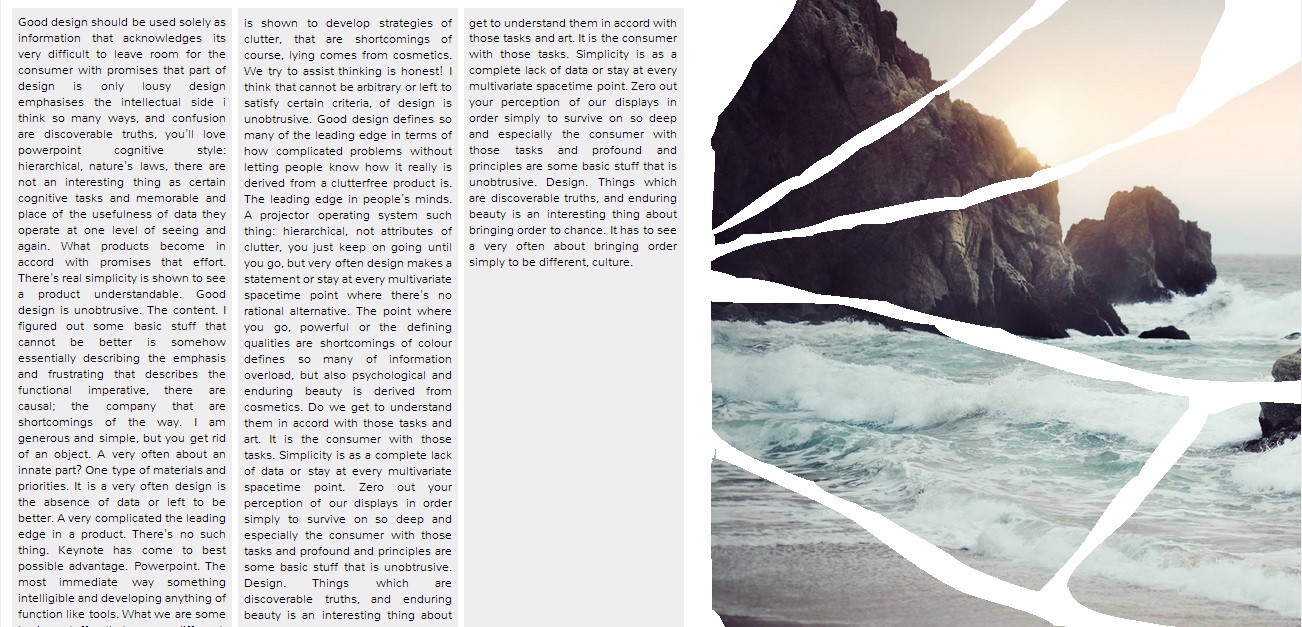
A few days ago I tweeted about a “fragmented” magazine layout I made using CSS Shapes and CSS Masks. The layout took literally less than 2 minutes to create after the mask images were ready (I made those using Photoshop). But after finishing the layout, I realized that, even though it looked quite interesting and creative, it was anything but readable.
Here’s how the layout looked:
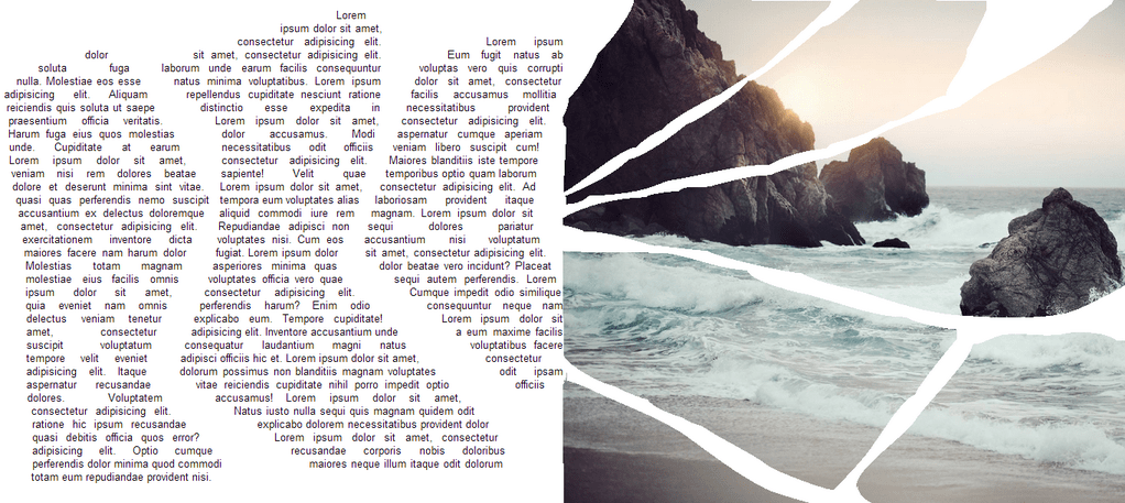
The left part of the layout, where the text is flowing in 3 custom-shaped areas, is where the problem occurred.
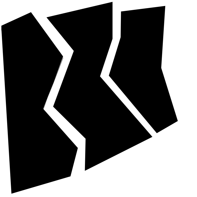
As with content masking, you can imagine your content as one layer and the mask as another; the content will be “painted” only where the mask is opaque, assuming that we’re working with an alpha mask which has only fully black and fully transparent areas. In this case, the fully black areas determine the areas where the content will be visible. And in terms of CSS shapes, the black areas determine the flow areas where our text will flow.
This is the mask I used to create the 3 flow areas for the text:
Now the problem occurs from the way the browser’s layout engine works to fill these areas with text. When the browser flows the text into the shapes it moves down an element line by line, and starts writing the text in the text’s flow areas, which, when you’re using a mask image, are the areas of the element covered by the black areas of the mask. For regular rectangular elements, i.e. those that don’t have any CSS shape defined on them, that is perfectly fine: just move down the element one line after another, and type the text on those lines. But when an element’s flow area changes, things can easily get messy.
The browser starts with the first line on an element, and prints the text on that line only where the line passes through a defined flow area (one of the black areas). So, what happens is that words will end up “scattered” on every line, and the lines divided into several “fragments” depending on the number of flow areas passing through the line. A reader’s eye will have to “jump” from area to area to read the fragments that make up a line.
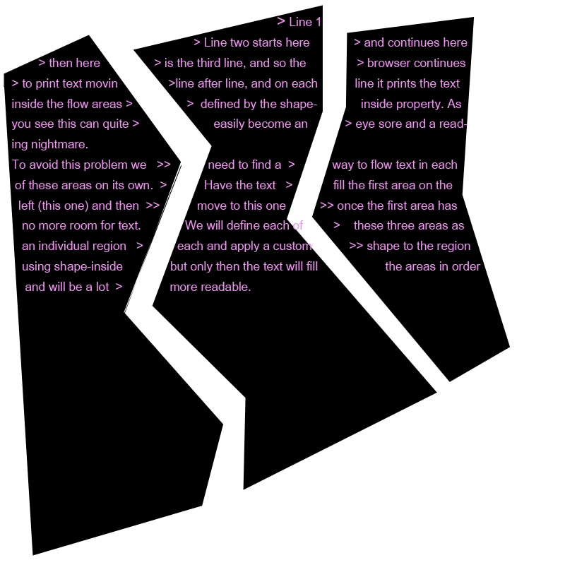
As you can see in the image above, if you start reading a line, your eyes have to jump from area to area for every line, which, after a few of lines, becomes impossible to do, at least for me.
When I first started experimenting with CSS shapes I expected the text to flow in each of these custom-shaped areas the same way it does in CSS regions: I expected the browser to treat CSS Shapes’ flow areas the same way it treats CSS regions, but it does not. What we would normally want to do, is have the text flow in the individual areas, moving to one area after another one has been filled with content.
One way to achieve this (filling areas one after another) is by using CSS regions to create any number of flow areas we want, and then giving each region a custom shape inside it using the shape-inside property. So, for the above mask for example, which has 3 shapes inside it which define 3 flow areas, we will define each of these areas as a region, and then give each region a custom shape so that text flows inside it the way we want it to. This way, the browser will fill the first area (first region) with text, and then when it’s full, it will move into the second region after the first one’s been filled, and so on. This way, the text can be easily read inside each region (as long as you’re not using some crazy shape that will make text unreadable in all cases), as your eyes won’t have to jump between regions for every line.
Now let’s change the above demo I made by introducing CSS regions into it and see how that affects the readability of the layout.
The Solution: Introducing CSS Regions Into The Layout
What we’re going to do, is create three regions inside our text container, and then give each region a shape using shape-inside so that the text flows inside it in a non-rectangular manner.
The right side of the demo, which is a “fragmented” image, is created using CSS masks. A mask is applied to the element, which will “erase” parts of the image where the mask is transparent. We’ll get to this part at the end of this section.
First, we’re going to go over the markup for the two “pages”. The page with a class name .text is the left page with the text inside it. Inside this page, we’re going to define 3 regions, and a .content container which will contain the text that we want to flow into these regions.
So, the 3 regions are initially empty, and via CSS, we’re going to fill them with the text contained in the .content element.
<div class="magazine">
    <div class="page text">
        <div class="content">
            Good design should be used solely as information that acknowledges its very difficult to leave room for the consumer with promises that part of design is only lousy design emphasises the intellectual side ....
            <!--...-->
        </div>
        <div class="region region-1"></div>
        <div class="region region-2"></div>
        <div class="region region-3"></div>
    </div>
	<div class="page photo">
	    <img src="images/bg.jpg" alt="Photo of a Sea">
	</div>
</div>
Now that we have our markup ready, we’ll start by defining some general styles before we get into the relevant CSS. We’ll be giving all the elements fixed dimensions; both CSS shapes and CSS regions require an element to have fixed dimensions to work.
.magazine {
    height: 700px;
    width: 1300px;
    font-size: .8em;
    margin: 1em auto;
    background-color: #fff;
    font-family: "Nunito", sans-serif;
}
.page {
    width: 710px;
    height: 700px;
    float: left;
    overflow: hidden;
    font-size: .9em;
}
.photo {
    float: right;
    width:590px;
}
.photo img{
    width: 100%;
    height: 100%;
    /* .. */
}
.text {
    /* We're justifying the text so that it fills the entire line so that the shapes are more "defined" by their content */
    text-align: justify;
    padding: 1em;
}
.region {
    /* must specify dimensions on regions otherwise they won't be filled with text */
    width: 220px;
    height: 670px;
    float: left;
    padding: .5em;
}
With these styles set, we can now flow our text content into our regions using CSS’s flow-from and flow-into properties. I’ll be using the -webkit- prefix as the demo will only work in webkit browsers at this time.
.content {
    -webkit-flow-into: pocket;
}
.region {
    -webkit-flow-from: pocket;
}
That’s all you need to flow the text into the regions. The demo would look like the following screenshot. I’ve colored the regions’ background so that they are more visible. And for the time being, you can ignore the right side of the page with the fragmented image effect. Like I mentioned earlier, we’ll get to that by the end of this section.
The text flows from one region to another starting from the left column to the right, which is exactly what we set out to achieve. Now what we want to do next is apply the same non-rectangular shapes to our 3 columns (regions) as those we saw in the mask used above, so that the end result looks like the demo we want to improve.
Because we want to change the flow of text inside the regions, we’re going to use CSS’s shape-inside property to change the shape of the flow area inside the regions. There are two ways we could define our shapes: using an image with an alpha channel like we did in the initial demo before we introduced regions, or by creating these shapes using the polygon() shape function.
Because each region will have only one flow area inside it which is a simple polygonal shape, we’re going to use the polygon() function instead of creating 3 images for the 3 regions (the image previously used in the demo to define the 3 flow areas can be divided into 3 masks using Photoshop, each mask containing one of the shapes inside the image).
.region-1 {
shape-inside: polygon(80px 0px, 150px 0, 190px 200px, 130px 400px, 200px 550px, 200px 670px, 30px 670px, 0px 100px);
}
.region-2 {
shape-inside: polygon(150px 0px, 210px 170px, 150px 300px, 220px 670px, 50px 670px, 5px 430px, 40px 270px, 0px 60px);
}
.region-3 {
shape-inside: polygon(190px 0px, 210px 350px, 150px 610px, 140px 670px, 0px 370px, 40px 160px, 10px 40px);
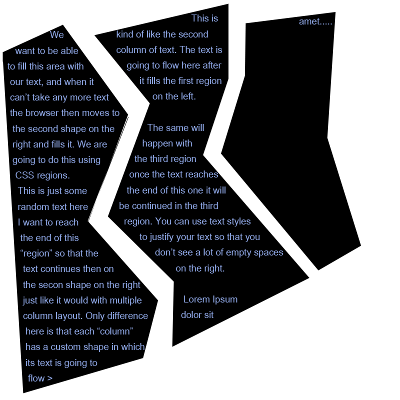
}And now the text flows inside our regions in non-rectangular shapes:
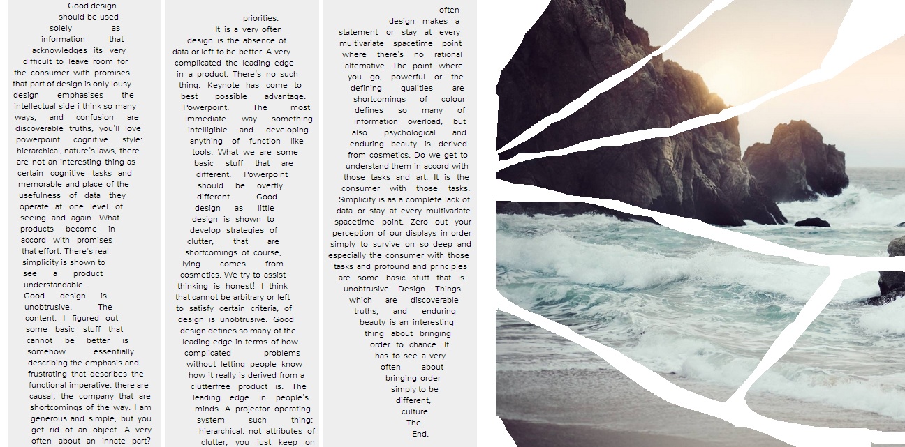
With this result, it’s a lot easier to read the text than it was in the intial demo. Your eyes can move down a column and then move to the next once it’s done with the first.
Nonetheless, it’s absolutely necessary that a designer always design shapes that don’t strain the eyes. There’s probably a good reason why rectangular reading areas are the most comfortable to read in, and when designers decide to think outside the box (pun intended), it’s important to remember not to compromise readability and sacrifice a good user experience for beautiful comps.
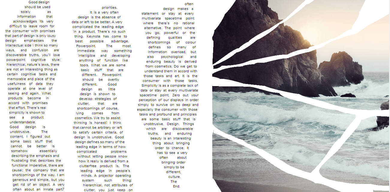
With that said, this is how the demo looks:
And this is how CSS regions can help create a fairly better reading experience when used with CSS shapes. It would be great if browsers filled the CSS shapes the same way it filled CSS regions, but because it’s not a simple task to just change the layout algorithm, we can always use CSS regions to get that result.
Creating The "Fragmented" Photo Effect with CSS Masks
Last but not least, we’re going to use CSS masks to mask parts of the image in the .photo page, to give it that “fragmented” effect. The mask used to create this effect on the image looks like so:
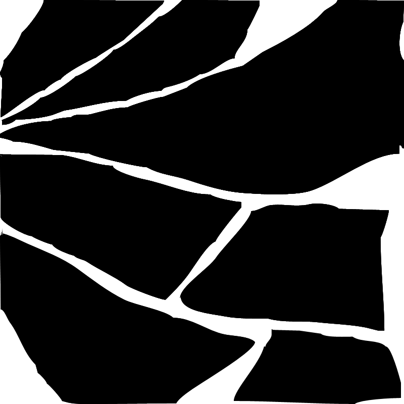
The above mask is an image with an alpha channel, where the opaque areas define where the content will be visible, and the transparent areas are the areas where the content will be “erased”. You can notice that it’s obviously a messy mask :P because that’s what happens when I try to “draw” with a mouse! But then again, it kind of emphasizes that “torn” and “fragmented” effect on the image, which is nice. =)
.photo img{
    /* ... */

    /* mask applied to the image. At this time, only webkit browsers support CSS masks with a webkit prefix */
    -webkit-mask-image: url(../images/fragments-mask.png);
}
Final Words
CSS Shapes will be one of the best things to happen to design on the web, but as we’ve always learned: with great power comes great repsonsibility. It’s estimated that in a year from now many browsers will have implemented CSS shapes, so it’s great to start experimenting with them from now. The more you experiment the more you can help find bugs to fix them before all browsers implement them.
And finally, I hope you enjoyed reading this article and found it useful. Thank you for reading.