CSS Regions Matter
Whether or not CSS Regions can be used to create multi-column or responsive layouts, fact remains that, unlike Flexbox, Multi-Columns, and Grids, CSS Regions are not a layout feature—they're a fragmentation feature that allows us to control or change the flow of content across containers in a page, or across pages.
Since CSS Regions are a fragmentation feature, they define where content flows on the screen—unlike Flexbox, floats, Grids, and other positioning features that define how content is laid out on a screen. Layout features position elements and containers; Regions can alter the flow of content that shows up in them.
In this article I want to go over some useful examples of use cases for CSS Regions, and highlight some of the challenges that we may face when using CSS Regions, and talk about possible solutions to common Regions problems.
I wrote this article before the news came out that Google decided to pull Regions out of Blink, which, in my opinion, is a big loss for the web community. So, even though the content of the article may go in vain, I think it's still worth sharing why I think CSS Regions mattered, and wish they weren't ditched like that. I hope you guys like it anyway.
Disclaimer In no way is this article meant as an attack on Mr. Håkon Wium Lie’s article about CSS Regions. Mr. Håkon’s article served as an incentive for me to dig deeper into CSS Regions, and during the process, I learned a lot about them, and about other future CSS features, and this article is the result of what I found out and my personal opinion regarding the usefulness of CSS Regions.
CSS Regions Problems and Possible Solutions
CSS regions have two prominent “problems” today: non-semantic presentational elements, and the non-responsiveness of regions.
The Problem Of Non-Semantic Markup, and Possible Solutions
The reason we are using non-semantic elements to create Regions today is that other layout features, such as Grids, for example, have not yet been finalized and are not yet ready to be used. So, instead of using portions or fragments of a CSS Grid layout, for example, as regions, we’re currently stuck with defining regions using “normal” elements such as divs.
CSS Regions are designed so that they work now, with normal elements, and also work with future features, instead of waiting for things to be perfect. It is only a matter of time before Regions can be used with other layout features, and then a lot of the current Regions problems can be solved.
When Regions are used with other features, such as Grids and Flexbox, they allow us to use fragments of a layout as regions by simply applying the flow-from property to them. No empty elements will be needed to define regions, whatsoever.
To demonstrate how Regions can be defined without creating empty elements, I will show a code example provided to me by Adobe’s Catalin Grigoroscuta. In the demo, the pseudo-element ::after is used to define regions to flow content into. So we do not need to add any empty elements to the page to create our regions, and therefore the semantics of the content are not compromised.
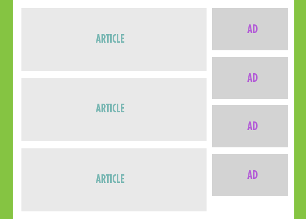
This demo is a variation of an excellent use case for Regions that Chris Coyier came up with: using regions to shuffle contents on a page, allowing us to reposition ads that are placed inside a sidebar on big screens, and place them in between the text content of an article on small screens, so that they don’t stack up down at the bottom of the article.
The layout would start with a sidebar having the ads inside it, much like most blogs and magazines do today.
And then using CSS Regions, the content is “folded” on smaller screens, allowing ads to be placed between the text content of the article. Without CSS Regions, the ads would appear at the bottom of the article, way down at the bottom.
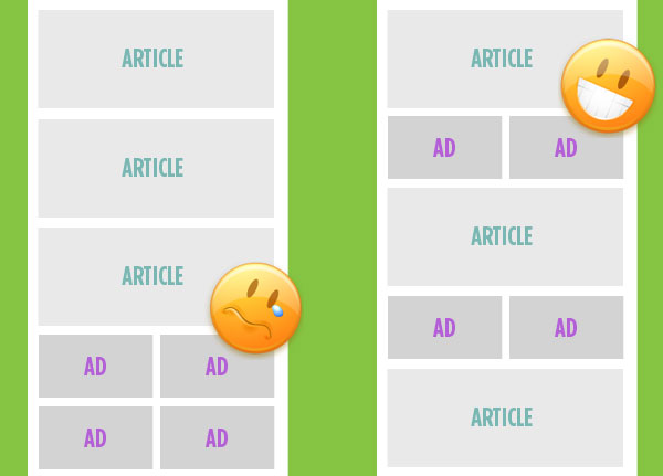
Chris did it by introducing empty elements into the article where he wants the ads to appear on small screens. And then, using media queries, he flowed the ads from the sidebar into these elements using the CSS Regions properties flow-from and flow-into.
<!-- Source: http://css-tricks.com/content-folding/ -->
<section class="main-content">

  <article> ... </article>

  <div class="ad-region-1">
    <!-- empty, ads flow into here as needed -->
  </div>

  <article> ... </article>

  <div class="ad-region-2">
    <!-- empty, ads flow into here as needed -->
  </div>

  <article> ... </article>

  <div class="ad-region-3">
    <!-- empty, ads flow into here as needed -->
  </div>

</section>

<aside>
   <!-- Fallback content in this flow region, probably clone #ad-source -->
</aside>

<!-- Source of flowing content, essentially hidden as an element -->
<div id="ad-source">
  <a href="#"><img src="ads/1.jpg"></a>
  <a href="#"><img src="ads/2.jpg"></a>
  <a href="#"><img src="ads/3.jpg"></a>
  <a href="#"><img src="ads/4.png"></a>
</div>
The CSS needed to define the flow of the ads into the regions is shown below.
/* define the source and destination of the ads flow */
#ad-source {
  -webkit-flow-into: ads;
  -ms-flow-into: ads;
}
aside, [class^='ad-region'] {
  -webkit-flow-from: ads;
  -ms-flow-from: ads;
}
/* initially hide the regions (empty elements)  */
[class^='ad-region'] {
  display: none;
  height: 155px;
  width: 100%;
}

/* show regions on small screens and hide the sidebar where the ads were on big screens */
@media (max-width: 800px) {
  [class^='ad-region'] {
    display: block;
  }
  [class^='ad-region']:last-child {
    height: 300px; /* I wish height auto worked */
  }
  aside {
    display: none;
  }
}
You can see that this use case for Regions is brilliant and very practical. But it has one problem: non-semantic empty elements.
A way to avoid using empty elements to define our regions would be to use the ::after pseudo-element on each of the elements, and use the pseudo-element as the region we flow the ads into. The following code shows how this can be achieved using just a few lines of CSS. No code bloating, no non-semantic elements.
First we create our markup, similar to the way Chris did it, but we leave out the empty elements.
<section>
<article>Lorem ipsum dolor sit amet, consectetur adipisicing elit. Quos possimus tenetur aut natus error aperiam ipsam atque laboriosam quod accusamus velit deserunt non quo blanditiis officiis pariatur eveniet fugiat neque.</article>
<article>Lorem ipsum dolor sit amet, consectetur adipisicing elit. Possimus reiciendis eveniet ex suscipit nam ad voluptas cumque beatae qui maxime repellat quos consequuntur sapiente esse animi ea accusantium dicta perspiciatis?</article>
<article>Lorem ipsum dolor sit amet, consectetur adipisicing elit. Autem numquam tenetur natus ad unde quisquam illo fuga deserunt quibusdam accusamus provident officiis laboriosam hic nihil dolorum aperiam reprehenderit adipisci eveniet?</article>
</section>
<aside>
<img class="ad" src="" alt="Ad 1" width="300px" height="80px"></img>
<img class="ad" src="" alt="Ad 2" width="300px" height="80px"></img>
<img class="ad" src="" alt="Ad 3" width="300px" height="80px"></img>
</aside>
And then using Regions properties, we define our regions on the ::after pseudo-element of each article.
/*
* Regions Code that makes the Folding Work
* 1) remove ads from sidebar and put them into a flow
* 2) "pour" the ads into the pseudo-element
*/
@media (max-width: 600px) {
  .ad {
    -webkit-flow-into: ads; /* 1 */
  }

  article::after {
    display: block;
    height: 5em;
    margin: 1em 0;
    -webkit-flow-from: ads; /* 2 */
  }
  section {
    width: 100%;
  }

}
This is a brilliant idea that solves the problem of non-semantic elements, and also shows how well Regions can work with other CSS features. You can see a fork of Catalin’s live demo here. And what’s even more awesome is that this technique and the code used for it are 100% reusable.
This example shows that the non-semantic elements that are now sometimes needed to define regions, will no longer be a problem when Regions are used in conjunction with other layouts features. Just like we defined regions on pseudo-elements, we would be able to define regions on fragments of the layout that are part of a Grid or Flexbox, for example, and the semantics wouldn’t be affected. Grids and other layout features would provide “slots” to use as regions, just like pseudo-elements can be used as regions.
The Responsiveness Of Regions Or Lack Thereof
CSS Regions are not responsive by themselves, they need media queries to change. But then again, Flexbox does too, and so do CSS Grids, and that does not mean these features are not useful. Relying on Regions alone to fully “responsify” a layout is not a good idea, but that’s not surprising, considering that it’s not what Regions are made for.
The biggest challenge that we could face when making Regions responsive is fitting the content inside a Region that has a fixed height but different widths on different screen sizes. We all know how limiting that is. If we start mobile-first, the content will be too little for the element on bigger screens when it expands horizontally, and if we start desktop-first, the content will overflow the element on small screens. The thing about regions is that it does not define a way to generate new boxes to fit the overflowing content. This is a curse, but also a blessing, because it allows Regions to work well with any other specification that can generate boxes.
The repsonsiveness of CSS regions would no longer be a problem when they are combined with other features that can do what Regions can’t do, such as the CSS Overflow Module. If these technologies were to combine, then we would be able to create responsive layouts that have regions defined in them, without having to worry about content overflowing the regions.
The CSS Overflow Module is described in the specification as follows:
This module contains the features of CSS relating to new mechanisms of overflow handling in visual media (e.g., screen or paper). In interactive media, it describes features that allow the overflow from a fixed size container to be handled by pagination (displaying one page at a time). It also describes features, applying to all visual media, that allow the contents of an element to be spread across multiple fragments, allowing the contents to flow across multiple regions or to have different styles for different fragments. (bold emphasis added by me)
Considering how CSS Regions are meant to help us create and control fragments of a layout, this Overflow module looks like a great match for Regions. Together, they could allow us to make Regions responsive by “extending” a region. The Overflow module handles overflow into “fragments”—it duplicates the source element and flows content into it as many times as necessary to fit the whole content. So as the screen becomes smaller, the region can be “extended” to fit its content without having to overflow that content into another region or element. Extending a region would be as simple as defining overflow: fragments; on it, and we would end up with a solution to the fixed region height problem. That sounds really great, doesn’t it?
There is also another proposal from Adobe—multiple pseudo-elements—which allows the creation of multiple ::before and ::after pseudo-elements on an element. Similar to the Overflow module, it would allow us to extend an element and use its extension as a region, much like we did in the example in the previous section, where we used the pseudo-element as a region to flow the ads into. We could define as many pseudo-elements as we want to “extend” a region whenever needed, without having to add a single empty element to the DOM. Razvan Caliman has even created a polyfill for pseudo-elements if you’re interested you can check that out.
Another challenge we may face when creating regions is having text overflow a region when the text is scaled up (page zoomed in) by the user, or when the contents of a region change such as when the page is translated into another language, for example. A lot of times, we may want to keep the contents of a region inside that region, and not have them flow into another region, even if that other region is an extension of the main region.
For this, the CSS Regions specification extends break properties from the Multi-Column Layout specification. These properties can be used to specify whether content inside a region is allowed to overflow to another region or not. More specifically, they allow us to decide whether a region breaks or does not break relative to the content inside it. This technique is useful for keeping related elements grouped together and for preventing important elements from being split.
The following image is borrowed from CJ Gammon's article on Smashing Magazine and shows how the break properties can work when shuffling a layout to fit on small screens. They allow us to prevent the regions from breaking until after each image in the image flow. This is an excellent use case for CSS Regions. You can read more about the example in the article on Smashing Magazine.
Brian Rinaldi has also touched on the topic of using CSS Regions in responsive layouts more then once. You can read more about creating simple and more complex layouts with CSS Regions in the following two articles he wrote:
- Using CSS Regions In Responsive Designs
- Creating complex layouts for the web with CSS Regions and Adobe Edge Reflow CC
CSS Regions Use Cases And Reusability Of Code
We can create reusable code using CSS Regions, similar to the way it is possible to create usable components using Web Components. The following examples show some use cases for CSS Regions that would otherwise not be possible without them. The code used to create the functionality in these examples is reusable.
I’m sure that once the new features like Grids and Flexbox are more widely supported, a lot more use cases for Regions may rise, so please do not take these examples as the only use cases for CSS Regions.
Using Regions To Shuffle Layouts On Different Screen Sizes
Regions give you the possibility to freely reshuffle the whole layout at any breakpoint. Even better than flex
— Christian Schaefer (@derSchepp) January 23, 2014The example we saw earlier about “folding” content and displaying ads in the middle of articles on small screens is a perfect example of the ability of CSS Regions to shuffle layouts, which makes them a fantastic tool to have in our responsive web design toolkit.
The code used to create the ad-shuffling layout can be reused in any layout that needs the same functionality—you add the necessary regions where you want the ads to appear (flow into), and use the same couple of CSS lines shown earlier to flow the contents of the sidebar (or whichever container contains the ads) into these regions on smaller screens. And, of course, you could also avoid using those extra elements as regions and use the pseudo-element technique for adding the regions between the sections of the article.
In addition to defining regions where you want the ads to flow into, you can also style these regions’ content using the @region rule. A @region rule contains style declarations specific to a particular region. This also allows for even more modular style sheets that are specific to certain regions. This way, you can add your regions into a page, and hook in their specific style sheet, and end up with contents flowing into those regions being styled the way you expect them to, based on the styles u specify using the @region rule.
For example, the following snippet will style all paragraphs that flow into a region by applying an italic font style to them.
@region #my-region {
    p {
    font-style: italic;
  }
}
It is important to note here that, at the time of writing of this article, only a subset of styles are implemented for region styling. Only styles that don’t affect layout can now be applied to content inside regions using @region, like, for example, text and background colors. Styles that do affect layout like display, float, and margin properties do not yet work inside regions. But once they do, we can style region-specific content better and use it to create modular and reusable code. Also, the styles inside the region are applied to the source element which is going to be moved into the region, so you’ll need to remember to use the appropriate class names or IDs as the ones you’re using on your content.
Repositioning Menus On Small Screens
In this example I am going to use just a couple of lines of CSS to move a navigation from the header into a hidden off-canvas sidebar on small screens. For the sake of brevity and clarity of code, I kept the sidebar visible because I wanted to focus only on the code that accomplishes the responsive menu effect using Regions, and not the actual hiding and showing of that menu.
The example is pretty basic, so I’ll just create a navigation menu in a header, and a sidebar to flow the menu into on small screens.
<header>
  <a href="" class="logo">Logo</a>
  <nav role='navigation' class="my-nav">
    <ul>
      <li><a href="#">Home</a></li>
      <li><a href="#">About</a></li>
      <li><a href="#">Clients</a></li>
      <li><a href="#">Contact Us</a></li>
    </ul>
  </nav>
</header>
<aside id="my-region">
</aside>
Only two lines of CSS are needed to move the navigation from the header into the sidebar. And only a few lines of CSS inside an @region rule are needed to apply styles to the contents inside our region. The navigation which is going to be moved into out region has new styles declared for it inside the @region rule. You can reuse this piece of code anywhere. Just drop that sidebar in and hook those few lines of CSS. Of course make sure the class names and IDs match those of the elements on the page you’re using them for.
Because, at this time, only a subset of styles are supported for region styling, I just changed the color of the links inside the sidebar for demonstration purposes, but when more styles are possible, we could have the navigation items stack on top of each other and be styled just like all off-canvas menus we see today.
/* region-specific styles */
@-webkit-region #my-region {
  .my-nav a{
    color: white;
  }
}
/* flow the menu from the header into the sidebar on small screens */
@media screen and (max-width:32em){
  header nav {
    -webkit-flow-into: navigation;
  }
  #my-region {
    -webkit-flow-from: navigation;
  }
}
You can see the live demo and check the code out here. Resize the screen to see the effect.
Razvan Caliman has also created a slightly more complex responsive menu that uses CSS Regions to flow menu items into a drop-down menu when these items no longer fit on the menu bar. You can see Razvan’s demo here.
Examples Of Where One Might Want To Use CSS Regions To Create Columns
There is no way in the CSS Multi-Columns module (that I know of) that gives designers the ability to style each column of text individually. The module allows content to be displayed in multiple columns, but it does not give us the power to treat each individual column separately, and give the columns different widths and heights, for example. And this is where CSS Regions have an advantage over Columns.
Columns created using CSS Regions are stylable any way we want them to. Each column is a region and each region can have its own styling independently of the other columns. And by styling I mean all kinds of styling: from adding backgrounds to a column, to styling text inside a column, to positioning columns, changing column dimensions, and even transforming columns using CSS Transforms.
Now, if creating a simple multi-column layout is the goal, and that layout can be achieved using Multi-Columns alone, then by all means we should use CSS Columns to do it. CSS Regions could do a lot of things, but they should not be used to do everything. Just because we can do something with Regions, does not mean that we should.
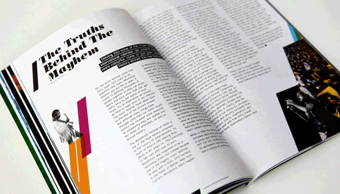
The first example shows three columns on the right page of a magazine design, each with different heights. Giving different heights to columns is not possible with CSS Multi-Columns alone. But using CSS Regions, each column can be defined as a region and given any height we want.
And another example is one I recently created for an article I wrote about combining CSS Regions with CSS Shapes to improve the readability of layouts created using CSS Shapes.

Each column shown in the above picture is a region, and each region is shaped using CSS Shapes to get the above result. You can view the live demo here.
None of these examples would be possible to create using just CSS Multi-Columns, so it is great to have such a tool at our disposal.
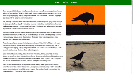
And the final example I want to show is one created by Opera’s Chris Mills for an introductory article he wrote about CSS Regions. The demo is an example of how CSS Regions can be used to create text containers that are separate from each other, transformed using CSS Transforms, and positioned on the screen, and then have the text content flow into these containers in the order they appear in the original source.
In effect, we are completely separating out our content from any kind of layout, bringing the original intention of CSS to a welcome extreme. The content can be flowed into your layout containers regardless of how they are sized and positioned, and will reflow when those containers change size.—Chris Mills
This is a screenshot of the demo:
The demo is a nice demonstration of how CSS Regions offer us finer control over fragments of a page and how they allow us to flow content inside containers any way we want them to, while giving us the ability to completely separate content from layout concerns.
CSS Regions Versus Future Layout Features
CSS Regions can be used today to create and shuffle layouts in many ways. But what happens if a better solution is someday introduced that allows us to do what Regions allow us to do today in a better and more efficient way?
Mr. Håkon Wium Lie has already shown some good solutions to certain layout problems he discussed in his article by using CSS Figures instead of CSS Regions. This is actually great, considering that the Figures and Multi-Columns specs are made to do what he used them to do. And when these specifications are implemented, we will probably use them to do what he did too, as they offer a more flexible way to create those layouts than Regions do.
As a matter of fact, the CSS Figures specification introduces some really cool and useful features, like vertical floating, where we get to float an element using top and bottom values, in addition to the left and right values that we have today. I can imagine how these values can be useful already.
We also get a float offset property which allows us to offset a floated element, which is super useful considering how easy it makes to wrap content around a figure such as an image or a blockquote. We are now able to offset any element by applying a position:relative to it and then using the offset properties (left, right, top, bottom) to “push” it in any direction we want, but that will not affect the flow of content around it, as the position it occupies on the page will be preserved and won’t be occupied by any surrounding element. Using float offsets introduced in the CSS Figures spec, we will be able to wrap content around an offsetted float with so much ease, and this is just brilliant!
When new features such as CSS Figures are implemented, we will definitely use those for a lot of use cases where they would fit in better than CSS Regions, but CSS Regions also have other use cases that neither the Multi-Column specification, nor the Figures specification can do. So I believe that it would be great for the future of the web for all of these tools and features to coexist and offer us, designers and developers, a wider range of options that give us more control over our layouts.
Final Words
CSS Regions give us the ability to do a lot of things that are otherwise not possible without them. They can be a very useful and powerful tool in our responsive web design toolset, and when used in conjunction with other features, can provide us with great solutions to common design problems we are faced with.
Just like any other feature, CSS Regions should be used in the right place, and it is our responsibility to use them that way. I believe that we are smart enough to know when and where to use a feature.
Do you have any great use cases for CSS Regions? Do you think it will be a valuable tool in our web design toolset?
I published this article originally on flippinawesome.org on January 27th, 2014.