On Switching from HEX & RGB to HSL
A couple of weeks ago I tweeted about a feature that I didn’t know existed in VS Code: the visual color editor that pops up when you hover over color values in a style sheet.
In the context of the tweet I mentioned that I had converted all the colors on my site from the Hexadecimal and RGB(A) formats to the HSL format. A bunch of folks asked me why I made this switch. This article is my response.
I’ve been using the Hexadecimal and RGB(A) color formats in my CSS for as long as I can remember. But I’ve never found these formats intuitive or easy to read, let alone tweak. I’ve always felt crippled whenever I needed to tweak the colors for contrast, or create colors that work well with other colors. I always resorted to GUIs, which made my workflow less than optimal. Until a while back when I came across a great article in which Marcin Wichary shows how he took advantage of the hsl() function in CSS to create different shades of colors for a dark theme for an app he was working on. That’s when I had an epic facepalm moment: how did I forget about HSL?!
I knew the hsl() function existed in CSS — heck, I even wrote an entry about it in the Codrops CSS Reference, but I don’t know why I never took advantage of it before now.
When I think about it, I guess it all goes back to my “Use it only when you need it” principle. I only introduce tools into my workflow when they offer great value for my projects. I’ve never given too much thought for the color scheme on my site — especially since I love black and white and have been sticking to them since forever, with one or two highlight colors for links and buttons here and there. So I never really needed a more powerful color system, despite the frustration I had whenever I tweaked the few colors I use on the site.
But with more sections added to the site during the last couple of years, and a few more sections I’m going to add later, and that will have their own set of colors, it became clear to me that color management in the CSS was going to get out of hand, and that I needed a more intuitive and sensible way to choose and tweak colors, this was particularly true because I also want to offer a couple of themes to make my site’s UI friendlier. Enter HSL.
HSL == Hue, Saturation, Lightness
In CSS, an HSL color can be expressed using the hsl() function:
color: hsl(33, 80%, 50%);The first parameter is the hue value, the second parameter is the saturation value, and the third is the lightness value. The function also has another variation: hsla(), which takes the same parameters, with an addition fourth parameter that controls the opacity of the color.
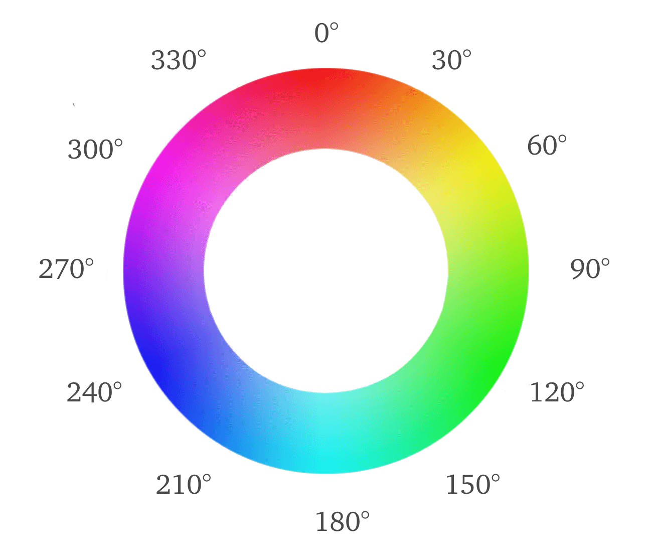
The best way to understand HSL if you’re not familiar with it is to consult a color wheel.

Hue
The Hue determines what color of the rainbow something is. The value of the hue is the angle of that color on the color wheel. Red starts at 0 degrees, and the rest of the colors follow along the 360 degrees. (You don’t need to specify the unit of the angle in the hsl() function because it is the default.)
Saturation
Colors can be vivid (rich) or dull. The less of the color there is, the more is turns into a shade of grey, depending on the hue and lightness you start with. Somewhere along the line — between the 100% pure hue and the shade of grey, you can see tinted grey, or, if you look at it the other way around, you see a dull hue. Saturation controls how vivid or dull a color is.
Lightness
HSL works by tinting colors with white, which is also similar to how I used to deal with colors back in my days of watercolor painting. If I wanted to make a color lighter, I’d add white. If I wanted to make it darker, I’d add black. This is how the Lightness parameter works, where going below 50% means you’re starting to add black to the hue and creating a new shade of the color, and going above 50% means you’re adding white, creating a tint.
In color theory, a tint is the mixture of a color with white, which increases lightness, while a shade with black, which reduces lightness. A tone is produced either by the mixture of a color with grey, or by both tinting and shading.[1] Mixing a color with any neutral color (including black, gray and white) reduces the chroma, or colorfulness, while the hue remains unchanged.
— Wikipedia
When you define a color in the HSL format, you pick a color in the form of an angle between 0 and 360. Setting the saturation to 100% and the lightness to 50% you get the purest form of that color. Tweaking the color from there on becomes very intuitive.
HSL and Color Harmonies
Using the color wheel to pick colors has many benefits. One of the main advantages of HSL is that creating color harmonies becomes a piece of cake.
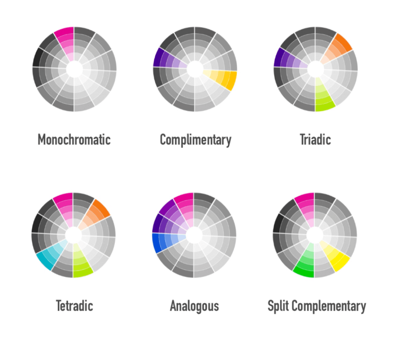
Complementary colors are located across from one another on the wheel. So if you start with a color and you want to get its complimentary one, all you need to do in CSS is to add 180° to the value of the Hue:
--primary-color:       hsl(257, 26%, 42%);
--complementary-color: hsl(437, 26%, 42%); // 257 + 180 === 257 - 180
The first thing you’ll probably notice in this example is that my complementary hue angle is greater than 360. Guess what? That’s okay, because HSL is smart enough to loop around the color wheel again. You could also have deducted 180 degrees from the primary hue if you didn’t want to add them.

There are many color harmonies (or schemes) as the image above shows. Similar to what we did above with the complimentary scheme, triadic color schemes can be created by adding (or subtracting) 120°. You can also create analogous color combinations with 30° separating the hues. You can also create monochromatic harmonies easily, with one main hue and then tweaking the lightness to get different tints and shades of that hue. The sky is the limit.
The Switch
The switch itself was super quick. I installed a Sublime Text plugin that converts all of my colors to HSL format in a fraction of a second. That’s all it took. Yay 🙌🏻 to useful tools (and to the brilliant people who make them).
HSL + CSS Custom Properties = 💜
CSS Custom Properties (a.k.a CSS Variables) are the best when it comes to creating multiple themes that can be applied on the fly. They:
- are live variables, available at run time. This makes it possible to change and update the values of these variables on the fly, and the changes will be reflected on the page without refreshing it.
- can be inlined in a style attribute, in a style tag, or updated within a style sheet — all live, just like any other CSS property. This means that you don’t need to request a separate style sheet for the different themes.
You can define a set of colors for each theme and then “activate” the theme by updating the value of a data attribute on the root element. Or you could use class names, if you prefer. The value of the theme data attribute is updated upon user’s interaction with a set of inputs specifically created for changing the theme.
You can use a CSS Variables as a value inside another variable. And you can use CSS Variables in combination with the calc() function. This, combined with hsl(), wields a lot of power when it comes to creating, maintaining and tweaking site-wide color themes.
Marcin already showed a great example in his article that I recommend checking out if you haven’t already. I imagine creating different themes leveraging CSS Variables and HSL could look something like this:
html {
    /* ...some styles... */
    --hue: 257;
    --complimentary-hue: calc( var(--hue) - 180);

    /* The styles here are mostly random. Don’t judge. */
    --background: hsl(var(--hue), 26%, 42%);
    --background-dark: hsl(var(--hue), 26%, 28%);
    --button-background: hsl(var(--complimentary-hue), 26%, 55%);
    /* etc. */
}

html[data-theme='green'] {
  --hue: 128;
}

html[data-theme='pink'] {
  --hue: 313;
}
You can organize the code in any and many different ways, all depending on your own project and needs. This is just a simple example showing how HSL can be used to create more maintainable and readable color swatches and relationships, especially when combined with CSS Variables. I’ll come back with another article and a real life example another time. 😌
Useful Resources
-
Marcin Wichary’s Dark Theme in a Day
Final Words
I’ve been meaning to create a living style guide for my site for over a year now. But most of us know that our own Web sites usually sit on the shelf with a lower priority compared to client projects, and this is particularly true for freelancers. We’d rather be spending the time working on client projects and making a living. But what we tend to neglect is the fact that our sites are our online home, the place clients visit to enquire about work, and it’s important that they reflect the kind of quality and organization that we promise to offer our clients.
I’m currently working on cleaning up the code and styles of my site, organizing the CSS files by creating componentized styles, and, eventually, working my way into creating a living style guide.
With HSL, I now feel like I have real control over color management — every aspect of it, from choosing colors to controlling how they relate to and work with each other. Creating color relationships and swatches for theming has never been more intuitive or as easy for me.
I’ve recently learned that Github also uses HSL as their color format. I really like the tip of how they moved from a dull, grey-grey into a more blue-tinted grey, which is made possible by choosing the blue hue you want and then desaturating it enough to get to the level of grey you want out of it, and decreasing its lightness to darken it as needed.
HSL is a very powerful color format, especially when combined with other CSS features like CSS Variables. And I intend to take full advantage of it from now on. I’ll share any special tips or tricks that I learn or come up with in my process as I go.
Cheers,
Sara