Understanding SVG Coordinate Systems and Transformations (Part 3) — Establishing New Viewports
At any point in an SVG drawing, you can establish new viewports and user coordinate systems by either nesting svgs or using elements such as the symbol element, among others. In this article we’re going to have a look at how we can do that and how this can be useful for controlling SVG elements and making them more flexible (and/or fluid).
This is the third and last article in a series of articles about SVG coordinate systems and transformations. In the first article, I covered everything you need to know to understand the basics of SVG coordinate systems; more specifically, the SVG viewport, and the viewBox and preserveAspectRatio attributes. In the second article, you can find everything you need to know about how SVG system transformations work.
- Understanding SVG Coordinate Systems & Transformations (Part 1) – The viewport,
viewBox, andpreserveAspectRatio - Understanding SVG Coordinate Systems & Transformations (Part 2) – The
transformAttribute - Understanding SVG Coordinate Systems & Transformations (Part 3) – Establishing New Viewports
Throughout this article, I’m going to assume that you read the first part of this series about SVG viewports and the viewBox and preserveAspectRatio attributes. You don’t need to have read the second one about coordinate system transformations to follow along this article.
Nesting svg Elements
In the first part we talked about how the <svg> element establishes a viewport for the content of the SVG canvas. At any point in an SVG drawing, you can establish a new viewport into which all contained graphics is drawn by including an <svg> element inside another <svg>. By establishing a new viewport, you also implicitly establish a new viewport coordinate system and a new user coordinate system.
For example, suppose you have an <svg> and some content inside it:
<svg xmlns="http://www.w3.org/2000/svg" xmlns:xlink="http://www.w3.org/1999/xlink">
	<!-- some SVG content -->
    <svg>
    	<!-- some inner SVG content -->
    </svg>
<svg>
The first thing to note here is that the inner <svg> element does not require specifying a namespace xmlns on it because it is assumed to be the same namespace as the outer <svg>'s namespace. Of course, even the outer <svg> does not require a namespace if it is embedded inline in an HTML5 document.
You can use a nested SVG to group elements together and then position them inside the parent SVG. Now, you can also group elements together and position them using the <g> group—by wrapping elements inside a group <g> element, you can position them on the canvas by using the transform attribute. However, an <svg> element has certain advantages over using <g>. Positioning using x and y coordinates is, in most cases, more convenient than using transforms. Moreover, an <svg> element accepts width and height attributes, which the <g> element doesn’t. That said, the <svg> may not always be needed or necessary, because it leads to the creation of a new viewport and coordinate systems, which you may not need or want.
By specifying a width and height to the <svg>, you restrict the content inside it to the bounds of the viewport that is defined by the x, y, width, and height attributes. Any content that lies beyond these bounds will be clipped.
If you don’t specify x and y attributes, they’re assumed to be zero. If you don’t specify height and width attributes, the <svg> will be 100% the width and height of its parent SVG.
Moreover, specifying a user coordinate system other than the default one will also affect the content inside the inner <svg>, too.
Percentage values specified for elements inside the inner <svg> will be calculated relative to it, not relative to the outer svg. Percentage values specified on the inner itself <svg> will be calculated relative to the outer svg. For example, the following will result in the inner SVG being equal to 400 units, and the rectangle inside it will be 200 units:
<svg width="800" height="600">
	<svg width="50%" ..>
		<rect width="50%" ... />
	</svg>
</svg>
If the width of the outermost <svg> is set to 100% (for example, if it is embedded inline in a document and you want it to be fluid), then the inner SVG will expand and shrink as necessary to maintain a width that is half of that of the outer SVG – this is powerful.
Nested SVGs are particularly useful for adding flexibility and fluidness to elements on the SVG canvas. We know that, using viewBox values and preserveAspectRatio, we can already create responsive SVGs. The outermost <svg>'s with can be set to 100% to make sure it expands and shrinks as its container (or the page) grows or shrinks. Then, by using viewBox values and preserveAspectRatio, we can make sure that the SVG canvas also responds to the changes in the viewport (outermost svg). I’ve written about responsifying SVGs in my CSSConf talk slides. You can check the technique out here.
However, when we do responsify an SVG like that, the entire canvas with all the elements drawn on it will respond and change simultaneously. But sometimes, you may want to have only one element inside the graphic to be flexible, while keeping others “fixed” in position and/or size. This is where nested svgs can be useful.
An svg element can have its own coordinate system independent of its parent, and it can have its own viewBox and preserveAspectRatio attributes that allow you to size and position the content inside it any way you want.
So, in order to make one element flexible, we can wrap it in an <svg> element, and give that svg a flexible width so that it adjusts to the width of the outermost SVG, and then specify preserveAspectRatio="none" so that the graphic inside it also stretches and shrinks with the container width. (Note that svgs can be nested to many levels, but in order to keep things simple, I’m nesting only one level deep in this article.)
To demonstrate how nested svgs can be useful, let’s look at some examples.
Example
Suppose we have the following SVG:
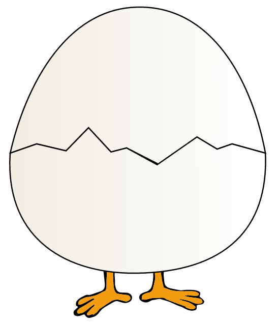
The above SVG is responsive. Resizing the screen will result in the entire SVG graphic responding as necessary. The following screenshot shows the result of shrinking the page, and how the SVG becomes smaller. Notice how the contents of the SVG maintain all their initial positions with respect to the SVG viewport and with respect to each other.
Using nested SVGs, we’re going to change that. We can specify a position for individual elements inside the SVG relative to the SVG’s viewport, so that as the SVG viewport size changes (i.e the size of the outermost svg changes), the elements respond independently of each other.
Note that, at this point, it is necessary that you be familiar with how the SVG viewport, `viewBox`, and `preserveAspectRatio` work.
We’re going to create an effect such that, when the screen is resized, the upper part of the egg is going to be moved so that the cute chicken inside it peeks out, as shown in the following image:
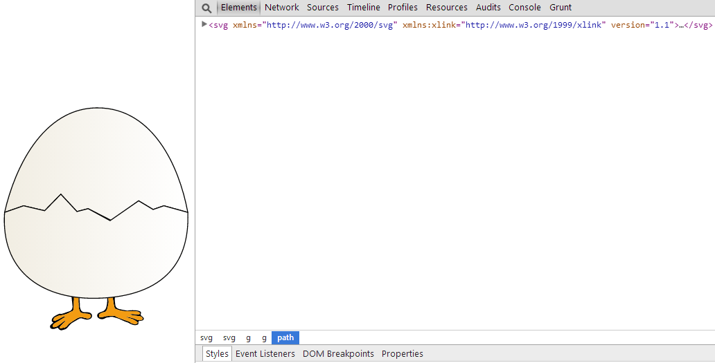
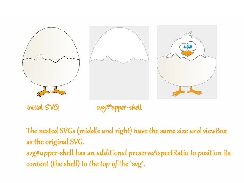
In order to get that effect, the egg’s upper part has to be separated from the rest by wrapping it inside an svg of its own. This svg wrapper will get an ID upper-shell.
Then, we’re going to make sure the new svg#upper-shell has the same height and width as the outer SVG. This can be achieved by either specifying width="100%" height="100%" on the svg, or by not specifying any height and width at all. If no width and height are specified on the inner SVG, it automatically expands to 100% the width and height of the outer SVG.
If no width and height are specified on the inner SVG, it automatically expands to 100% the width and height of the outer SVG.
And finally, to make sure the upper shell is “lifted” up or positioned at the top center of the svg#upper-shell, we’re going to use the appropriate preserveAspectRatio value which makes sure the viewBox is positioned at the top center of the viewport—the value is xMidYMin.
The code for the SVG graphic becomes:
<svg version="1.1" xmlns="http://www.w3.org/2000/svg" xmlns:xlink="http://www.w3.org/1999/xlink">
    <!-- ... -->
    <svg viewBox="0 0 315 385" preserveAspectRatio="xMidYMid meet">
        <!-- the chicken illustration -->
        <g id="chicken">
            <!-- ... -->
        </g>
        <!-- path forming the lower shell -->
        <path id="lower-shell" fill="url(#gradient)" stroke="#000000" stroke-width="1.5003" d="..."/>
    </svg>

    <svg id="upper-shell" viewBox="0 0 315 385" preserveAspectRatio="xMidYMin meet">
        <!-- path forming the upper shell -->
        <path id="the-upper-shell" fill="url(#gradient)" stroke="#000000" stroke-width="1.5003" d="..."/>
    </svg>
</svg>
I've stripped out the parts that relevant to the article like the gradient used to color the egg shells and the paths forming the shapes, just for the sake of brevity in the example code.
At this point, note that the viewBox specified on the nested svg#upper-shell has the same value as that of the outermost svg (before it was removed). The reason we used the same viewBox value is so that, the SVG maintains its original look on big screens.
So, the way this goes is: we start with an SVG—in our case, it’s the image of a cracked egg with a chicken hidden inside it.
Then, we create another “layer” and promote the upper shell to it—this layer is created by using a nested svg.
The nested svg has the same dimensions as the outer svg and the same viewBox.
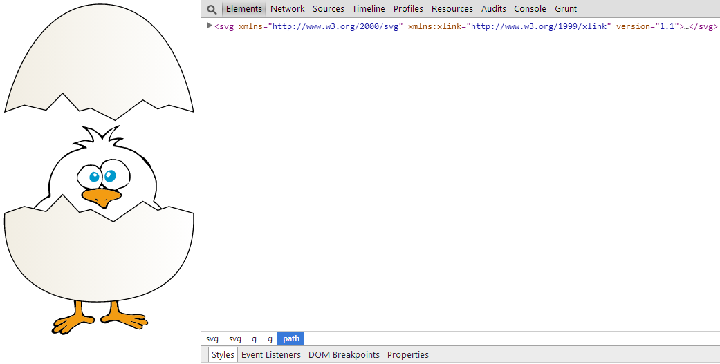
And finally, the viewBox of the inner SVG is set to “stick” to the top of the viewport no matter what the screen size is—this makes sure that, when the screen size is narrow and the SVG is elongated, the upper shell will be lifted upwards, thus showing the chicken “behind” it on the canvas.
Once the screen size shrinks, the SVG is elongated, and the viewBox containing the upper shell is positioned at the top of the viewport using preserveAspectratio="xMidYMin meet".
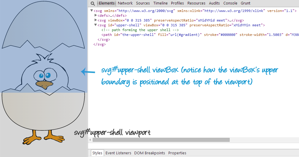
svg. The translucent orange box shows the viewBox inside the svg—it is positioned at the top center of the viewport using preserveAspectratio="xMidYMin meet".
Click on the following button to see the live SVG. Remember to resize your browser to see the SVG adapt.
Nesting or “layering” SVGs allows you to position parts of the SVG relative to the changing viewport, while maintaining the elements’ aspect ratio. So the image adapts without distorting the elements inside it.
If we wanted the entire egg to come off the chicken, we could always wrap the lower shell in an svg layer of its own, having the same viewBox, too. Then, to make sure the lower shell moves down and sticks to the bottom center of the viewport, we position it using preserveAspectRatio="xMidYMax meet". The code would look like this:
<svg version="1.1" xmlns="http://www.w3.org/2000/svg" xmlns:xlink="http://www.w3.org/1999/xlink">
    <svg id="chick" viewBox="0 0 315 385" preserveAspectRatio="xMidYMid meet">
        <!-- the chicken illustration -->
        <g id="chick">
            <!-- ... -->
        </g>
    </svg>

    <svg id="upper-shell" viewBox="0 0 315 385" preserveAspectRatio="xMidYMid meet">
        <!-- path forming the upper shell -->
        <path id="the-upper-shell" fill="url(#gradient)" stroke="#000000" stroke-width="1.5003" d="..."/>
    </svg>

    <svg id="lower-shell" viewBox="0 0 315 385" preserveAspectRatio="xMidYMax meet">
        <!-- path forming the lower shell -->
        <path id="the-lower-shell" fill="url(#gradient)" stroke="#000000" stroke-width="1.5003" d="..."/>
    </svg>
</svg>
Each of the svg layers/viewports is equal to 100% the width and height of the outermost svg. So we basically have three clones. Each layer contains an element—the upper shell, the lower shell, or the chick. The viewBox for the three layers is the same, with only the preserveAspectRatio being different.
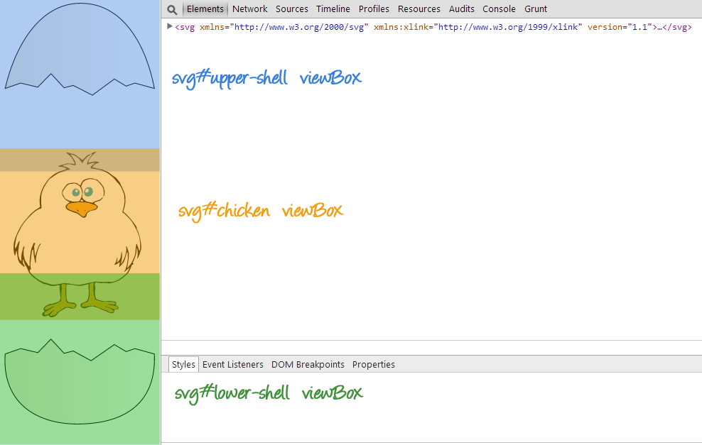
svgs have a 100% height and width value covering the entire outermost viewport. Their viewBoxes are also equal as you can see in the image. Only the position of these viewBoxes is different (specified using preserveAspectRatio).
Of course, in this example I started with a graphic of a chicken hiding inside an egg, and that is revealed when the screen becomes smaller. However, you could do something different: you could start with a graphic on a small screen, that then reveals something new as the screen becomes bigger; i.e as the svg becomes wider and there is more horizontal space to show elements.
You could get a lot more creative, and show and hide elements according to different screen sizes—using media queries—and have the new elements be positioned in a certain way to achieve a certain effect. The sky is the limit here.
Also note that the nested svgs don’t need to have the same height and width as their containing svg; you can specify a height and width and have the content of the svg be limited to and clipped by the boundaries specified by that height and width—it all boils down to what you’re trying to achieve.
Making Elements Fluid Using Nested SVGs
In addition to positioning elements while preserving their aspect ratios, we can use nested svgs allow only certain elements to be fluid—this can be done by not preserving the aspect ratio of these particular elements.
For example, if you want only one element in the SVG to be fluid, you can wrap it in an svg, and use preserveAspectRatio="none" to have that element expand to fill the entire width of the viewport at all times, while maintaining the aspect ratio and positioning of other elements like we did in the previous example.
<svg>
    <!-- ... -->
    <svg viewBox=".." preserveAspectRatio="none">
        <!-- this content will be fluid -->
    </svg>
    <svg viewBox=".." preserveAspectRatio="..">
        <!-- content positioned somewhere in the viewport -->
    </svg>
    <!-- ... -->
</svg>
Jake Archibald created a simple and practical use case for nested SVGs that does exactly that: a simple UI that contains elements positioned at the corners of the outermost svg, maintaining their aspect ratios, and a middle part of the UI is fluid and responds to the change in the svg width by shrinking and expanding with it. You can check his demo out here. Make sure you inspect the code in the dev tools to select and visualize the different viewboxes and svgs used.
Other ways to establish new viewports
svg elements are not the only elements that establish new viewports in SVG. In the following sections, we’re going to go over the other ways to establish new viewports using other SVG elements.
Establishing a new viewport by `use`ing `symbol`
The symbol element defines a new viewport whenever it is instantiated by the use element.
A symbol element can be used by referencing it in the xlink:href attribute of the use element:
<svg>
    <symbol id="my-symbol" viewBox="0 0 300 200">
        <!-- contents of the symbol -->
        <!-- this content is only rendered when `use`d -->
    </symbol>
    <use xlink:href="#my-symbol" x="?" y="?" width="?" height="?">
</svg>
The question marks used as values above are used only to indicate that these values may or may not be specified—if x and y are not specified, they default to zero, and you don’t need to specify a height and width either.
You see, when you use a symbol element, and then inspect the DOM using the dev tools, you will not see the contents of the symbol inside the use tag. The reason for this is that the contents of use are rendered into a shadow tree, which you can inspect if you enable inspecting the shadow DOM in the dev tools.
When the symbol is used, it is deeply cloned into the generated shadow tree, with the exception that the symbol is replaced by an svg. This generated svg will always have explicit values for attributes width and height. If attributes width and/or height are provided on the use element, then these attributes will be transferred to the generated svg. If attributes width and/or height are not specified, the generated svg element will use values of 100% for these attributes.
When thesymbolis used, it is deeply cloned into the generated shadow tree, with the exception that thesymbolis replaced by ansvg.
Because we end up with an svg in the DOM, and because this svg is practically contained in the outer svg where use is used, we’re left with a nested svg situation not very different from the one we talked about in the previous section—the nested svg forms a new viewport. The viewBox for the nested svg is the viewBox specified on the symbol element. (The symbol element accepts a viewBox attribute value. For more information, refer to the article: Structuring, Grouping, and Referencing in SVG – The <g>, <use>, <defs> and <symbol> Elements).
So we now have a new viewport whose dimensions and position can be specified in the use element (x, y, width, height), and whose viewBox value can also be specified in the symbol element. The content of the symbol is then rendered and positioned inside this viewport and viewBox.
And last but not least, the symbol element also accepts a preserveAspectratio attribute value, that allows you to position the viewBox inside the new viewport established by use. Pretty neat, right? You can control the newly created nested svg just like we did in the previous sections.
Dirk Weber has also created a demo that uses nested SVGs and symbol elements to mimic the behavior of CSS border images. You can check his article out here.
Establishing a new viewport by referencing an SVG image in `image`
The image element indicates that the contents of a complete file are to be rendered into a given rectangle within the current user coordinate system. The image element can refer to raster image files such as PNG or JPEG or to files with MIME type of “image/svg+xml”.
An image element that references an SVG file will result in the establishment of a temporary new viewport since the referenced resource by definition will have an svg element.
<image xlink:href="myGraphic.svg" x="?" y="?" width="?" height="?" preserveAspectRatio="?" />The <image> element accepts many attributes, some of these attributes—the ones that are relevant to this article—are x and y position attributes, width and height attributes, and preserveAspectratio.
Normally, an SVG file will contain a root <svg> element; this element may or may not have position and dimensions specified, in addition to a viewBox and a preserveAspectratio value.
When an image element references an SVG image file, the x, y, width and height attributes on the root svg are ignored. Unless the value of preserveAspectRatio on the image element starts with ‘defer’, the preserveAspectRatio attribute on the root element in the referenced SVG image is also ignored. Instead, the preserveAspectRatio attribute on the referencing image element defines how the SVG image content is fitted into the viewport.
The value of the viewBox attribute to use when evaluating the preserveAspectRatio attribute is defined by the referenced content. For content that clearly identifies a viewBox (e.g. an SVG file with the viewBox attribute on the outermost svg element) that value should be used. For most raster content (PNG, JPEG) the bounds of the image should be used (i.e. the image element has an implicit viewBox of ‘0 0 raster-image-width raster-image-height’). Where no value is readily available (e.g. an SVG file with no viewBox attribute on the outermost svg element) the preserveAspectRatio attribute is ignored, and only the translation due to the x & y attributes of the viewport is used to display the content.
For example, if the image element referenced a PNG or JPEG and preserveAspectRatio="xMinYMin meet", then the aspect ratio of the raster would be preserved, the raster would be sized as large as possible while ensuring that the entire raster fits within the viewport, and the top/left of the raster would be aligned with the top/left of the viewport as defined by the attributes x, y, width and height on the image element.
If the value of preserveAspectRatio was ‘none’ then aspect ratio of the image would not be preserved. The image would be fitted such that the top/left corner of the raster exactly aligns with coordinate (x, y) and the bottom/right corner of the raster exactly aligns with coordinate (x+width, y+height).
Establishing a new viewport using `iframe`
An iframe element that references an SVG file establishes new viewport similar to the situation of image element explained above. An iframe element can also have x, y, width, and height attributes, in addition to its own preserveAspectratio.
Establishing a new viewport using `foreignObject`
A foreignObject element creates a new viewport for rendering the content that is within the element.
The foreignObject tag allows you to add non-SVG content into an SVG file. Usually, the contents of foreignObject are assumed to be from a different namespace. For example, you could drop some HTML in the middle of an SVG element.
The foreignObject element accepts attributes, among which are x, y, height, and width, which are used to position the object and size it, creating the bounds used to render the contents referenced inside it.
There is a lot to say about the foreignObject element besides its creation of a new viewport for its content. If you’re interested, you can check the MDN entry or check this practical use case by Christian Schaeffer on The Nitty Gritty Blog.
Wrapping Up
Establishing new viewports and coordinate systems—be that by nesting svgs or another element from the ones mentioned above—allows you to control parts of the SVG that you would otherwise not be able to control the same way.
The entire time that I was working on this article and thinking of demos and use cases, all I kept thinking of is how nesting SVGs can give us finer control and flexibility for when we’re dealing with SVGs. Adaptive SVGs can be created with neat effects, fluid elements inside SVGs that are independent of the other elements on the page are possible, mimicing CSS border images for crispier backgrounds on high-resolution screens, and so much more.
Have you created any interesting examples using nested viewports in SVG? Can you think of more creative examples?
This article concludes the series of “Understanding SVG Coordinate Systems & Transformations”. Next up, we’ll be diving into animations, and more! Stay tuned, and thank you for reading!