Understanding SVG Coordinate Systems and Transformations (Part 1) — The viewport, viewBox, and preserveAspectRatio
SVG elements aren't governed by a CSS box model like HTML elements are. This makes positioning and transforming these elements trickier and may seem—at first glance—less intuitive. However, once you understand how SVG coordinate systems and transformations work, manipulating SVGs becomes a lot easier and makes a lot more sense. In this article we're going to go over three of the most important SVG attributes that control SVG coordinate systems: viewport, viewBox, and preserveAspectRatio.
This is the first in a series of three articles covering the topic of coordinate systems and transformations in SVG.
- Understanding SVG Coordinate Systems & Transformations (Part 1) – The viewport,
viewBox, &preserveAspectRatio - Understanding SVG Coordinate Systems & Transformations (Part 2) – The
transformAttribute - Understanding SVG Coordinate Systems & Transformations (Part 3) – Establishing New Viewports
For the sake of visualizing the concepts and explanations in the article even further, I created an interactive demo that allows you to play with the values of the viewBox and preserveAspectRatio attributes.
Check the interactive demo out.
The demo is the cherry on top of the cake, so do make sure you come back to read the article if you check it out before you do!
The SVG Canvas
The canvas is the space or area where the SVG content is drawn. Conceptually, this canvas is infinite in both dimensions. The SVG can therefore be of any size. However, it is rendered on the screen relative to a finite region known as the viewport. Areas of the SVG that lie beyond the boundaries of the viewport are clipped off and not visible.
The viewport
The viewport is the viewing area where the SVG will be visible. You can think of the viewport as a window through which you can see a particular scene. The scene may be entirely or partially visible through that window.
The SVG viewport is similar to the viewport of the browser you’re viewing this page through. A web page can be of any size; it can be wider than the viewport’s width, and is in most cases also longer than the viewport’s length. However, only portions of a web page are visible through the viewport at a time.
Whether or not the entire SVG canvas or part of it is visible depends on the size of that canvas* and the value of the preserveAspectRatio attribute. You don't have to worry about these now; we'll talk about them further in more detail.
You specify the size of the viewport using the width and height attributes on the outermost <svg> element.
<!-- the viewport will be 800px by 600px -->
<svg width="800" height="600">
	<!-- SVG content drawn onto the SVG canvas -->
</svg>
In SVG, values can be set with or without a unit identifier. A unitless value is said to be specified in user space using user units. If a value is specified in user units, then the value is assumed to be equivalent to the same number of “px” units. This means that the viewport in the above example will be rendered as a 800px by 600px viewport.
You can also specify values using units. The supported length unit identifiers in SVG are: em, ex, px, pt, pc, cm, mm, in, and percentages.
Once the width and height of the outermost SVG element are set, the browser establishes an initial viewport coordinate system and an initial user coordinate system.
The initial coordinate system
The initial viewport coordinate system is a coordinate system established on the viewport, with the origin at the top left corner of the viewport at point (0, 0), the positive x-axis pointing towards the right, the positive y-axis pointing down, and one unit in the initial coordinate system equals one “pixel” in the viewport. This coordinate system is similar to the coordinate system established on an HTML element with a CSS box model.
The initial user coordinate system is the coordinate system established on the SVG canvas. This coordinate system is initially identical to the viewport coordinate system—it has its origin at the top left corner of the viewport with the positive x-axis pointing towards the right, the positive y-axis pointing down. Using the viewBox attribute, the initial user coordinate system—also known as the current coordinate system, or user space in use—can be modified so that it is not identical to the viewport coordinate system anymore. We’ll talk about modifying it in the next section.
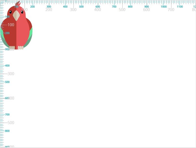
For now, we won’t specify a viewBox attribute value. The user coordinate system of the SVG canvas is identical to that of the viewport.
In the following image, the viewport coordinate system “ruler” is grey, and that of the user coordinate system (the viewBox) is blue. Since they are both identical at this point, the two coordinate systems overlap.
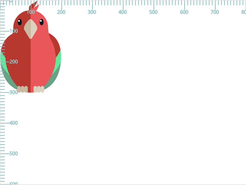
The parrot in the above SVG has a bounding box that is 200 units (200 pixels in this case) in width and 300 units in height. The parrot is drawn on the canvas based on the initial coordinate system.
A new user space (i.e., a new current coordinate system) can also be established by specifying transformations using the transform attribute on a container element or graphics element. We'll talk about transformations in the second part of this article, and then in more details in the third and last part.
The viewBox
I like to think of the viewBox as the “real” coordinate system. After all, it is the coordinate system used to draw the SVG graphics onto the canvas. This coordinate system can be smaller or bigger than the viewport, and it can be fully or partially visible inside the viewport too.
In the previous section, this coordinate system—the user coordinate system—was identical to the viewport coordinate system. The reason for that is that we did not specify it to be otherwise. That’s why all the positioning and drawing seemed to be done relative to the viewport coordinate system. Because once we created a viewport coordinate system (using width and height), the browser created a default user coordinate system that is identical to it.
You specify your own user coordinate system using the viewBox attribute. If the user coordinate system you choose has the same aspect ratio (ratio of height to width) as the viewport coordinate system, it will stretch to fill the viewport area (we’ll talk examples in a minute). However, if your user coordinate system does not have the same aspect ratio, you can use the preserveAspectRatio attribute to specify whether or not the entire system will be visible inside the viewport or not, and you can also use it to specify how it is positioned inside the viewport. We’ll get into details and lots of examples for this case in the next section. In this section, we’ll stick to examples where the aspect ratio of the viewBox matches that of the viewport—in these examples, preserveAspectRatio has no effect.
Before we get into the examples, we’ll go over the syntax of viewBox.
The viewBox syntax
The viewBox attribute takes four parameters as a value: <min-x>, <min-y>, width and height.
viewBox = <min-x> <min-y> <width> <height>The <min-x> and <min-y> values determine the upper left corner of the viewbox, and the width and height determine the width and height of that viewBox. Note here that the width and height of the viewBox need not be the same as the width and height set on the parent <svg> element. A negative value for <width> or <height> is invalid. A value of zero disables rendering of the element.
Note that the width of the viewport can also be set in CSS to any value. For example, setting width: 100% will make the SVG viewport fluid in a document. Whatever value of the viewBox, it will then be mapped to the computed width of the outer SVG element.
An example of setting viewBox would look like the following:
<!-- The viewbox in this example is equal to the viewport, but it can be different -->
<svg width="800" height="600" viewbox="0 0 800 600">
	<!-- SVG content drawn onto the SVG canvas -->
</svg>
If you’ve read about the viewBox somewhere before, you may have come across a few definitions saying that you can use the viewBox attribute to transform the SVG graphic by scaling or translating it. This is true. I’m going to go further and say that you can even crop the SVG graphic using viewBox.
The best way to understand the viewBox and differentiate it from the viewport is by visualizing it. So let’s start with some examples. We’ll start with examples where the aspect ratio of the viewbox is the same as the aspect ratio of the viewport, so we won’t need to dig into preserveAspectRatio yet.
viewBox with aspect ratio equal to the viewport's aspect ratio
We’ll start with a simple example. The viewbox in this example will be half the size of the viewport. We won’t change the origin of the viewbox in this one, so both <min-x> and <min-y> will be set to zero. The width and height of the viewbox will be half the width and height of the viewport. This means that we’re preserving the aspect ratio.
<svg width="800" height="600" viewbox="0 0 400 300">
	<!-- SVG content drawn onto the SVG canvas -->
</svg>
So, what does viewbox="0 0 400 300" exactly do?
- It specifies a specific region of the canvas spanning from a top left point at (0, 0) to a point at (400, 300).
- The SVG graphic is then cropped to that region.
- The region is scaled up (in a zoom-in-like effect) to fill the entire viewport.
- The user coordinate system is mapped to the viewport coordinate system so that—in this case—one user unit is equal to two viewport units.
The following image shows the result of applying the above viewbox to the <svg> canvas in our example. The grey units represent the viewport coordinate system, and the blue coordinate system represents the user coordinate system established by the viewBox.
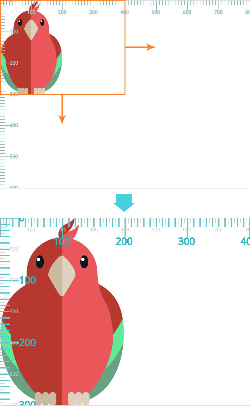
Anything you draw on the SVG canvas will be drawn relative to the new user coordinate system.
I like to visualize the SVG canvas with a viewBox the same way as Google maps. You can zoom in to a specific region or area in Google maps; that area will be the only area visible, scaled up, inside the viewport of the browser. However, you know that the rest of the map is still there, but it's not visible because it extends beyond the boundaries of the viewport—it's being clipped out.
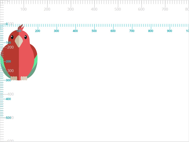
Now let’s try changing the <min-x> and <min-y> values. We’ll set both to 100. They can be any number you want. The width and height ratio will also be the same as width and height ratio of the viewport.
<svg width="800" height="600" viewbox="100 100 200 150">
	<!-- SVG content drawn onto the SVG canvas -->
</svg>
The effect of applying viewBox="100 100 200 150" is also a crop effect like the one in the previous example. The graphic is cropped and scaled up to fill the entire viewport area.
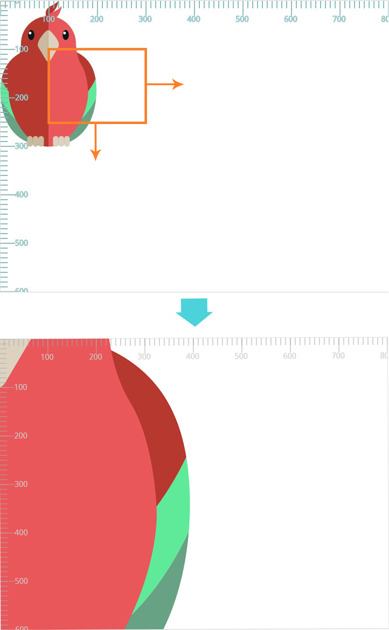
Again, the user coordinate system is mapped to the viewport coordinate system—200 user units are mapped to 800 viewport units so that every user unit is equal to four viewport units. This results in a zoom-in effect like the one you can see in the above screenshot.
Also note, at this point, that specifying non-zero values for the <min-x> and <min-y> values has a transformation effect on the graphic; more specifically, it is as though the SVG canvas was translated by 100 units to the top and 100 units to the left (transform="translate(-100 -100)").
Indeed, as the specification states, the effect of the
.viewBox attribute is that the user agent automatically supplies the appropriate transformation matrix to map the specified rectangle in user space to the bounds of a designated region (often, the viewport)
This is just a fancy way of saying what we already mentioned before: the graphic is cropped and then scaled to fit into the viewport. The spec then goes on to add a note: in some cases the user agent will need to supply a translate transformation in addition to a scale transformation. For example, on an outermost svg element, a translate transformation will be needed if the
viewBox attributes specifies values other than zero for <min-x> or <min-y>.)
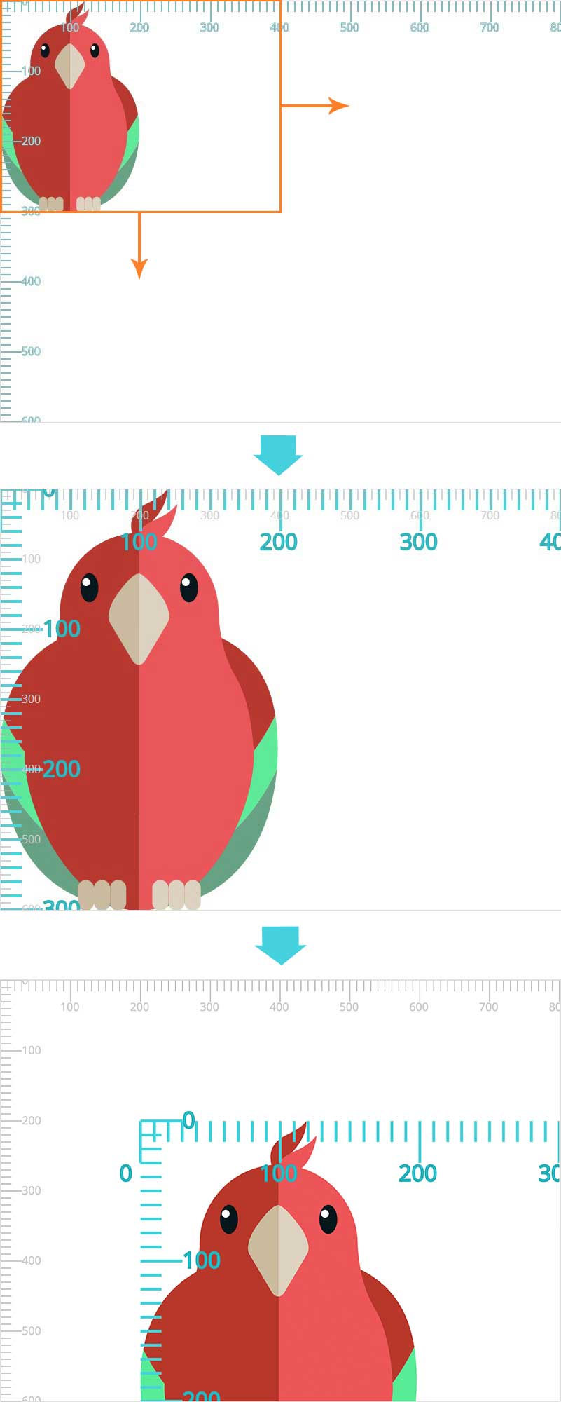
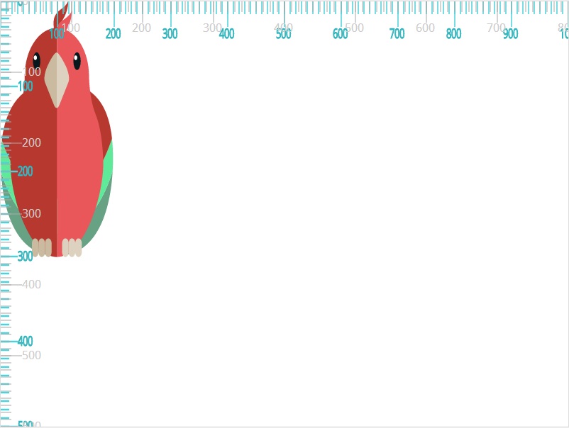
To demonstrate the translation transformation even better, let’s try applying negative values (-100) to <min-x> and <min-y>. The translation effect would be then similar to transform="translate(100 100)"; meaning that the graphic will be translated to the bottom and to the right after being cropped and scaled. If were to revisit the second to last example with a crop size of 400 by 300, and then add the new negative <min-x> and <min-y> values, this would be our new code:
<svg width="800" height="600" viewbox="-100 -100 400 300">
	<!-- SVG content drawn onto the SVG canvas -->
</svg>
The result of applying the above viewBox transformation to the graphic is shown in the following image:
Note that, unlike the transform attribute, the automatic transformation that is created due to a viewBox does not affect the x, y, width and height attributes on the element with the viewBox attribute. Thus, in the example above which shows an svg element which has attributes width, height and viewBox, the width and height attributes represent values in the coordinate system that exists before the viewBox transformation is applied. You can see this in the above examples as the initial (grey) viewport coordinate system remains unaffected even after using the viewBox attribute on the <svg>.
On the other hand, like the transform attribute, it does establish a new coordinate system for all other attributes and for descendant elements. You can also see that in the above examples as the user coordinate system established is a new one—it does not remain as the initial user coordinate system which was identical to the viewport coordinate system before the viewBox was used. And any descendants of the <svg> will be positioned and sized in the new user coordinate system, not the initial one.
Our last viewBox example is similar to the previous ones, but instead of cropping the canvas, we’re going to extend it inside the viewport and see how it affects the graphic. We’re going to specify a viewbox with a width and height that are larger than those of the viewport, while also maintaining the aspect ratio of the viewport. We’ll deal with different aspect ratios in the next section.
In this example, we’ll make the viewbox 1.5 times the size of the viewport.
<svg width="800" height="600" viewbox="0 0 1200 900">
	<!-- SVG content drawn onto the SVG canvas -->
</svg>
What will happen now is that the user coordinate system is going to be scaled up to 1200x900. It will then be mapped to the viewport coordinate system so that every 1 unit in the user coordinate system is equal to viewport-width / viewBox-width horizontally, and viewport-height / viewBox-height units vertically in the viewport coordinate system. This means that, in this case, every one x-unit in the user coordinate system is equal to 0.66 x-units in the viewport coordinate system, and every one user y-unit is mapped to 0.66 viewport y-units.
Of course, the best way to understand this is to visualize the result. The viewbox is scaled so that it fits inside the viewport as shown in the following image. And because the graphic is drawn on the canvas based on the new user coordinate system, not the viewport coordinate system, it will look smaller inside the viewport.
viewBox.
So far, all of our examples have been in conformity with the viewport’s height to width aspect ratio. But what happens if the height and width specified in the viewBox have a different aspect ratio than that of the viewport’s? For example, suppose we set the dimensions of the viewbox to be 1000x500. The aspect ratio of height to width is no longer the same as that of the viewport. The result of using viewBox = "0 0 1000 500" in our example looks like the following:
The user coordinate system and hence the graphic is positioned inside the viewport so that:
- The entire viewbox fits inside the viewport.
- The aspect ratio of the viewbox is preserved. The viewbox was not stretched to cover the viewport area.
- THe viewbox is centered inside the viewport both vertically and horizontally.
This is the default behavior. What controls this behavior? And what if we want to change the position of the viewbox inside the viewport? This is where the preserveAspectRatio attribute comes in.
The preserveAspectRatio Attribute
The preserveAspectRatio attribute is used to force a uniform scaling for the purposes of preserving the aspect ratio of a graphic.
If you define a user coordinate system with an aspect ratio different from that of the viewport’s, and if the browser were to stretch the viewbox to fit into the viewport as we’ve seen in previous examples, the difference in aspect ratios will cause the graphic to be distorted in either direction. So if the viewbox in the last example were to be stretched to fill the viewport in both directions, the graphic would look like so:
The distortion is also clearly visible (and unwanted, of course) when using a viewbox value of 0 0 200 300, which would be smaller than the dimensions of the viewport. I chose this value in particular so that the viewbox matches the size of the bounding box of the parrot. If the browser were to stretch the graphic to fill the entire viewport, it would look like the so:
The preserveAspectRatio attribute allows you to force uniform scaling of the viewbox, while maintaining the aspect ratio, and it allows you to specify how to position the viewbox inside the viewport if you don’t want it to be centered by default.
The preserveAspectRatio syntax
The official syntax for preserveAspectRatio is:
preserveAspectRatio = defer? <align> <meetOrSlice>?It is usable on any element that establishes a new viewport (we’ll get into these in the next parts of the series).
The defer argument is optional, and is used only when you’re applying preserveAspectRatio to an <image>. It is ignored when used on any other element. Since <image> it outside the scope of this article, we’ll skip the defer option for now.
The align parameter indicates whether to force uniform scaling and, if so, the alignment method to use in case the aspect ratio of the viewBox doesn’t match the aspect ratio of the viewport.
If the align value is set to none, for example:
preserveAspectRatio = "none"The graphic will be scaled to fit inside the viewport without maintaining the aspect ratio, just like we saw in the last two examples.
All other values of preserveAspectRatio force uniform scaling while preserving the viewbox’s aspect ratio, and specify how to align the viewbox inside the viewport. We’ll get into the values of align shortly.
The last argument, meetOrSlice is also optional, and it defaults to meet. This argument specifies whether or not the entire viewBox should be visible inside the viewport. If provided, it is separated from the align parameter by one or more spaces. For example:
preserveAspectRatio = "xMinYMin slice"These values may seem foreign at first. To make understanding them easier and make them more familiar, you can think of the meetOrSlice value as being similar to the background-size values contain and cover; they work pretty much the same. meet is similar to contain, and slice is similar to cover. Here are the definitions and meaning of each value:
- meet (The default value)
-
Scale the graphic as much as possible while maintaining the following two criteria:
- aspect ratio is preserved
- the entire
viewBoxis visible within the viewport
In this case, if the aspect ratio of the graphic does not match the viewport, some of the viewport will extend beyond the bounds of the
viewBox(i.e., the area into which theviewBoxwill draw will be smaller than the viewport). (See the last example of The viewBox section.) In this case, the boundaries of the `viewBox` are contained inside the viewport such that the boundaries *meet*.This value is similar to
background-size: contain. The background image is scaled as much as possible while preserving its aspect ratio and making sure it fits entirely into the background painting area. If the aspect ratio of the background is not the same as that of the element it is being applied to, parts of the background painting area will not be covered by the background image. - slice
-
Scale the graphic so that the
viewBoxcovers the entire viewport area, while maintaining its aspect ratio. TheviewBoxis scaled just enough to cover the viewport area (in both dimensions), but it is not scaled any more than needed to achieve that. In other words, it is scaled to the smallest size such that the width and height of theviewBoxcan completely cover the viewport.In this case, if the aspect ratio of the
viewBoxdoes not match the viewport, some of theviewBoxwill extend beyond the bounds of the viewport (i.e., the area into which theviewBoxwill draw is larger than the viewport). This will result in part of the `viewBox` being *sliced off*.You can think of this as being similar to
background-size: cover. In the case of a background image, the image is scaled while preserving its intrinsic aspect ratio (if any), to the smallest size such that both its width and its height can completely cover the background positioning area.
So, meetOrSlice is used to specify whether or not the viewBox will be completely contained inside the viewport, or if it should be scaled as much as needed to cover the entire viewport, even if this means that a part of the viewbox will be “sliced off”.
For example, if we were to apply viewBox size of 200x300, and using both the meet and slice values, keeping the align value set to the default by the browser, the result for each value will look like the following:
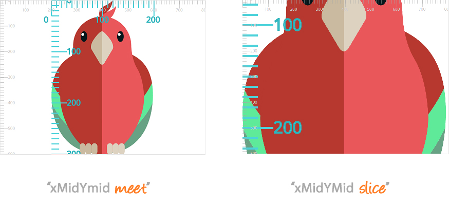
meet parameter vs the slice parameter on a viewBox with an aspect ratio different from that of the viewport's aspect ratio.
The default value for
align is xMidYMid, so, in both cases, the graphic is scaled so that its mid axes align with the mid axes of the viewport.
The align parameter takes one of nine values, or the none value. Any value other than none is used to uniformly scale the image preserving its aspect ratio, and it is also used to align the viewBox inside the viewport.
The align values works similar to the way background-position works when used with percentage values. You can think of the viewBox as being the background image. The way the positioning with align differs from background-position is that instead of positioning a specific point of the viewbox over a corresponding point of the viewport, it aligns specific “axes” of the viewBox with corresponding “axes” of the viewport.
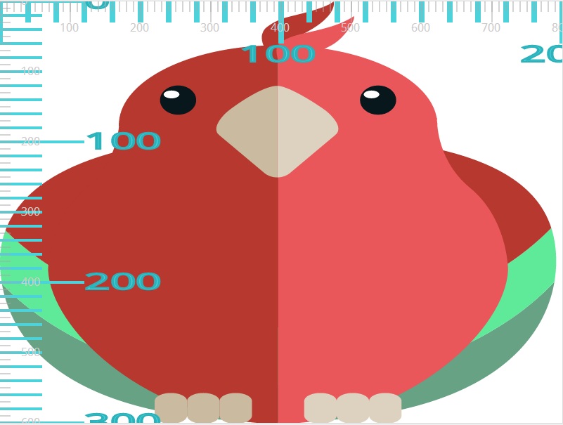
In order to understand the meaning of each of the align values, we’re going to first introduce each of the “axes”.
Remember the <min-x> and <min-y> values of the viewBox? We’re going to use each of these to define the “min-x” axis and “min-y” axis on the viewBox. Additionally, we’re going to define two axes “max-x” and “max-y”, which will be positioned at <min-x> + <width> and <min-y> + <height>, respectively. And last but not least, we’ll define two axes “mid-x” and “mid-y”, which are positioned at <min-x> + (<width>/2) and <min-y> + (<height>/2), respectively.
Did that make things more confusing? If so, have a look at the following image to see what each of those axes represents. In the image, both <min-x> and <min-y> are set to their default 0 values. The viewBox is set to viewBox = "0 0 300 300".
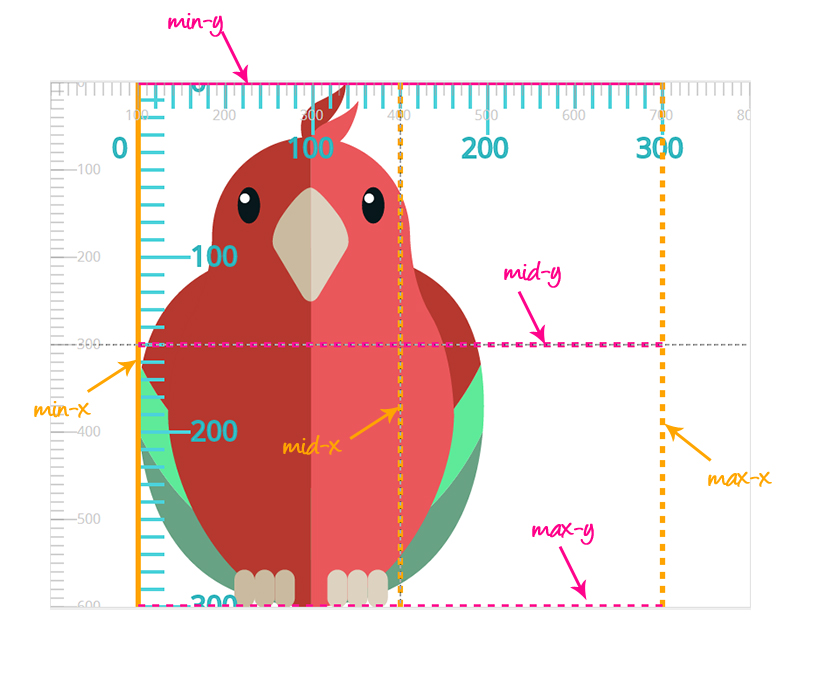
The dashed grey lines in the above image represent the mid-x and mid-y axes of the viewport. We’re going to use those to align the mid-x and mid-y of axes of the viewBox for some values. For the viewport, the min-x value is equal to 0, the min-y value is also 0, the max-x value is equal to the width of the viewBox, the max-y value is equal to its height, and the mid-x and mid-y represent the middle values of the width and height, respectively.
The alignment values are:
- none
-
Do not force uniform scaling. Scale the graphic content of the given element non-uniformly (without preserving aspect ratio) if necessary such that the element’s bounding box exactly matches the viewport rectangle.
In other words, the
viewBoxis stretched or shrunk as necssary so that it fills the entire viewport exactly, disregarding the aspect ratio. The graphic may be distorted.(Note: if
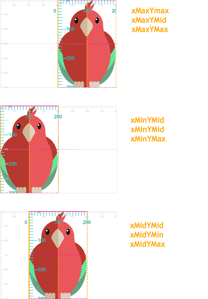
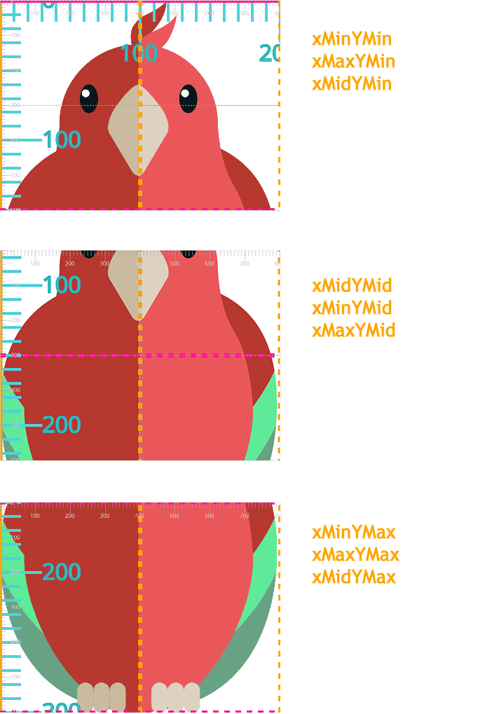
alignis none, then the optionalmeetOrSlicevalue is ignored.) - xMinYMin
-
Force uniform scaling.
Align the
min-xof the element’sviewBoxwith the smallest X value of the viewport.Align the
min-yof the element’sviewBoxwith the smallest Y value of the viewport.Think of this as being similar to
background-position: 0% 0%;. - xMinYMid
-
Force uniform scaling.
Align the
min-xof the element’sviewBoxwith the smallest X value of the viewport.Align the midpoint Y value of the element’s
viewBoxwith the midpoint Y value of the viewport.Think of this as being similar to
background-position: 0% 50%;. - xMinYMax
-
Force uniform scaling.
Align the
min-xof the element’sviewBoxwith the smallest X value of the viewport.Align the
min-y+heightof the element’sviewBoxwith the maximum Y value of the viewport.Think of this as being similar to
background-position: 0% 100%;. - xMidYMin
-
Force uniform scaling.
Align the midpoint X value of the element’s
viewBoxwith the midpoint X value of the viewport.Align the
min-yof the element’sviewBoxwith the smallest Y value of the viewport.Think of this as being similar to
background-position: 50% 0%;. - xMidYMid (The default value)
-
Force uniform scaling.
Align the midpoint X value of the element’s
viewBoxwith the midpoint X value of the viewport.Align the midpoint Y value of the element’s
viewBoxwith the midpoint Y value of the viewport.Think of this as being similar to
background-position: 50% 50%;. - xMidYMax
-
Force uniform scaling.
Align the midpoint X value of the element’s
viewBoxwith the midpoint X value of the viewport.Align the
min-y+heightof the element’sviewBoxwith the maximum Y value of the viewport.Think of this as being similar to
background-position: 50% 100%;. - xMaxYMin
-
Force uniform scaling.
Align the
min-x+widthof the element’sviewBoxwith the maximum X value of the viewport.Align the
min-yof the element’sviewBoxwith the smallest Y value of the viewport.Think of this as being similar to
background-position: 100% 0%;. - xMaxYMid
-
Force uniform scaling.
Align the
min-x+widthof the element’sviewBoxwith the maximum X value of the viewport.Align the midpoint Y value of the element’s
viewBoxwith the midpoint Y value of the viewport.Think of this as being similar to
background-position: 100% 50%;. - xMaxYMax
-
Force uniform scaling.
Align the
min-x+widthof the element’sviewBoxwith the maximum X value of the viewport.Align the
min-y+heightof the element’sviewBoxwith the maximum Y value of the viewport.Think of this as being similar to
background-position: 100% 100%;.
So, using the align and meetOrSlice values of the preserveAspectRatio attribute, you can specify whether or not to scale the viewBox uniformly, how to align it inside the viewport, and whether or not it should be entirely visible inside the viewport.
Sometimes, and depending on the size of the viewBox, some values may have similar results. For example, in the viewBox="0 0 200 300" example from earlier, some alignments are identical using different align values. The value of meetOrSlice is set to meet in this case so that the entire viewBox is contained inside the viewport.
viewBox using different align values. The meetOrSlice value is set to meet.
If we were to change the meetOrSlice value to slice, we’d get different results for different values. Notice how the viewBox is stretched so that it covers the entire viewport. The x-axis is stretched so that the 200 units cover the viewport’s 800 units. In order for this to happen, and to maintain the aspect ratio of the viewbox, the y-axis gets “sliced off” at the bottom, but you can image it extending below the viewport’s height.
viewBox using different align values. The meetOrSlice value is set to slice.
Of course, different viewBox values will also look different from the 200x300 we’re using here. For the sake of brevity, I won’t get into more examples, and I’ll leave you to play with an interactive demo I created to help you better visualize how the viewBox and different preserveAspectRatio values work together when different values are used. You can check the interactive demo out by visiting the link in the next section.
But before we move to that, I just want to note that the mid-x, mid-y, max-x, and max-y values change if the values of the <min-x> and <min-y> change. You can play with the interactive demo and change these values to see how the axes and thus the alignment of the viewBox changes accordingly.
The following image shows the effect of using viewBox = "100 0 200 300" on the position of the alignment axes. We’re using the same example as earlier, but instead of having the <min-x> value be set to zero, we’re setting it to 100. You can set them to any number value you want. Notice how the min-x, mid-x, and max-x axes change. The preserveAspectRatio used here is the default xMidYMid meet, which means that the mid-* axes are aligned with the middle axes of the viewport.
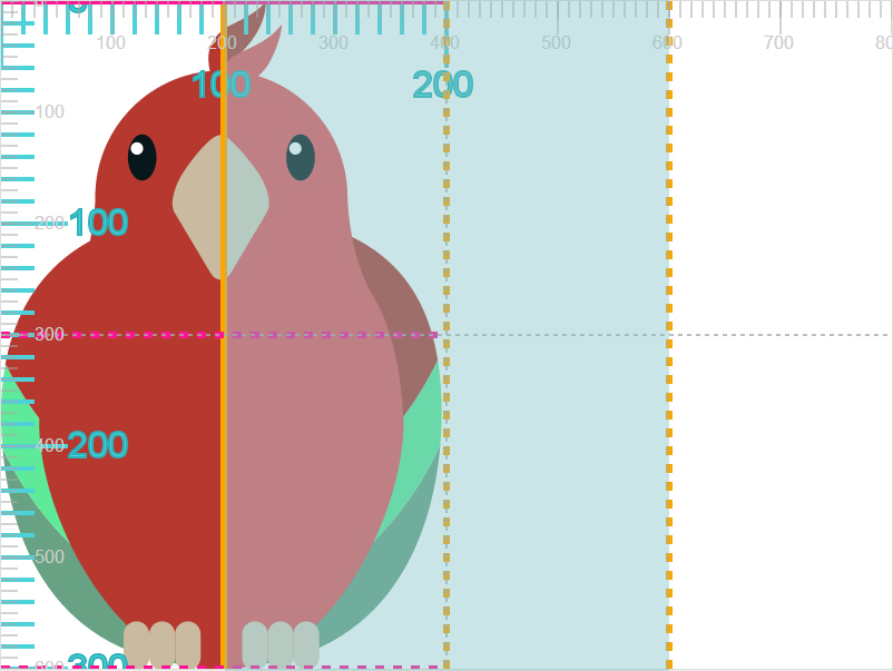
viewBox area after changing the value of `min-x`.
The Interactive Demo
The best way to understand how the viewport, viewBox, and different preserveAspectRatio values work and interact together is by visualizing them.
For that purpose, I created a simple interactive demo that allows you to change the values of these attributes and see the result of the new values live.
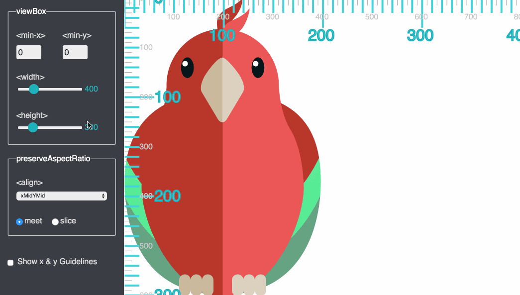
Check the interactive demo out.
I hope you found this article useful in understanding the SVG viewport, viewBox, and preserveAspectRatio concepts. If you’d like to learn more about SVG coordinate systems, like nesting coordinate systems, establishing new ones, and transformations in SVG, stay tuned for the remaining parts of this series. You can subscribe to the RSS (link below) or follow me on Twitter to stay updated. Thank you very much for reading!
The SVG parrot illustration used is a freebie from Freepik.com.
If you enjoyed this article you may also be interested in:
- Structuring, Grouping, and Referencing in SVG – The `g`, `use`, `defs` and `symbol` Elements
- Clipping in CSS and SVG – The
clip-pathProperty and `clipPath` Element