On Designing and Building Toggle Switches
Yesterday I was working on creating the slides and accompanying demos for my upcoming Web Directions Code talk next week. One of the demos I’m creating is a basic proof of concept for a simple switch that is used to switch the theme of a UI from light to dark and vice versa. I liked, and was inspired, by the theme switch in the Medium app, shown below.
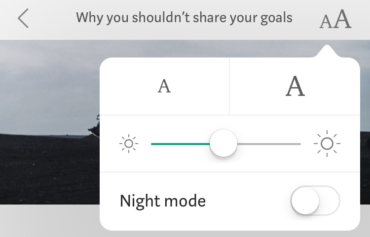
The only difference is that I wanted my switch to explicitly state which theme is currently enabled, so instead of just enabling and disabling a dark theme like the Medium switch, I wanted the user to explicitly switch between Light and Dark options. There’s no particular reason for that other than personal preference. There are other ways to do this as well. How you design it is a personal preference, as long as it works and is easily understandable by users.
As always, I started thinking about how to mark this simple element up, ensuring accessibility is baked right into it from the start. So I started doing my homework and reading and learning all I can about this topic.
It was important for me to make sure this demo is accessible even if it’s just a quick proof of concept for a talk. First of all, because the code for the demo will be public, so I have a bigger responsibility for making sure it’s accessible, because I wouldn’t want to spread any inaccessible code around, especially if there’s a chance people might be using it somewhere else.
Another reason I wanted this to be good is that I’ll probably want to reuse it for other components for my upcoming front-end components workshop.
Start with the markup
As I mentioned above, I started thinking about how to mark this element up ensuring it is accessible to screen readers. That’s when I realized (and it was a “D’oh!” kinda moment) that function and markup depend on how I want the toggle to behave, and on how I want it to look.
It was pretty clear to me: the switch would allow a user to choose between a light theme and a dark theme, with the light theme being the default. It was at this moment that radio buttons came to my mind: two options with one of them checked, and only one option can be checked at a time; that makes a great use case for good old radio buttons.
I knew I would have to choose something different if I wanted the UI to look and behave differently. For example, if I wanted the UI to say “Enable/Disable Dark Mode”, then I wouldn’t need or want to use radio buttons, because I’d only have one option to deal with that could be switched on and off — that would be a great use case for a checkbox or a good old toggle <button>.
Takeaways:
- Style and function are interrelated; so it helps to think about these two simultaneously when designing for accessibility (and designing anything in general, really).
- Always, always start thinking about the markup and accessibility when building components, regardless of how small or simple they seem.
Research
As always, I needed to back my theory and practice up with good research. So I started reading. My first go-to references are Heydon Pickering’s Inclusive Components and The A11y Project.
As it turns out, Heydon had a fantastic article just about Toggle Buttons which I learned a lot from, and my friend Scott O’Hara had an ARIA switch button included in the Patterns section of the A11y Project. So, naturally, I inspected the code for that button and read Heydon’s article to confirm if I’m on the right path. Thankfully, it turns out I was.
Before I move on it’s worth mentioning that this is not an article about how to create accessible toggle switches. Heydon’s article does a fantastic job covering that.
The main points I personally concluded from the above research are:
-
There are different types of switches that seem to do similar things but are fundamentally different when it comes to markup and accessibility. Just because they are styled to look the same, doesn’t mean they are necessarily the same.
-
I need to think about how I want the UI to behave, look and sound when marking the switch up. Design and UX first, then code.
-
A toggle switch can be used to switch between two separate options, or it can be used to switch one option on and off (or like enabling/disabling an option). This is where the implementation differences start to manifest.
-
If you’re switching between two separate options, using standard radio buttons makes sense. Radio buttons are used when you need your users to choose one of two or more options, so this is a perfect use case for them. They also have basic accessibility and keyboard tabbing baked right in. Just make sure you don’t break the accessibility of either of these in the HTML or using CSS.
-
If the purpose of the switch is to enable/disable a feature (or turn it on/off), there are other approaches for it:
- Using a checkbox to check/uncheck (enable/disable) that option.
- Using a
<button>that can have two states: pressed and not pressed. This approach requires the use of ARIA which in turn will require JavaScript to function properly for assistive technologies (the ARIA attribute values are updated on click with JavaScript). Read Heydon’t article for more details on this approach. - This approach means that you have only one option, which in turn means that the switch button has only one associated label, and would probably not look like a “double-switch” button anymore, unless:
- The double-switch button (indicating on/off) states would have clear text indicating what the current active state is; so it would look like this example from Scott’s demo mentioned in the A11y project :
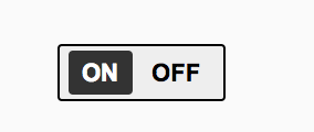
- The double-switch button (indicating on/off) states would have clear text indicating what the current active state is; so it would look like this example from Scott’s demo mentioned in the A11y project :
For my use theme switcher, it was a clear choice: since the user has two options (dark and light), I was going to use radio buttons. I didn’t want it to say “turn dark mode on/off” — I wanted it to say “Enable light mode or enable dark mode”. The solution will be CSS and HTML only, require no JavaScript, and accessibility would be baked right in by default.
Takeaway:
- Have a clear vision of what the design of the component is supposed to do and not do. Base your markup and styles on that.
If you like this article you may love my Universal Components Workshop. I’m running this workshop at a couple of events in the Fall, so you may like to sign up for one of them.
I also run in-house workshops, so you can request this workshop (or another one) for your team.
Learn MoreInspecting Code
Now, after reading and inspecting in the above resources, I decided to see how other people are marking such a switch up. After all, I knew I’d find tonnes of examples of toggle switches that look and behave like this visually on Codepen, and it’s always great to see how others are doing it — maybe I’m missing on some cool techniques for styling that I can learn, or maybe I’m missing some important piece of information when it comes to the markup and accessibility.
Since I was working in Codepen on my own version of this switch (demo shared below), I thought I’d inspect Codepen’s own toggle switch: the switch that you use to choose whether you want the pen to be public or private.
Quick takeaway:
- It is always helpful and interesting to learn from other people’s work by inspecting their code (be that via the devtools or on Codepen).
The Codepen Privacy Switch
The Codepen switch exhibited some weird behavior that I had also noticed before but never felt curious enough to “debug”. The following video shows this behavior:
First, it’s worth mentioning that I was always confused by this switch. The red color vs green always gave out a weird feedback loop. If I make the pen private, the color turns green, and making it public makes it red. In my head, green meant more like “this pen is accessible by people, it’s open” and red was more like “this pen is closed, people are NOT allowed access”. But in Codepen terms, the colors symbolized other things. More specifically, the red stands for “PUBLIC ZONE = DANGER ZONE” or “BEWARE this pen is now PUBLIC which is NOT GOOD”. (Sorry, I’m being too dramatic, but purposefully.)
Then there was the buggy behavior demonstrated in the video above (where clicking on the same label changes the value of the switch to the other label’s value). I was curious to see what was causing it so, again, I fired up devtools and inspected the code.
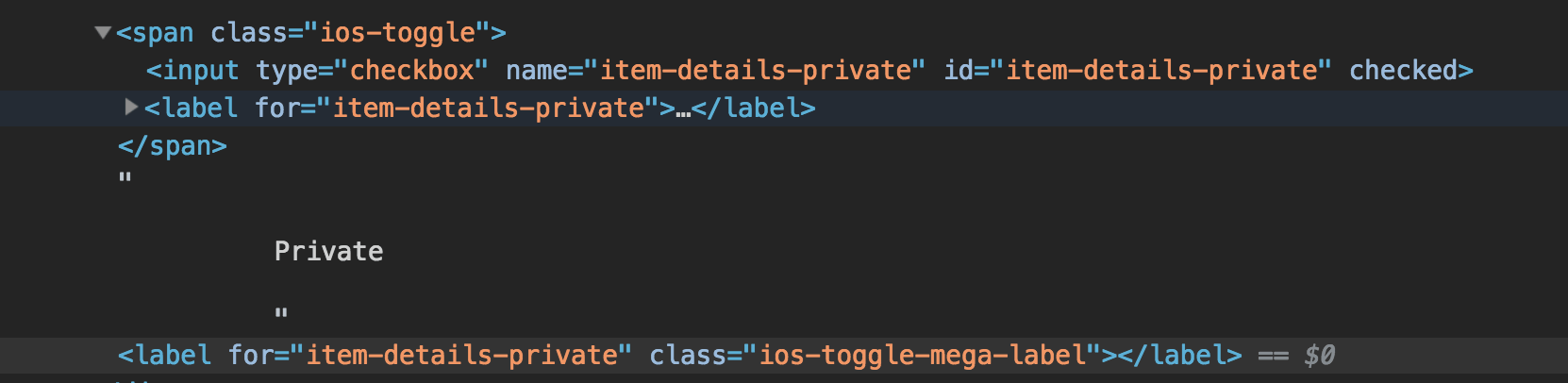
I found that the Codepen switch is one checkbox that appears to have two labels. That’s why clicking on both “Public” and “Private” multiple times would cause the switch to be turned on and off. In other words, this is why the visual feedback/behavior of the switch did not match the purpose of the switch or what it seemed to do.
I tweeted about this bug, its possible cause, and suggested an alternative solution that could fix it.
I started getting responses and opinions from other developers, which led to a very good and enlightening discussion that I thoroughly enjoyed (one of the few positive aspects of Twitter!).
The general consensus was that the switch needed fixing, of course. But how it would be fixed depends largely on what the Codepen team wants it to do:
If the switch toggle is supposed to be an enable/disable button for the “Private” option
Then:
- That would mean that the ON/OFF switch pattern mentioned in the previous section above would be the ideal solution.
- This means that the “Public” label would be discarded, and only the “Private” label would be preserved, with a clear indication that the switch next to it turns this option on or off. Which brings me to another point:
- The visual representation of the switch would either have to change completely or it should be tweaked:
- If the switch button were to remain visually the same (i.e. preserve the double-swicth “move this toggle left and right” behavior), I’d suggest adding “On/Off” labels to it akin to what Scott did in his A11y project demo, because according to WCAG, you should not use color alone to convery information. The colors also need to have enough contrast if you were to use them. And, again, I’d reconsider the red and green colors as they may confuse someone else like they confused me for a while. (Someone suggested grey and green, because “The addition of color would more closely connotate the enabled state (no color vs has color as opposed to two separate colors)”.)
- The underlying structure and markup for this case (one label only) could be:
- checkbox, that can be checked or unchecked. I would suggest just using simple (fancy, maybe) checkbox styles for this behavior and ditching the whole double-switch style altogether.
<button>witharia-pressed(andaria-checkedif needed), where the pressed state would indicate the pen is private, and the unpressed state indicates it’s not private; i.e. it’s public. The style of the button would also change in this case, and the behavior would requir JavaScript to modify the value of the ARIA attributes on click.
If the switch toggle is supposed to explicitly offer and enable two separate options: Public and Private
Then using a couple of radio buttons would make much sense, in my opinion. Two radio buttons, each with its own label, announced to assisitive technologies as a couple of separate options of which the user should choose one, and perfectly accessible via keyboards, and has no additional ARIA or JS requirements to function. And sprinkle some CSS on it to create the “double-switch” button style if you want (seriously I don’t know what else to call it) and you’re all done. The markup and styles for such a solution might differ slightly between developers, but the essence of the code would be the same.
Which brings me to the live demo…
Live Example
This is my implementation of a two-options toggle switch. I created this not as a solution to the Codepen switch, but simply as a switch for my light/dark theme switcher that I’m using in my talk:
See the Pen Accessible Option(/Toggle) Switch by Sara Soueidan (@SaraSoueidan) on CodePen.
My switch is going to live in the context of a larger set of form elements, that’s why I don’t have any fieldset or legend in the demo. And yes I know, I know… you could also tweak the code to not need the extra spans in the markup and use pseudo-elements instead, but I chose this approach anyway, just because I wanted to. Try to play with the code and uncomment some of the styles (especially try removing the spans to see how my switch looks like without them) to dissect the code and have a better idea of my choices and what I was trying to achieve.
I also added focus styles to ensure keyboard users can see where the focus is since I’ve covered my default radio buttons with the spans, and labels don’t get highlighted on focus by default. I used :focus-visible only at first (with polyfill) but it didn’t work as expected in Firefox and Safari, so I ended up adding :focus back again and using that instead. Also, the focus styles aren’t very pretty, I know, but this demo is just a proof of concept so it doesn’t need to be strikingly beautiful.
If you’d like to see another demo that also uses radio buttons but implements them differently, without spans and using pseudo-elements, check this Codepen by my friend Scott O’hara out:
See the Pen Radio Toggle Switch by Scott (@scottohara) on CodePen.
Final Words.
OK let me start by saying that I could be wrong. I know that the Codepen folks may want something completely different, or think of something completely different. So this article is not meant to redesign the Codepen switch button, but rather serve as a documentation of my research and train of thought while working on creating my own switch button for my talk. I’ll need to do even more research when it’s time to continue working on my new workshop, and things may change, and I know I’ll learn and know more by the time I create my next switch. But, until then, I know I’ve got this blog post to reference for some of the thoughts and ideas that crossed my mind when I took the first step into this.
I hope you find something useful reading this article. An if you’ve made it this far already: thank you for reading.
Cheers.