What a Year of Learning and Teaching Accessibility Taught Me
(This article was originally published on 24accessibility).
A few years ago I didn't know what the term "accessibility" meant. I built Web sites that were partially inaccessible because I didn't know better. Fast forward to today, I know enough to be able to write, speak and run workshops on accessibility, helping others build more a accessible and inclusive Web. Much like everyone else in our field, I am still learning. But since I started, I learned a lot of valuable lessons and core values that drive my work today. Here are a few of them.
Semantic HTML is the foundation of a truly accessible Web.
Semantic HTML is the universal language that all devices accessing the internet understand. It is the language you use to communicate your content to these various devices, including but not limited to browsers, reading apps, screen readers, smart watches, and more.
HTML is semantic, or in other words, it is descriptive and provides meaning — each HTML element describes the type of content it presents. So if you have a heading, you use a heading element. If you have a paragraph, you use a <p> tag. In other words, it means using the correct HTML elements for their correct purpose.
By using correct elements, your document content will have conveyable structure and meaning.
Structure is important because it helps interoperability. Interoperability is the ability of different systems, devices, applications or products to connect and communicate in a coordinated way, without effort from the end user. In other words, it allows more devices to interpret and access your content, including devices that will show up in the future.
Structure helps applications like reading apps and reader modes (such as Safari’s reader mode) as well as environments like Windows High Contrast Mode understand your content and style it in ways that improve the user experience. This is only possible when the proper HTML semantic elements are used, such as <article>, <h1>, <ul>, <aside>, <nav>, among many others available in HTML5. These elements describe the type of content they contain. Without them, these applications wouldn’t be able to tell what that content is, and therefore won’t be able to style it properly. This increases the risk of making the content less accessible, if not completely inaccessible.
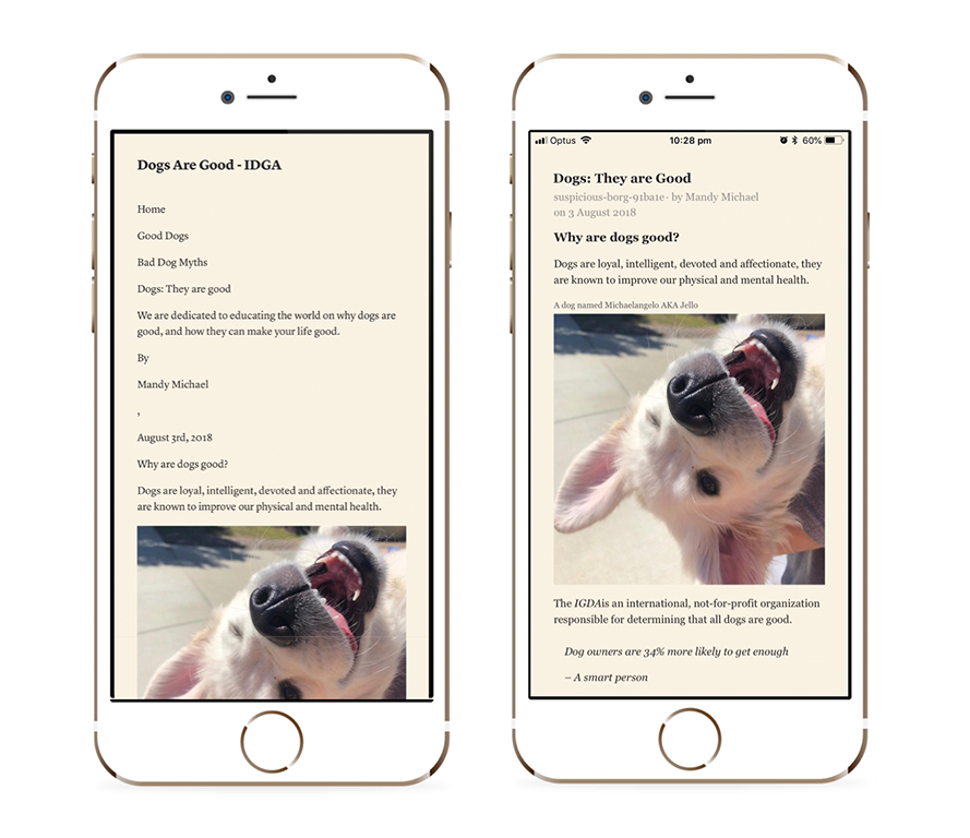
Structure is also important because it allows your users to navigate your content more efficiently. Screen reader users rely on proper document structure to jump to areas of the page they need more quickly. They do that using various quick/hot keys — power commands but for screen reader users. If you don’t use proper landmarks (exposed to screen readers via semantic HTML elements like <nav> and <main> and <header>), screen reader users may not be able to efficiently navigate the page and would have to search for their areas of interest more tediously.
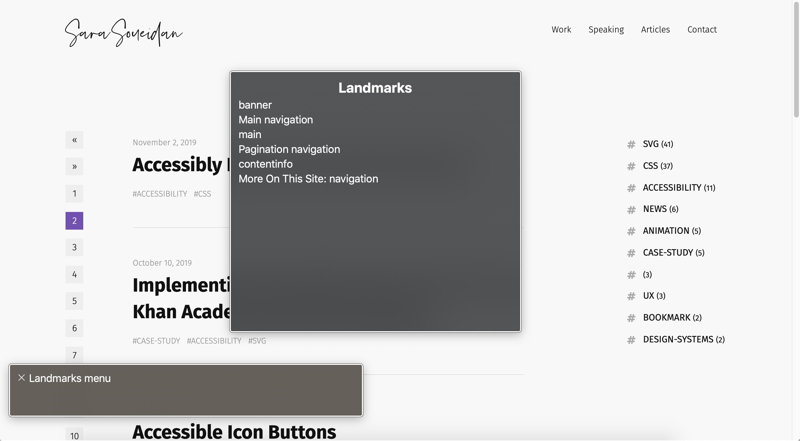
Headings also provide an outline or “skeleton” of the page that users can navigate using hot keys, and which is similar to the visual hierarchy sighted users get from viewing your page. We This is why using appropriate heading levels, regardless of what the heading size looks like. (Note that while we can style headings to look differently where needed, visual consistency is just as important.)
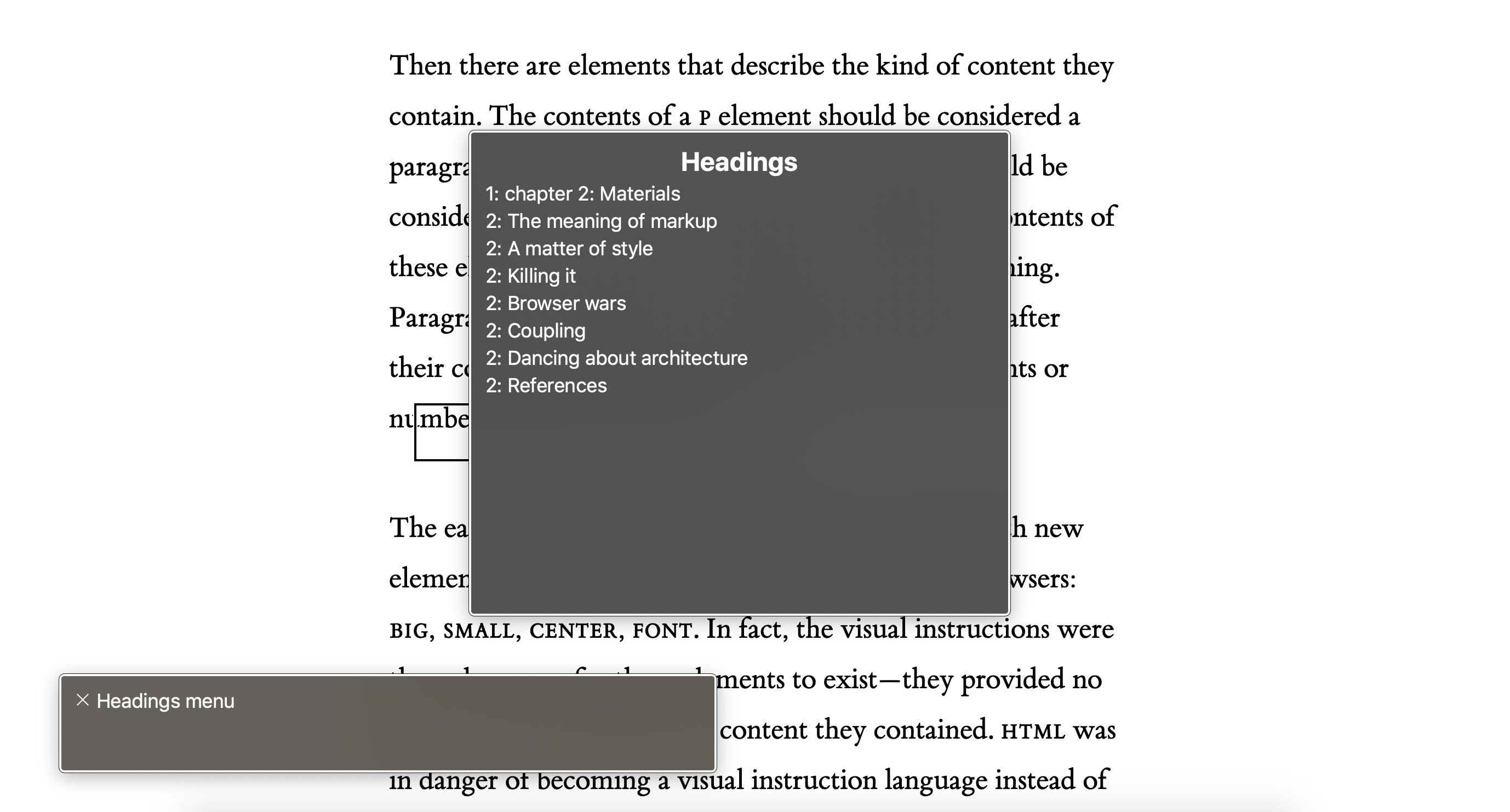
Semantics also convey purpose. HTML elements, as Jeremy Keith puts it in his Web book “Resilient Web Design” are a vocabulary of meaning
. When you use the proper HTML elements everywhere, it allows different apps and devices to convey your content’s meaning to the user so that they know what to expect of it and how to interact with it.
For example, when you use <button> to create a button, a screen reader exposes that button as what it is, and the user knows that they can do a specific action using that button (usually specified using the button’s accessible name) by either pressing the SPACE key or the ENTER key. The native <button> element comes with all the functionality and accessibility built into it by default.
But if you don’t use a <button> to create a button, and you choose to use a <div>, for example, instead, you lose all the built-in semantics and keyboard interactivity, making the button completely inaccessible to screen readers.
“But you can use ARIA attributes to turn a div into a button! Right?”
Well, yes and no…
ARIA is a polyfill for HTML semantics.
ARIA attributes are possibly the most powerful tool in our accessibility arsenal. Many ARIA attributes mirror native HTML semantics, while others provide semantics that do not natively exist in HTML. They don’t change behavior or add functionality. They don’t make an element focusable or add keyboard behavior, for example. So if you do choose to go the route of making a button out of a div, you’re gonna have to add that functionality yourself using JavaScript. But why create a brittle implementation of something that is already provided to you by default?
The first rule of ARIA states:
If you can use a native HTML element or attribute with the semantics and behavior you require already built in, instead of re-purposing an element and adding an ARIA role, state or property to make it accessible, then do so.
So while we should defer to using native HTML elements whenever possible, there are certain widgets that we can only build with the help of ARIA. For instance, there are no native HTML equivalents for Tab widgets (e.g. markup consisting of role=tab, tablist and tabpanel) — with all the interactivity built into them by default, so we can create tabs by repurposing other elements with ARIA and exposing them combined as a tabbed UI to screen reader users (e.g. role=“tab”, role=“tablist”, etc.)
Because ARIA fundamentally changes the exposed semantics and accessibility mappings of elements, if incorrectly used, it can have negative impacts on the way content is exposed to people using assistive technologies. Scott O’Hara, referencing the ARIA Practicing Guidelines notes:
ARIA practices first principlal states "A role is a promise".
When using ARIA, or even HTML for that matter, think about what you’re promising the people who use your interface or consume your documents.
Are you fulfilling the promises you are making?
Before using ARIA attributes, think about what you’re promising your users. ARIA attributes directly affect how elements are exposed in the accessibility tree, and therefore how they are communicated to your users. Use them wisely and sparingly, and make sure that what you’ve built meets the expectations you’ve created for your users. If you need pointers as to how to use and not use them, the Using ARIA document is a great place to start.
Top tip for accessibility from @LeonieWatson - there are about 147 HTML elements and only two of them have no built in accessibility features -<div>and<span>. Use the right semantic elements as much as possible! — Beth Fraser
Simplest #a11y advice I've ever received: the div is your last resort. Is this your main content? There's a tag for that. Is it your header? That's got a tag, too. The div isn't bad; it just doesn't mean anything. That means you certainly don't need it for something clickable!
Assume your content has a specific meaning and try to find the tag for that meaning. If it doesn't, then the div (or span) is what you want! The div does have a place. That place is not what many tutorials would have you believe.
JavaScript is imperative for creating truly accessible custom interactive components.
Even though you can get away with creating “functional” interactive components such as a CSS-only modal overlay or a disclosure widget using the infamous checkbox hack, it is almost always guaranteed that those CSS-only components are not truly accessible.
When you create an interactive widget, that widget is most likely to have a state. A disclosure widget is either “open” or “closed” (or “expanded/collapsed”). That state is exposed to screen reader users using ARIA attributes (e.g. aria-expanded= "true/false), and when a user interacts with the widget, the state changes, and that change needs to be conveyed to the user. JavaScript is needed to do that. I made peace with this fact two years ago when I needed to create an accessible tooltip for one of my clients.
JavaScript is also needed to add keyboard functionality to custom components (e.g. tabs in a tabbed interface need to be nagivatable by arrow keys, and a disclosure widget needs to be operable using SPACE and ENTER keys).
Side note: Even though JavaScript is a requirement for creating interactive custom components, in order to make sure that your content is inclusive of all users regardless of their context, you can, and probably should — whenever possible — make sure that they can consume that content when JavaScript is not available. In fact, you should never assume that your users will have JavaScript, as there are plenty of reasons why they might not. This is why progressive enhancement is the most accessible strategy for building for the Web. I would even go as far as saying that it is a requirement, in some cases, for creating inclusive documents and components.
Progressive enhancement is an inclusive strategy for building for the Web.
There seems to be a misconception among many developers that just because JavaScript is required to make an interactive component accessible then you cannot possibly build it with progressive enhancement as an approach. The reason for that is that those developers think that Progressive Enhancement is anti-JavaScript. That is a fallacy.
Progressive enhancement is about layering — starting with the most resilient base — semantic HTML! — and then layering styles (CSS) and functionality (JavaScript!) on top as appropriate.
But what progressive enhancement achieves is having a resilient layer of content that will always be accessible, even when the CSS and/or JavaScript are absent.
From the first day that I learned about progressive enhancement, it’s become my go-to strategy for building Web interfaces. I can’t imagine creating for the Web another way. And when I started building with accessibility in mind, I was convinced that it is the most sensible approach to developing for the Web.
Let’s take a Tabs component again as an example. In a tabbed component, you have a series of tabs that control their respective content panels. The user can navigate between these panels by clicking on the tab they want. Tabs require JavaScript to be operable and accessible. But what if JavaScript does not work? If the Tabs were not progressively enhanced — if they were built with the assumption that JavaScript would always be there, then the component will fail to function and the content in all the hidden panels will be completely inaccessible.
But if think about Tabs from a progressive enhancement point of view, you’ll want to consider what the content inside of it would look like had it been only created using HTML — without the CSS that adds the Tabbed UI affordances, and without the JavaScript that makes it behave like typical tabs.
In this case, you may think of the tabs and panels as a series of sections, each with a title and content. These sections may or may not have a table of contents at the top. This would be the default “view”, and is what the user gets by default when the JavaScript doesn’t work.
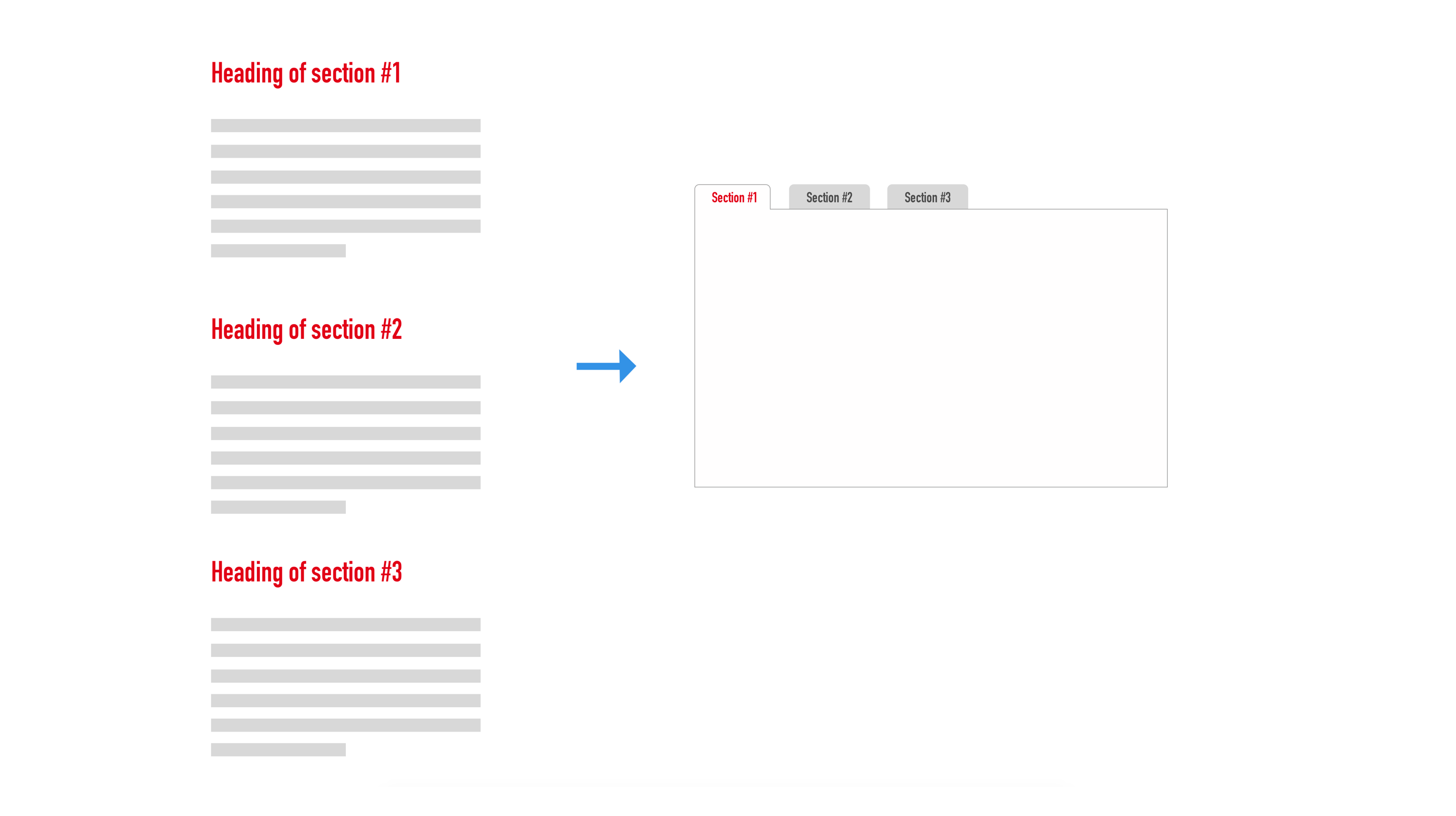
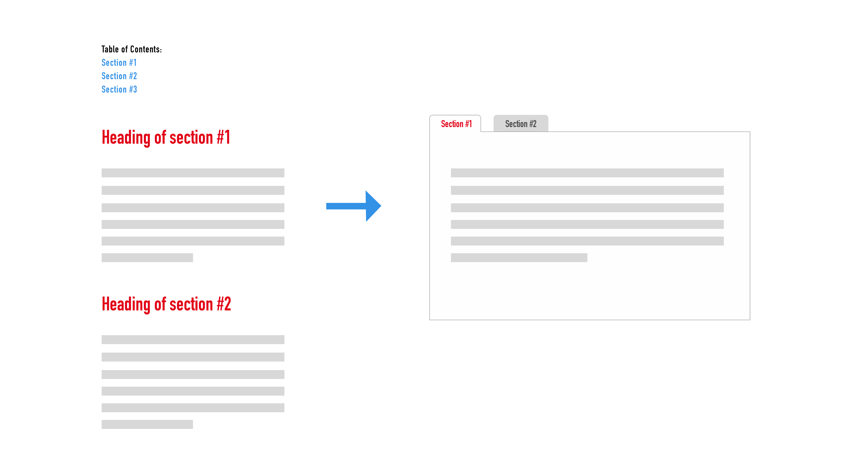
Then, when the JavaScript runs, you can enhance those sections by changing their layout and display, and adding the required interactivity. The way I would do it is I would probably add a style hook I want in the markup, and then I’d use that to change the layout of my sections knowing that the JavaScript has run and the Tabs will be operable and interactive.
When you shift accessibility to the left of your process, using progressive enhancement as a development strategy makes even more sense. Pretty much every single non-native interactive component I have built over the past year has been enhanced from a basic non-interactive component. Start with HTMl first. Utilize everything it has to offer to provide an accessible basic experience. Then enhance with CSS and JavaScript when they are available.
Progressive enhancement. Because sometimes your JavaScript just won’t work.
Be prepared.
— @sil
Design does not always dictate implementation.
One of the most common ways I see semantics broken is when they are derived from the visual design. Because the visual design does not always describe the type of content it is representing.
Headings are a perfect example here. In a recent talk I gave, I showed an example from one of my latest client projects, where the page was designed in a way that a main heading for the page was seemingly non-existent, when in fact it wasn’t. It was just not styled like a large level one heading normally would.
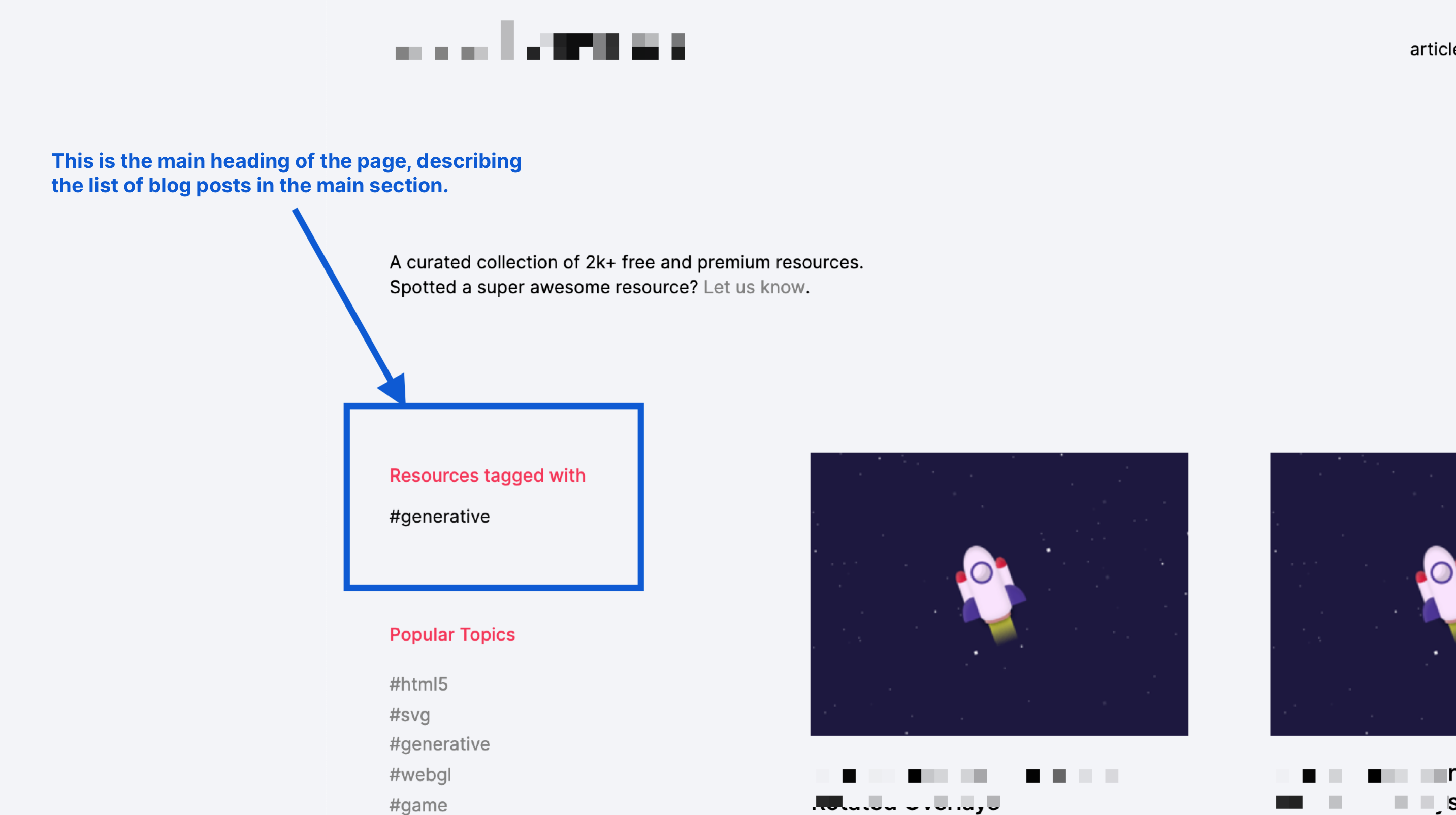
Thinking about the document structure and screen reader user expectations, I knew the page needed to have a main heading. While I had to provide a heading for screen reader users only for some other pages where one was visually absent, in this particular case the heading was already there, it was just styled to look different. So it looked like the page didn’t have a main heading, but in reality it did.
Looking at the page through the lens of accessibility and keeping the HTML layer — semantics and structure — in mind, changed the way I saw the page, and fundamentally changed how I ended up coding it.
So just because a component or element looks a certain way doesn’t mean that it is. And just because it doesn’t look a certain way, doesn’t mean that it isn’t.
The same is true for interactive UI patterns. The same pattern may create a different experience depending on the context it is in. And often times the context defines how a pattern should behave, what the user experience should be like, and that, in turn, determines what the underlying semantics should be, and that drives implementation.
In the same project I just mentioned, there was a seemingly simple UI pattern that turned out to be quite an interesting UX and accessibility challenge. The following image is a screenshot of that component:
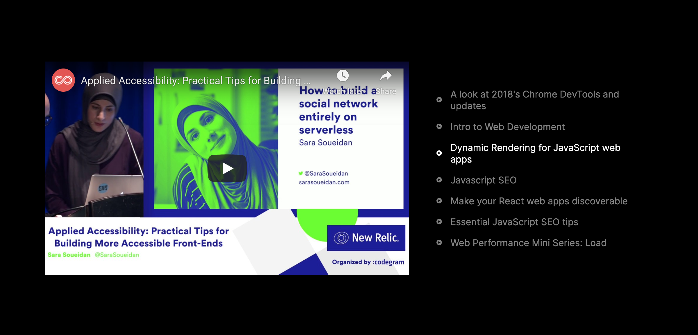
In order to implement this video player, I needed to know how it worked, so I can mark it up in a way that conveys its semantics and functionality to screen readers properly.
Even though the list of video titles on the right looks like a list of links, it is not really a list of links, because a link is supposed to take you somewhere, but these “links” don’t. Clicking on a video title would load that title in the player on the left. So it is an interactive element that performs an action and that is not a link. Therefore, and even though their appearance doesn’t show it, these titles are actually buttons.
Then there was the question of what happens when a title is clicked? does the video autoplay? If it does, then the button should probably also pause the video, making it a type of a toggle button. But if you play/pause a video from the title button, you’d want to associate that button to the play/pause buttons inside the video itself, which can be a challenge given that the video could be a Youtube video, or a Vimeo video, or self-hosted. And if you don’t autoplay the video, should you move focus to the iframe after the button is clicked?
After reviewing the intended UX and testing with screen readers, I ended up implementing it as a tabs component, with all tabs controlling the one panel containing the video.
I had never thought about a tabbed interface with multiple tabs controlling the same one panel before. But the context of this component and the UX of it triggered a train of thought and UX considerations that drove the final implementation.
So one of the things that I learned from this component was that the UX drives the implementation. ARIA comes with a lot of attributes that enable us to create different UI patterns in different contexts, and sometimes all we need to do is modify the pattern a little bit to work in the context it is in.
It’s weird that we still derive the semantics from a visual design instead of the other way around.
The visual design is different per context while the core semantics are not.
Just because it is technically accessible, doesn’t mean it is inclusive.
You can build something that is technically accessible but isn’t inclusive. That element or component may have all the buttons you want and you may be able to navigate it using a keyboard and use it with a screen reader, but did you really take your user’s needs and expectations into consideration when you made the decisions about how and what of that element should be exposed and interacted with?
In his talk “Inclusive by Design”, Derek Featherstone, accessibility advocate and designer, talks about how he and his team built an accessible video player for an organization that they were contracted by. The video player had lots of buttons and was tested for technical accessibility over many phases.
But then when the time came and the component needed to be used by users with different disabilities, they realized that, even though they had built the perfect accessible video player, that video player was not truly inclusive — it was missing certain functionality that made using the player easier for a group of users, such as a Rewind or Fast Forward button. Derek and his team had also made assumptions about how all users would be using the video player, and forgot about the users that were using an older version of a screen reader and who were therefore missing important announcements that were supposed to help them operate the video player. So after several iterations and tests with various users, they ended up adding features to the video player that would take many more disabilities into account, and expectations that those users would have of the player, and that made it far more inclusive and tremendously improved its user experience.
Derek’s talk is full of such good examples that emphasize the importance of including your users early in the design process, and making sure that you embrace diversity by default. The idea is that if you’re designing something for me, I should have a reasonably meaningful way of participating in that thing. I should be represented in that somehow.
“Nothing about us, without us.”- Michael Masutha
At the end of the day, it is always about the user.
As you develop with real user experiences and inclusivity in mind, you’ll soon realize that a design pattern can be built in more than just one way. And there are quite a few things in accessible design that are opinionated.
Modal overlays are a great example. Regardless of being an annoying UI pattern, there are quite a few discussions around how they should be implemented and how they should behave once they are opened: Should you focus the first focusable element inside the modal? What if there is no focusable element? What if the first focusable element is the close button? Would you want the modal overlay to prompt a closing action as soon as it’s opened? (Of course not.) What if the first focusable element is an input field asking the user for their email address? Is it appropriate to prompt the user for their personal information without context first? (Also of course not.)
At the end of the day, no matter what decision you end up making, it should always be about the user. So getting the user and/or a more diverse team involved in the design and development process is crucial in building truly inclusive Web interfaces.
But what if you can’t? What if you don’t have access to such an environment or team? What if, like me, you’re a solo developer who often joins teams that usually don’t have users or disabled people involved?
When in doubt, ask for help.
If you can’t do it yourself, you can seek the experience and advice of other people who can. And it is very important for you to be open to constructive feedback.
There are quite a bunch of wonderful (and sometimes understandably grumpy) accessibility experts in our field who want the Web to be and become more accessible. Most of them have been doing free work like giving free advice and sharing their valuable knowledge in various forms — writing articles and books, making video courses, giving talks and workshops, etc. And there is a lot that we can learn from them. And most of them welcome questions and inquiries (paid and free).
Some of my go-to experts are (in no particular order):
- Leonie Watson
- Derek Featherstone
- Scott O’Hara
- Marcy Sutton
- Rob Dodson
- Alice Boxhall
- Marco Zehe
- Eric Bailey
- Steve Faulkner
- The Paciello Group
You’d do well to spend some time reading the ARIA specifications and guidelines, and trying to get acquainted with as much about accessibility as you can, before asking for help. After all, these kind people may be able to help us, but they shouldn’t have to do our work for us — at least not for free.
Final Words
Accessibility isn’t easy. And often times it is downright hard. But that comes with the territory. Designing for humans is hard. And accessibility is, at the end of the day, all about and all for humans.
We may not get it completely right, and there may always be room for improvement — especially as more users use our products and consume our content, but one thing I know is that that should never discourage us. Almost everything can be improved in one way or another. The most important thing is to be open to feedback and to be empathetic enough to care about our users and try our best to make their lives easier with the (powerful) tools we have at our disposal.
Use HTML. Enhance with CSS. Leverage the power of JavaScript. And include your users in your design process as early as possible. And always look at your work through the lens of inclusion. This will take you far ahead. Then learn more, iterate, and improve. And don’t forget, we’re all just temporarily abled. -->