SVG Style Inheritance and the ‘Flash Of Unstyled SVG’
On Using SVG Presentation Attributes To Provide Style Fallback for CSS Failure Scenarios
There are too few things not to like about SVG, and I don’t mean the things that browsers cause by incomplete or lack of certain features or buggy implementations. Yet you might sometimes get some unpredictable results that might frustrate you when working with SVG, if you don’t know the details of how certain features should behave and what to expect from them, as per the specifications. SVG presentation attributes come with a bit of their own behavior which might sometimes surprise you.
I’ve written and spoken quite a bit about styling and animating SVGs with CSS, and have included a list of resources to dive into the details at the end of the article. I’ve also touched on the subject of style inheritance and the CSS Cascade in SVG in both speaking and writing. However, the topic is worth its own blog post.
I’ve been meaning to write this article for a while now but have been kept preoccupied. But what prompted me to finally write it today is this tweet I saw yesterday:
Issue: Oversized SVG icons when the page’s CSS fails to load https://t.co/FwkaBAzrAT
— Web Platform Daily (@openwebdaily) February 29, 2016
And I remembered that I have already mentioned the cause and solution to this issue in one of my talks as well as in the Smashing Book 5 chapter on SVG, but never in one of my articles, not even the article focused on making SVGs responsive with CSS. (See links at the bottom of the article.)
So, what’s the problem again?
When CSS is disabled or fails to load for any reason—such as when you’re on lo-fi, most SVG images, especially inline ones, will scale and take up the entire viewport width, thus making the unstyled page look even more ‘broken’ than it already does.
I’ve come across this scaling issue quite a few times in the past when I visited Codepen on my fairly slow connection (which sometimes gets more than just ‘fairly’ slow). The responsive Codepen logo would take up the entire viewport area, thus blocking the content underneath it and forcing you to scroll down to read whatever comes after it.
This—allow me to call it—Flash of Unstyled SVGs (FOUSVG) is caused by the lack of width and height attributes on the <svg> element.
But the SVGs are meant to be responsive…
So why would you want to set explicit dimensions on your <svg>when what you’re really trying to do is make the SVG fluid, right?
Right.
Ideally, we should make our SVGs responsive while also catering for any worst case scenarios where our styles are ignored or simply not applied for any reason.
By taking advantage of the SVG style inheritance tree, we can make our SVGs responsive while simultaneously planning for worst case scenarios, and providing a decent, less broken, fallback.
The How
In order to avoid the no-CSS scaling issue, all you need to do is not remove the width and height attributes from the SVG.
1. Keep the width and height attributes
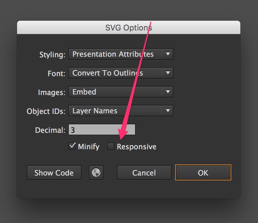
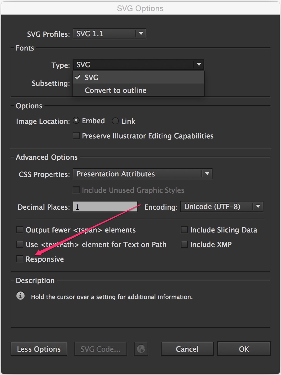
This means that, if you’re creating the SVG yourself in, say, Adobe Illustrator, you should avoid checking the ‘Responsive’ option in the Export panel(s).


It’s very tempting to check that option, because you do want your SVGs to be responsive, after all, but you shouldn’t check it unless what you need is for the SVG to simply occupy the entire width on the screen—like when it’s supposed to be viewport-width, for example. (I’ve embedded an SVG in my current client project and I wanted it to occupy the full page width, so I safely removed the attributes.)
Unchecking the ‘Responsive’ option will ensure that Illustrator will export the SVG and preserve the dimensions it has.
2. Specify your desired width and height values in the CSS
You want your SVG to scale—be fluid—and fill out its container’s width?
No problem. Tell the browser you want that to happen by specifying the dimensions specified in the attributes above, using CSS properties:
svg {
	width: 100%;
	height: 100%;
}
or maybe something like
svg {
	width: 1em;
	height: 1em;
	/* maybe even... */
	color: currentColor;
}
which will restrict the dimensions of an SVG icon, for example, and scale it in proportion to the text it is inline with.
Specifying your desired width and height in the CSS will make sure the width and height attributes no longer restrict the dimensions of the SVG when the CSS is successfully loaded and applied.
If the CSS does fail to load, the browser will use the values provided in the attributes as fallback, thus preventing the excessive scaling of the SVG.
The Why: Why does the above technique work?
SVG presentation attributes are special style properties—a shorthand for setting a CSS property on an SVG node. For this reason, it only makes sense that SVG presentation attributes would contribute to the style cascade.
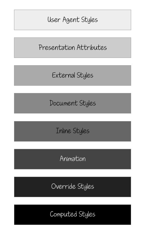
When I got started with SVG, I expected presentation attributes to be more specific than any other style declaration. It made sense to me that the “closer” a style is to a node, the more specific it is. For example, inline <style>s are more specific than external styles, an inline style attribute is more specific than <style> ‘islands’, so I thought it made sense for presentation attributes to be the most specific form of styles. But I was wrong.
Just like HTML presentational attributes, SVG attributes count as low-level author style sheets and are overridden by any other style definitions: external style sheets, document style sheets and inline styles.
SVG attributes count as low-level “author style sheets” and are overridden by any other style definitions: external style sheets, document style sheets and inline styles.
This makes it possible to provide a fallback for when the CSS styles are not available, so the SVGs still look good in their ‘worst’ case.

Tip: You can use presentation attributes to provide fallback for more than SVG scaling
If you have an SVG you’re styling and animating using CSS properties, you may start by ditching the presentation attributes altogether—we do have an option to do just that in Illustrator’s Export panel, by choosing CSS Properties over Presentation Attributes. That will lead to all attributes being exported as CSS properties, if they can be set as CSS properties.
You see, only a subset of all CSS properties may be set by SVG attributes, and vice versa. The SVG specification lists the SVG attributes that may be set as CSS properties. Some of these attributes are shared with CSS, such as opacity and transform, among others, while some are not, such as fill, stroke and stroke-width, among others.
In SVG 2, this list will include x, y, width, height, cx, cy and a few other presentation attributes that were not possible to set via CSS in SVG 1.1. The new list of attributes can be found in the SVG 2 specification.
Some of the ‘new’ CSS properties for SVG are already implemented and available in Chrome today!
There is a benefit to keeping the presentation attributes inside the SVG as well, not just on the root element. These benefits are highlighted the most when you attempt to style the contents of <use>d elements in SVG.
When you re-use an element, the contents of that element are copied, as is, into wherever you place the <use> in the page. But you may want to re-use an element mutliple times and style each occurance differently. You can do that by leveraging CSS Custom Properties (a.k.a. CSS Variables).
When ‘theming’ multiple <use> elements with CSS custom properties, it is recommended to always keep the presentation attributes that provide the default styles for the reused SVG, so that the image is styled both when the CSS fails to load and/or when the SVG is viewed in browsers that don’t yet support custom properties. Without the presentation attributes, most styles—such as fill and stroke—will default to black, which is probably not what you want.
Weird SVG scaling gotchas to be aware of
Depending on how you embed your SVG, browsers will generally default to a 300px by 150px size, which is the default size for replaced elements in CSS. This is the default size you get for <iframe>s as well, for example.
If the dimensions of the SVG are not specified, or if they are explicitly set to auto, the browsers will default to the 300 by 150 pixels dimension. If either dimension is set to auto (instead of 100% as mentioned earlier), the browser will cancel out the value set in the presentation attributes and will default to one of the default height and width values.
Well, kind of…
Again, It Depends™.
You see, the browser behavior depends on how you embed your SVG. If you embed the SVG using <iframe>, you get the 300x150 as a default. If you embed the SVG inline in the document (using <svg>), most browsers will scale it to the width of its container and will scale the height proportionally to preserve the SVG’s aspect ratio, while Internet Explorer will scale the width but not the height, so you need to explicitly tell it to scale the height as well.
Fun fact: IE will scale the height of the SVG if you give it an explicit width value of 100%. Crazy, but true.
I’ve written more about the rendering of different SVG embed techniques in the ‘Making SVGs Responsive with CSS’ article linked at the bottom of the article, along with ways to ensure the SVG is ‘responsified’ across all browsers.
Amelia Bellamy-Royds has also gotten into more detail about the browser scaling techniques in her article ‘How to Scale SVG’ on CSS-Tricks.
Scaling Tip: Never drop the viewBox
Ever.
This is possibly the most important thing you need to be aware of when attempting to scale SVG: you need the SVG viewBox to properly scale SVG images.
you need the SVG viewBox to properly scale SVG images.
Do not remove it.
After reading this artilce, developer David Bushell shared his own experience highlighting the importance of the viewBox to make sure SVG images are rendered as expected. You can check his post out here.
Wrapping Up
Having explicit, non-percentage width and height values set on an SVG not only helps with fixing FOUSVG issues, but it also helps with other scaling problems, especially when the SVG is used as a background image in CSS. Internet Explorer sometimes refuses to scale the image properly if it doesn’t have its aspect ratio specified with the width and height attributes. I’ve had this happen even with non-background images recently as well. Quite honestly, I don’t know the details of why or when exactly this happens, but I do know that we can avoid it by having these attributes available anyway.
The viewBox is even more important than the width and height, so always make sure you keep it there. You can learn all there is to know about how the viewBox works in this article. It is a very powerful attribute that is definitely worth taking the time to master.
Further Reading
- [Slides] Styling and Animating SVGs with CSS – my talk from 2014, given at CSSConf and CSSConf EU.
- [Article] Styling and Animating SVGs with CSS — sort of a talk transcript, published on Smashing Magazine
- Making SVGs Responsive with CSS — article published on Codrops
- How to Scale SVG — by Amelia Bellamy-Royds
- Scaling of SVG Backgrounds on MDN
- Styling the Contents of SVG
<use>with CSS on Codrops - Understanding SVG Coordinate Systems and Transformations (Part 1): The viewport,
viewBoxandpreserveAspectRatioAttributes
I hope you found this article useful. Thank you for reading!