Nested Links Without Nesting Links
Chris Coyier started a thought exercise thread last week asking the community how they would approach building nested links. I had the same requirement a couple of years ago when I was building the front-end foundation for Smashing Magazine. So I thought I’d write my response to Chris’s thread out in the form of a blog post.
The Challenge
The following video shows what an article on the home page’s list of Latest Articles behaves like. Take note of how the URL of the links change at the bottom left of the video recording as I hover over different areas of the clickable blog post. You’ll notice that each of the internal links in the post links to a different page than that of the post itself, while clicking anywhere else on the post item links to the full article.
Each article is clickable as a whole entity and would link to the article page. But we still wanted the links within the article item, such as the author name and any links inside the excerpt, to also work as regular links.
Native Markup Limitations
According to the specification, an <a> element’s content model specifically states that an <a> cannot contain any interactive descendants. An <a> element is interactive, and so therefore you cannot nest an <a> inside another <a>.
This means that this markup is invalid:
<a href="#1">
    Link content that references
    <a href="#2"> another link </a>
    within the main one.
</a>
In fact, if you do use that markup, your main link is going to break into two separate links, with some of its text content being left out in the process.
The following image shows what the DOM looks like after the browser parses my nested links from the above example:
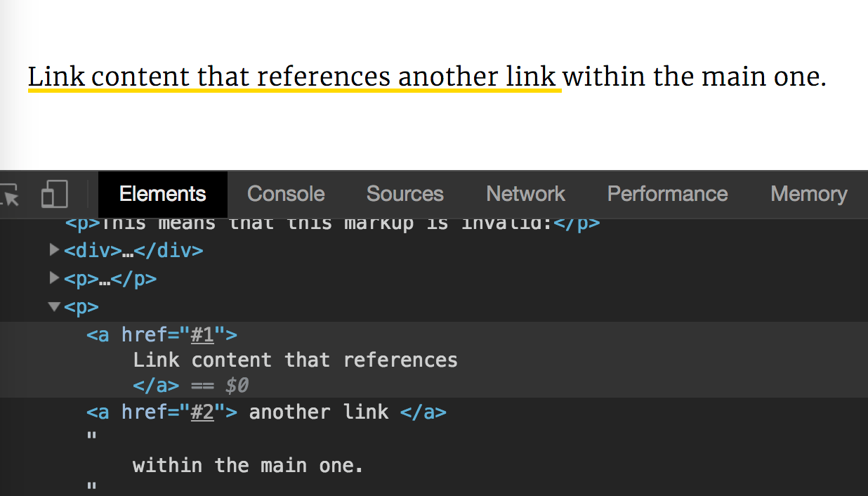
The browser “breaks” when it finds an <a> before it finds the closing tag for the preceding <a>, to it takes it up on itself to close the previous <a>
The object Hack
Upon searching for ways to nest links — if any existed, I came across this article by Roman Komarov, in which he explains his workaround for nesting links that he found when he was trying to nest links in one of his own projects.
Roman came up with a brilliant way to make nesting links possible by working around the browser’s restrictions, taking advantage of how it parses HTML, and fooling it into allowing the nested link inside the first one using the <object> element: the inner link is wrapped in an <object> and this object is given a random, invalid mime type.
Because of the way browsers handle object elements, the object element is going to be completely ignored, allowing the content inside of it to be displayed in its stead. In fact, the contents of the object are only there to be displayed as a fallback for when the object itself fails to display. So we make it fail, by providing an invalid type, and the browser then displays the content inside of it — our nested <a> — in its place, thus rendering the inner link inside the outer one. Note that this is only possible because:
…after wrapping any HTML with such attributeless
objectwe would get just a wrapper element for this content. But a wrapper with an unusual trait: any content inside of it would be treated by browser’s parser without looking at the object’s context. So, using this trait we can, finally, nest one link into another, separating them for a parser.
Albeit being a very clever hack, this is still a hack. It comes with its own limitations, including browser support that you’d have to work around. (Check Roman’s article out for more details.)
This hack also wasn’t very practical for the Smashing Magazine use case. We shouldn’t have to set up a script to wrap every single inner link with an object. Aside from being a hassle, in my very lazy developer opinion, this — I assume — might also have performance implications. So I continued looking for other — hopefully less hacky — options.
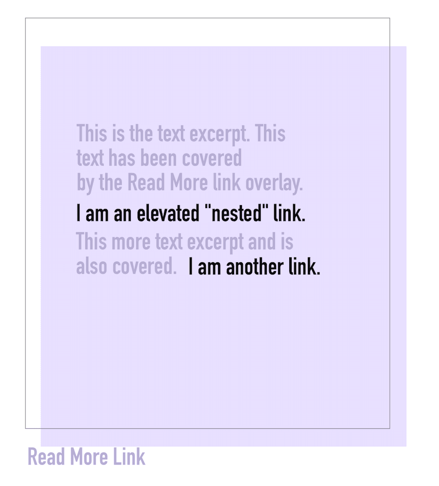
The CSS-only Layered Links
There’s a reason I say “layered” link, not “nested” link here. This technique fakes the behavior of nested links by overlaying one link on top of the whole item (article post in our case), and then elevating the remaining links on top of it.
This results in the whole item area linking to the URL of that link overlay. The remaining links are elevated so their pointer events are not blocked by the overlay, thus allowing them to be independently clickable.
Harry Roberts has a JSFiddle demo of this technique.
For the following markup:
<div class="post-link">
<p>Pellentesque habitant morbi tristique senectus et netus et malesuada fames ac turpis egestas. Vestibulum tortor quam, <a href="https://www.google.com">feugiat vitae</a>, ultricies eget, tempor sit amet, ante. <a href="http://www.apple.com/">Aenean fermentum</a>, elit eget tincidunt condimentum, eros ipsum rutrum orci, sagittis tempus lacus enim ac dui. Ut felis. Praesent dapibus, neque <a href="https://www.facebook.com/">id cursus faucibus</a>, tortor neque egestas augue, eu vulputate magna eros eu erat. Aliquam erat volutpat.</p>
<a href="http://csswizardry.com/2013/02/introducing-csswizardry-grids/" class="post-link__read-more">Read more…</a>
</div>The styles (SCSS) look like this:
.post-link {
    position: relative;
    /* Position any links in the post excerpt at the top of the `z-index` stack. */
    a {
        position: relative;
        z-index: 1;
    }
}
    /* Stretch the ‘read more’ link over the whole of the post.
     * Hide the ‘read more’ link’s text. */
    .post-link__read-more {
        top:    0;
        right:  0;
        bottom: 0;
        left:   0;
        overflow: hidden;
        text-indent: 100%;
        white-space: nowrap;
        /* Needs a heightened specificity to trump `.post-link a`.
         * Stack it under all other links in the post text. */
        a& {
            position: absolute;
            z-index: 0;
        }
    }
The following image shows a very rough visual representation of this technique:
Albeit brilliant, this technique had another issue that I wasn’t okay with: the keyboard tabbing order was, well, out of order. Here is a video showing what tabbing through the links Harry’s demo looks like:
Because we have a Read More link that overlays the whole post, the tabbing order goes like this:
- Tab to child link
- Tab to child link
- Tab to child link
- Tab (whole) post
- [tab to move to next post:]
- Tab next post’s child link
- Tab next post’s links
- Tab next post’s link
- Tab (whole) next post
This tabbing order felt very unnatural to me, so I knew I would have to adjust this technique to fix that.
My Implementation
Harry’s technique provides everything I need for the Smashing use case, except for my expected tab order, especially given the markup on the magazine differed slightly from the markup Harry was working with:
<div class="">
    <article class="">

        <header>
            <time datetime="" class="">7 days ago</time>
            <h2 class="">
                <!-- our first link 👇🏻 -->>
                <a href="/2018/08/desktop-wallpaper-calendars-september-2018/">This is our post title</a>
            </h2>
            <span class="">by <a href="/author/cosima-mielke">Author Name</a></span>
        </header>

        <p class="">
            This is the post excerpt which very well contains <a href="#">links</a> to places.
        </p>

    </article>

    <a href="#"> <span class="visually-hidden">Read More</span></a>
The first link in the post markup is the title of the post which, naturally, links to the post itself.
So I thought: what if, instead of overlaying the last link in the post — the Read More link — over the post, I would overlay the first link instead?
Getting the title of the post to expand and cover the entire post area would mean that that area would also link to the post, which is exactly what we want to do in the first place!
And since we’re not overlaying the last link on top of the links prior to it, this fixes the tab order and we end up with tabbing that works like this:
The user tabs through the posts by going through the title, its following “child” links, then the Read More link, then moves on to the title of the following post, its child links, its Read More link, and so on. We’ve surpassed the backwards jump where the entire post was re-focused after focusing its contents. (Usually, tabbing would happen the other way around: focus the container, then tab through its content.)
Technically, the post title will be expanded to cover the post by expanding a ::before pseudo-element inside of, which practically expand the entire title’s box with it:
.the-post {
    /* elevate the links up */
    a {
        position: relative;
        z-index: 1;
    }
}

.the-post-title {
    /* ... */

    a {
        position: static;
        /* expand the pseudo-element to cover the post area */
        &::before {
            content: "";
            position: absolute;
            z-index: 0;
            top: ...;
            left: ...;
            width: ...;
            height: ...;
            /* ... */
        }
    }
}
UX & Usability Considerations
You may have already noticed the major limitation to this technique: the post excerpt’s text is covered by the pseudo-element, which makes that text unselectable. If you try to select the text to copy it, you won’t be able to.
This was a compromise the Smashing team were okay with after testing the design with their users. The inability to select the text wasn’t an issue, as not many users attempted to make that selection.
Final Words
Calling these links “layered links” is a lot more appropriate and descriptive than “nested links”, given how they are implemented/styled.
I would consider this technique “hacky” for sure, but if it works, and as long as it does not compromise the overall accessibility of the design, then I see no reason not to use it.
The most important takeaway from this is to remember to always test the usability and accessibility of your design, especially if you use unconventional CSS tricks to create it.
If you’re interested in some of the other tricks I used during the Smashing magazine development, check out the video of my talk, or read the case study which includes a link to the talk slides.
I hope you found this article useful.
Cheers,
Sara